Problem: Designing a sustainable product & brand for the african middle classes that avoided cliched ecology imagery and aligned to the premium identity of ‘silicone valley’ tech giants.
Solution: A modern minimal visual style across product & brand, combined with imagery & messaging that leant into the brands african heritage & culture.
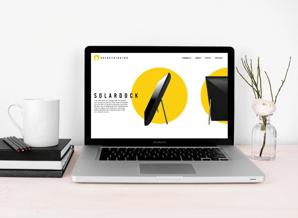
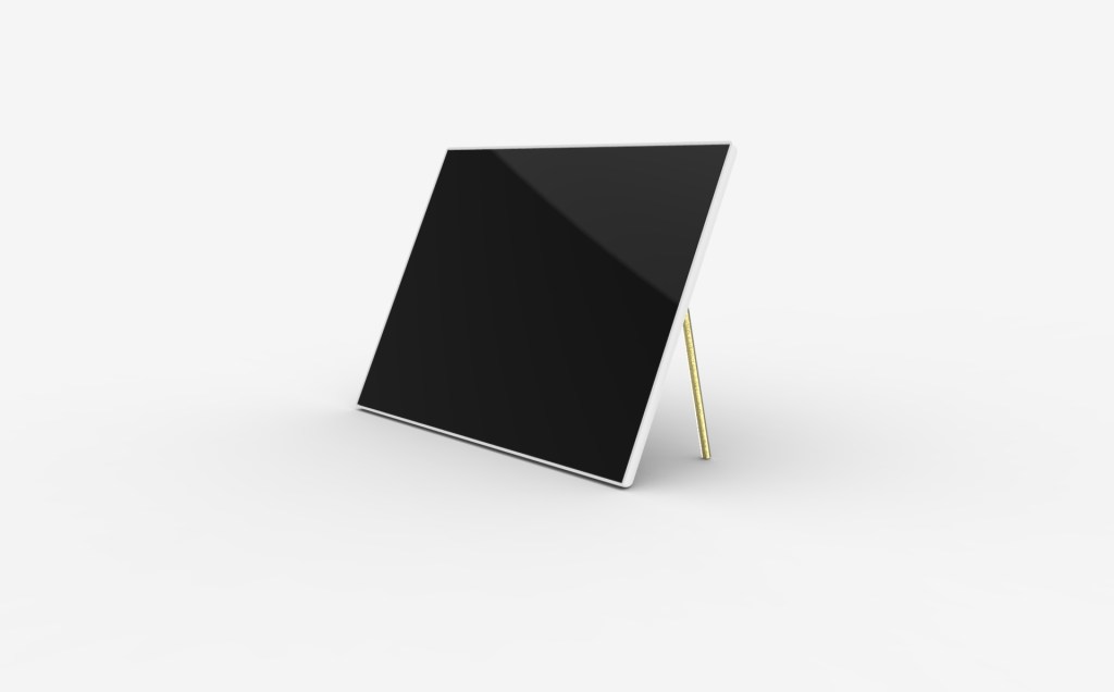
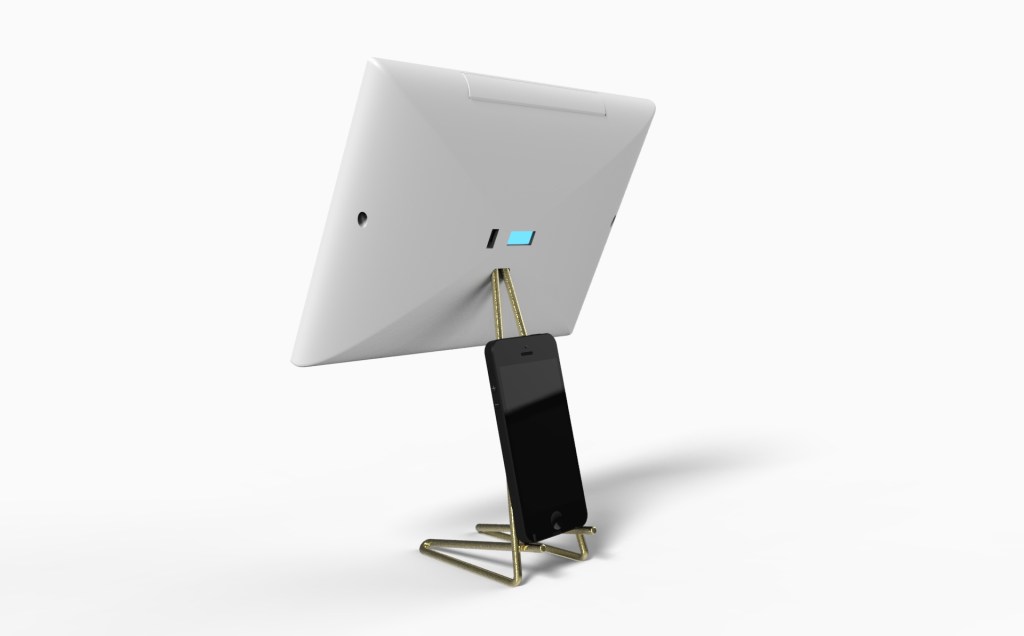
Product (SolarDock)
The Brief
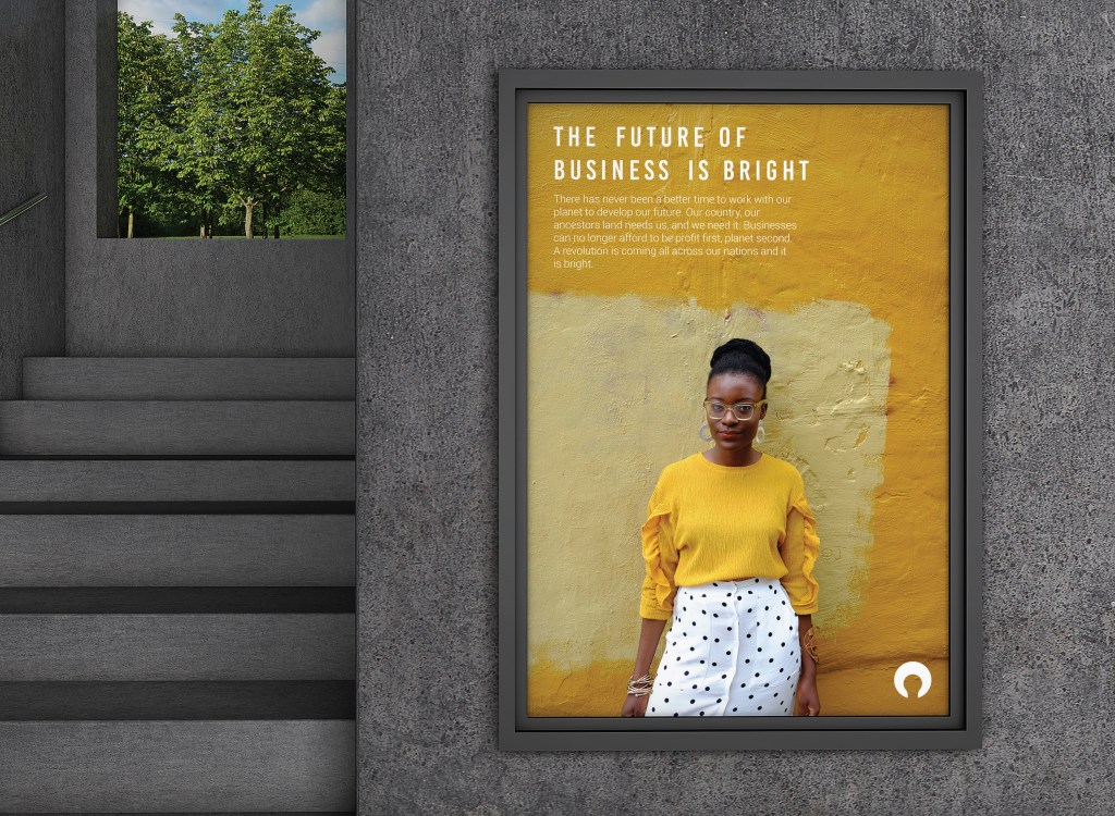
The African continent is the site of the largest and fastest growing middle class in the world, but many national infrastructures have been unable to keep up with this rate of growth. Feyi recognised the opportunity for sustainable charging technology to thrive within this market, providing a stable and reliable power source for the smartphones that drive modern business. In doing so he also sought to create a company that thrived ecologically, as well as economically.
Whilst Feyi developed the ‘solar charged battery’ functionality, he needed a product designed in which to sell it.
The Approach
From previous research I was aware that avoiding traditional ecological design language would give this piece a better chance in the market. Many consumers write-off obviously ecological products assuming there to be a compromise on functionality to allow for the increased ecology.
In order to provide adequate solar power, the product needed to be quite large, as such I felt it important to design a piece with enough presence to standalone, but a quiet enough design to blend into the background if required.
As the product developed a portability element was added to the brief that required the piece to be disassembleable.


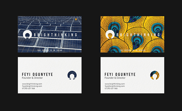
Brand Identity
The Brief
Having developed the product, Brighthinking needed an identity. Having avoided the cliched visual language of ecology in the product, the brand needed to maintain this as well as reflecting the clean minimal design language that permeats modern technology brands.
This product has been featured at no.1 in DesignRush’s ‘Best Green Technology Branding Examples’.
The Approach
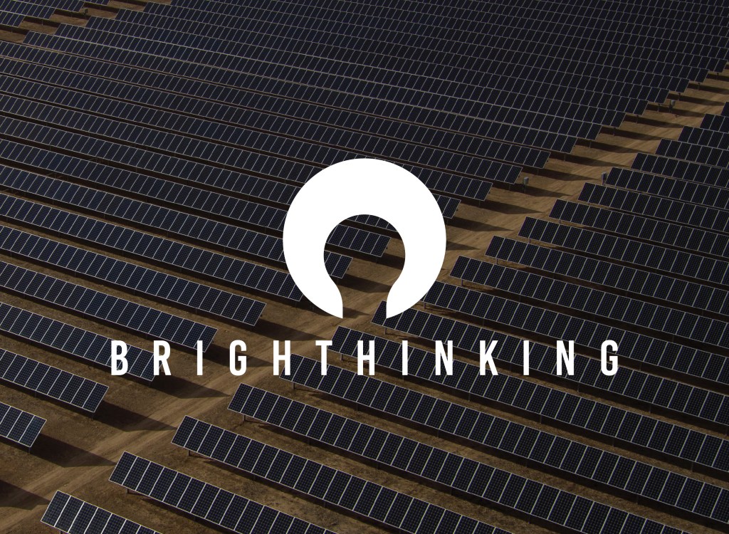
The sun was chosen as a visual foundation, not only for the obvious solar energy connection, but also for its rich heritage and storied meaning within many African cultures. In the businesses early months a lightbulb drawing by Feyi’s sister had been used as the unofficial icon, Feyi and I were keen to incorporate this imagery into the new logo in reference to this original mark.
Throughout our conversations a bold and bright future was regularly mentioned. These elements were incorporated through a flexible palette of golds and yellows, a bold cinematic font selection, and a repeated slogan: ‘the future is…’