Context
This ‘archive’ houses some highlights of my logo & brand work from the past decade. These projects range in scope and audience and were performed in a mixture of roles between freelance, contract, and in-house.
ApproAch
Whilst each project is unique, I aim to create identities that resonate with all audiences. Communicating to and attracting the appropriating target market, differentiating them from their competitors, whilst also providing something that represents the vision at the core of the business.
Scope
Logo
Visual Identity
Brand Identity
Naming
Strapline/Slogan Writing
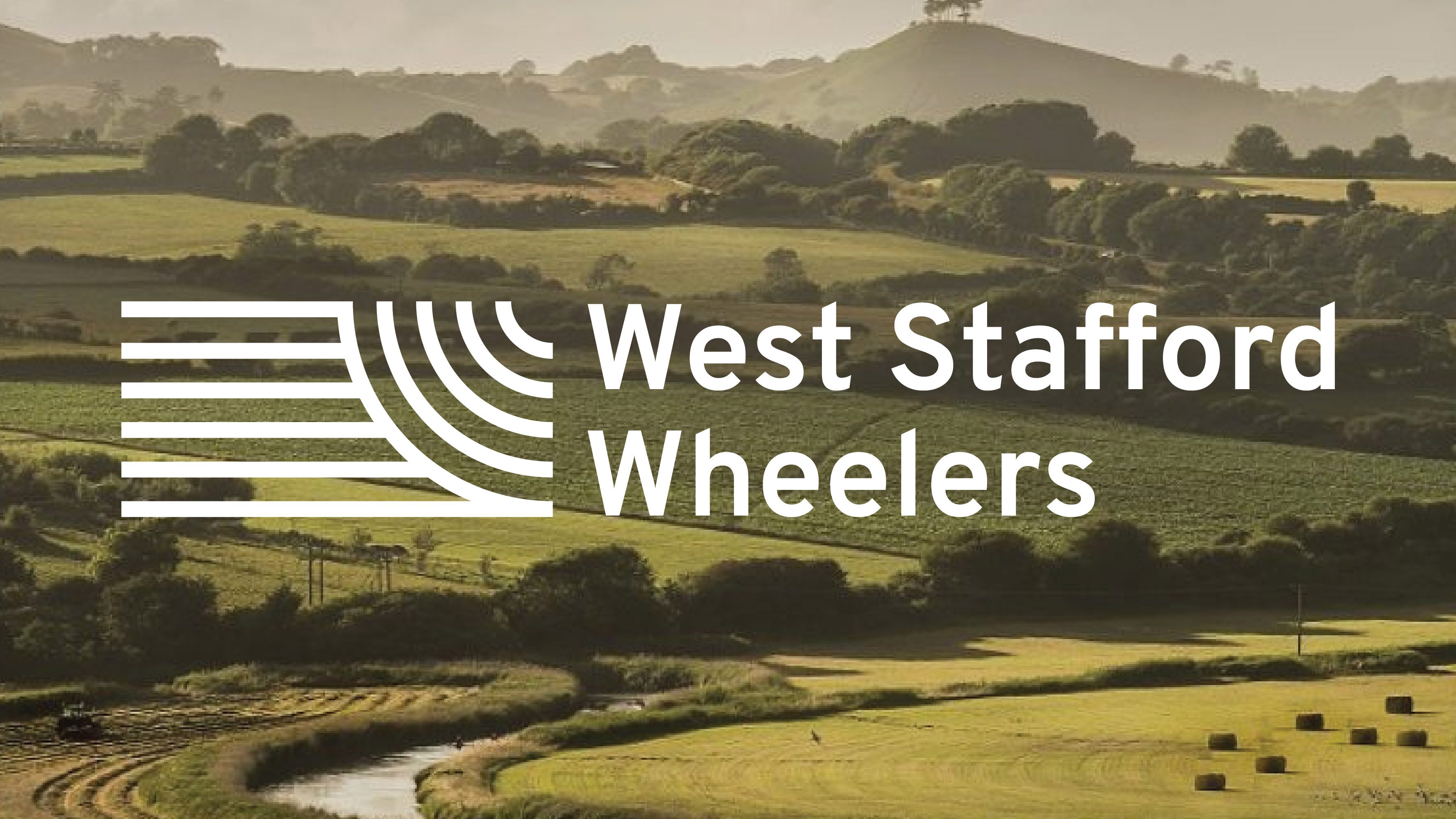
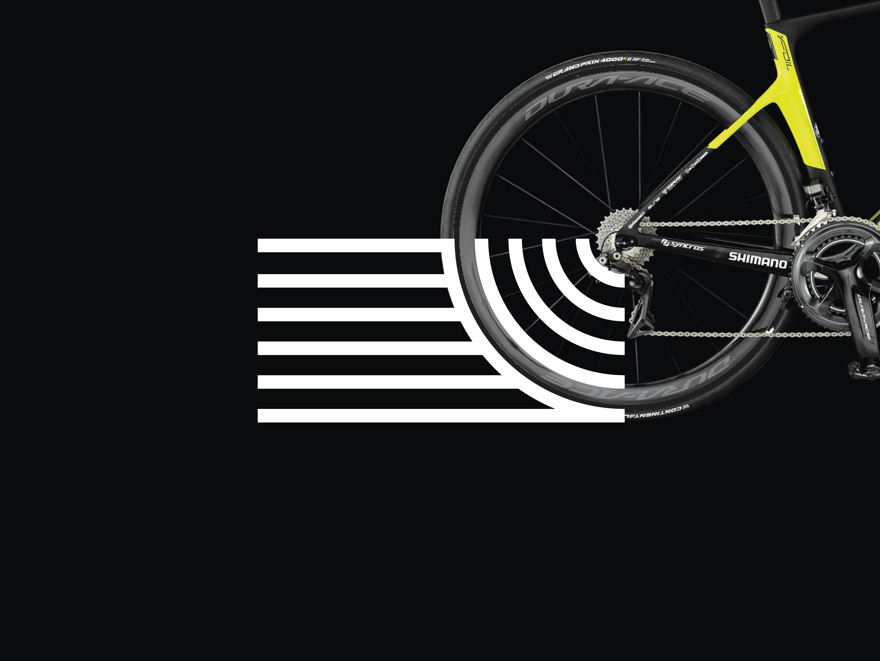
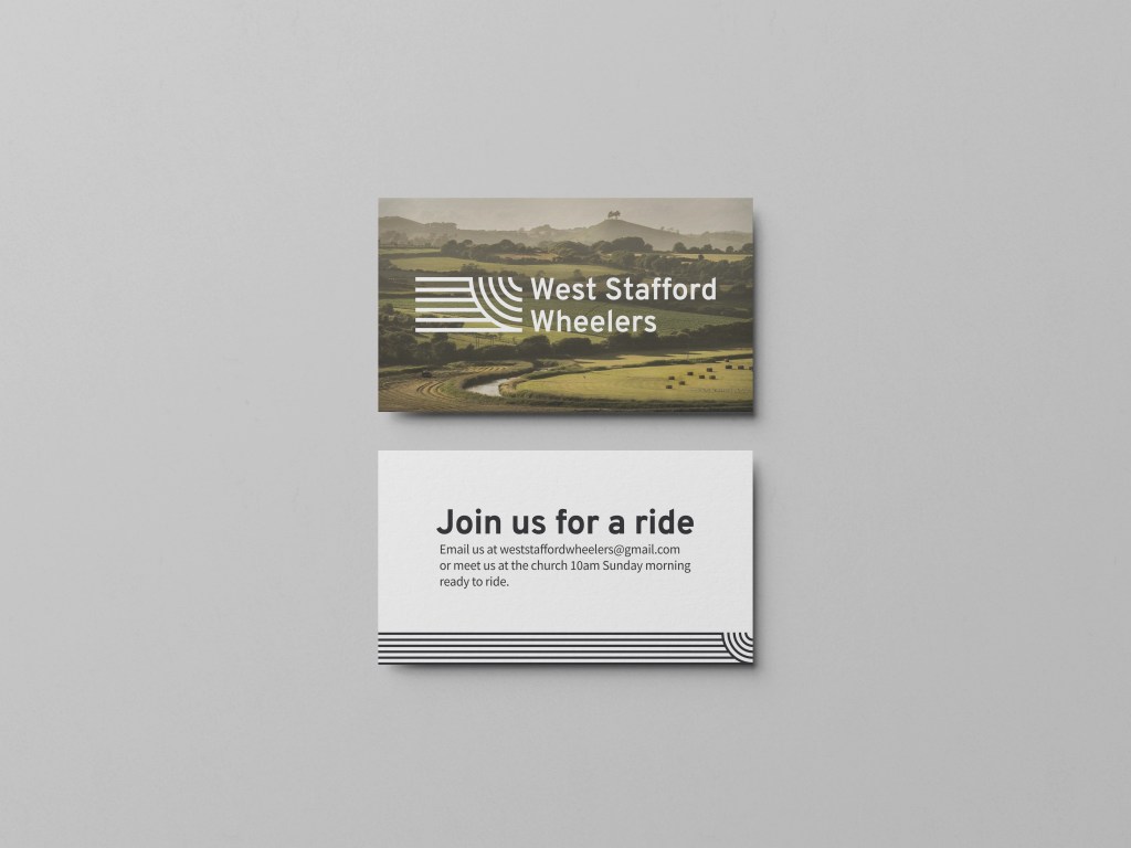
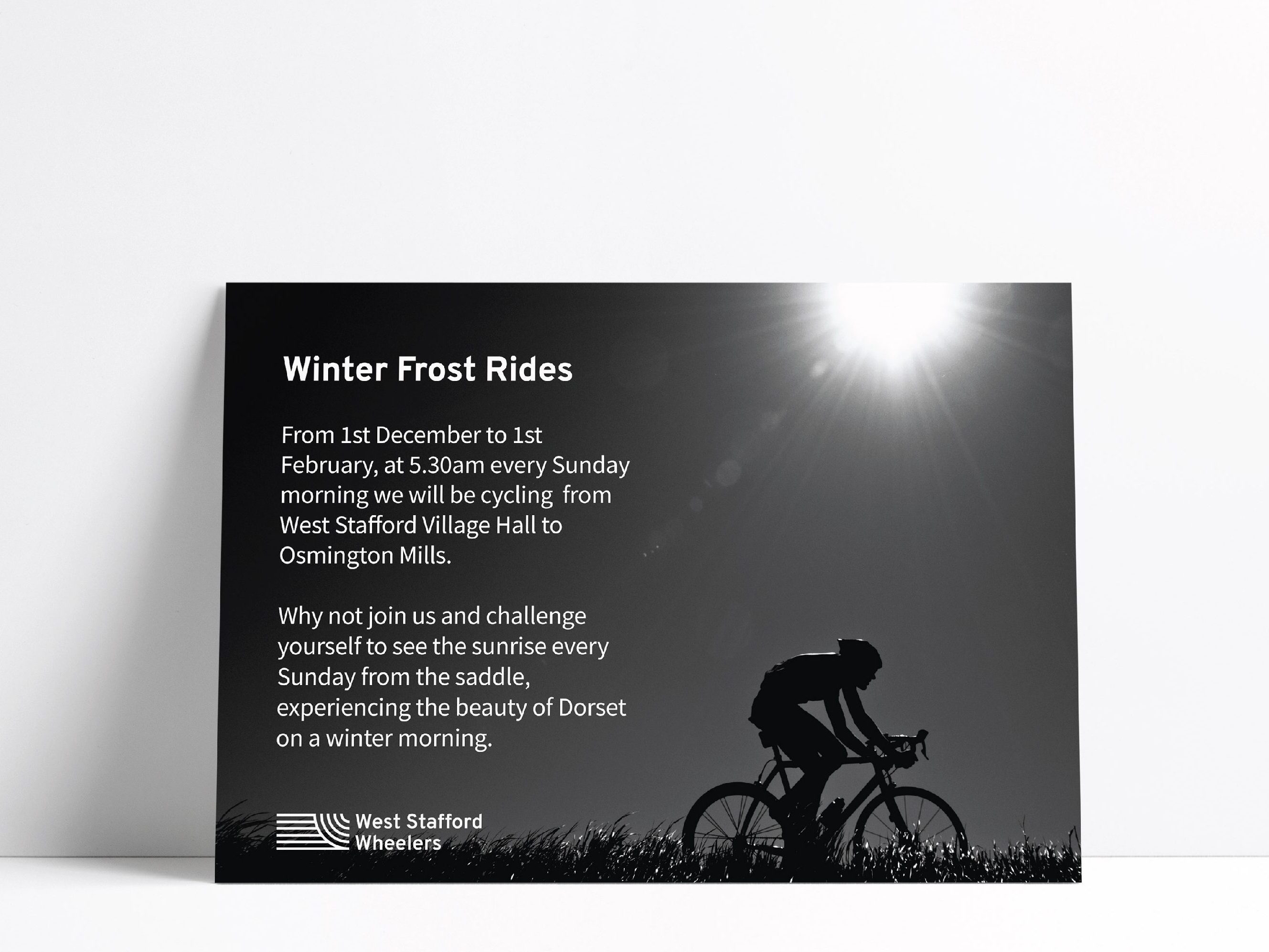
Logo design for a cycling club for impassioned riders, aiming to differentiate themselves from the local casual club. The logo manifests the sensations of speed, wind on skin, & spokes cutting through air that inspire these cyclists to their passion.
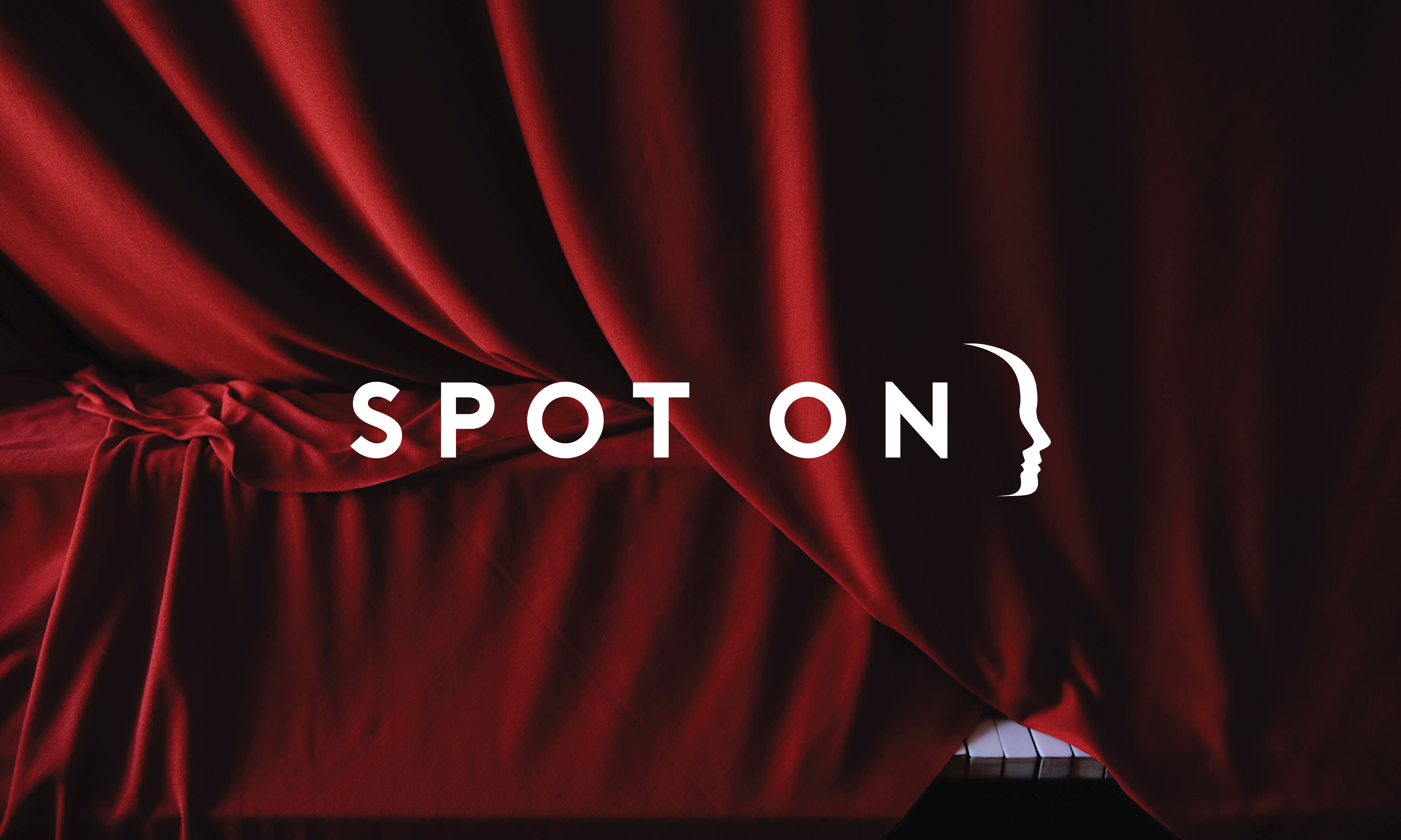
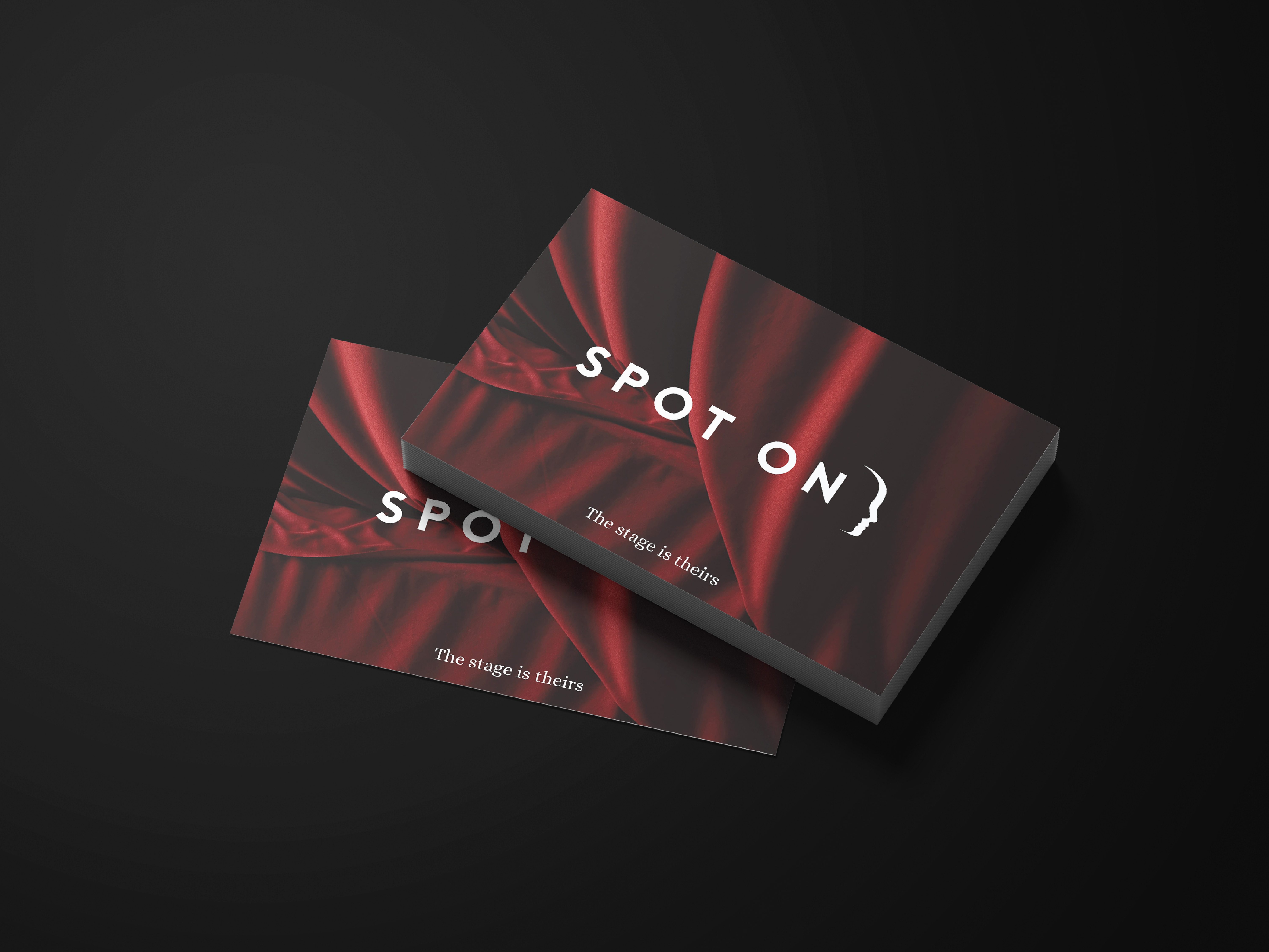
Logo & simple visual identity for a German coaching & mentoring business that supports students during ‘sandwich years’. The logo interprets the founders vision “like a director shining a spotlight on talented young people”, containing both the spotlit student and behind the scenes mentor ‘in the shadows’. The colour palette draws from again the visual language of stage in order to help differentiate the business from the typical dark blues and greys of the industry.


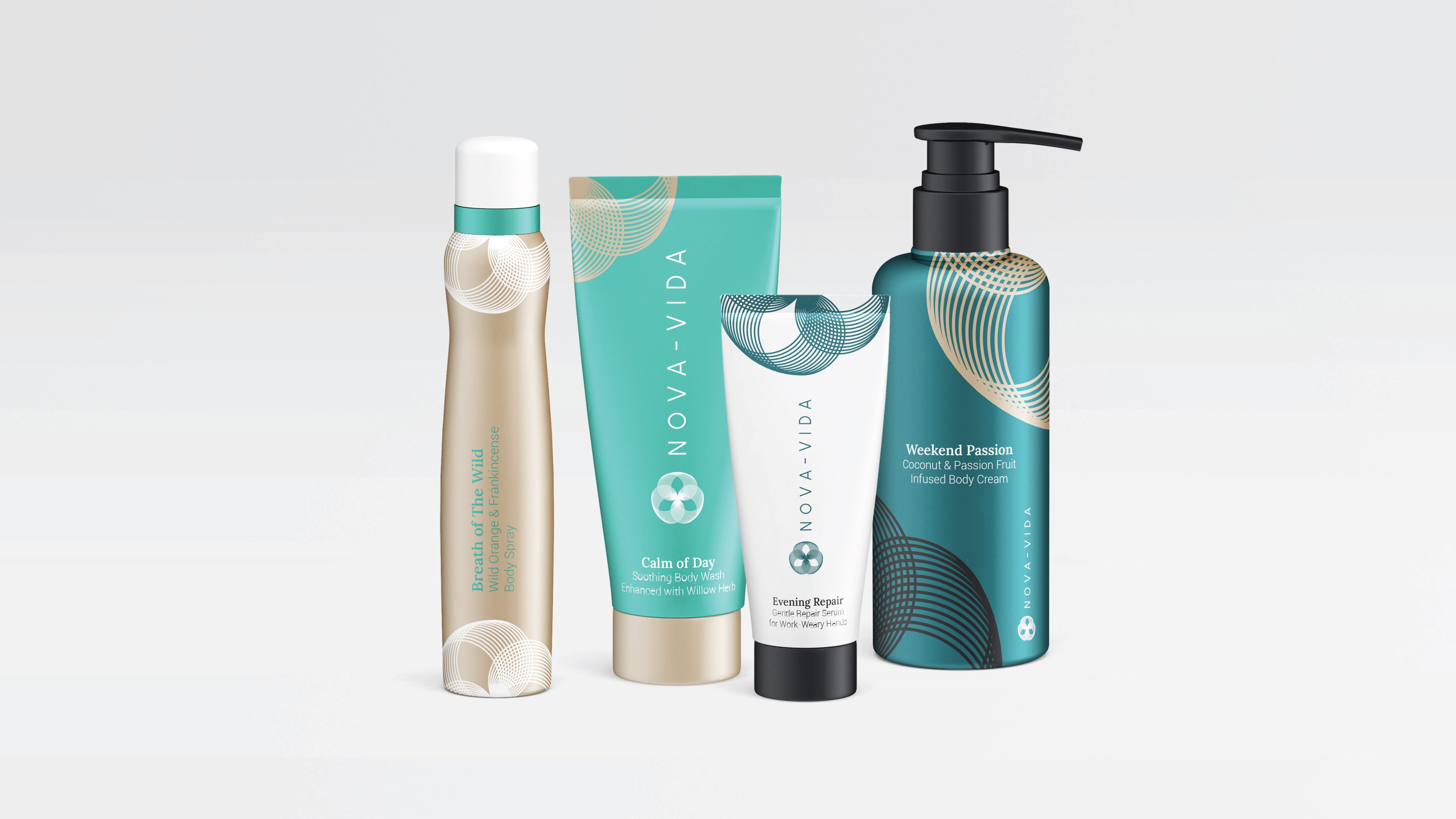
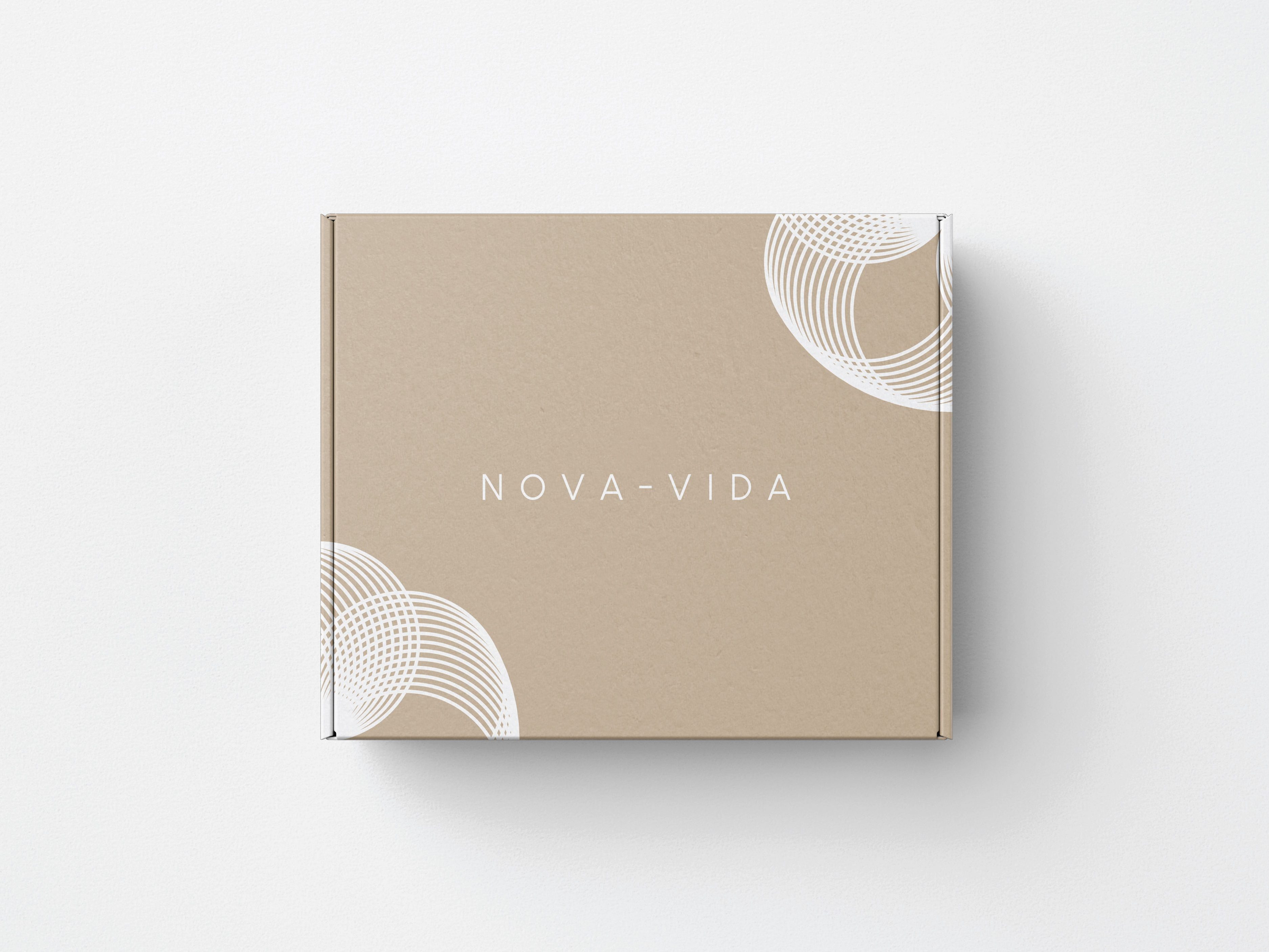
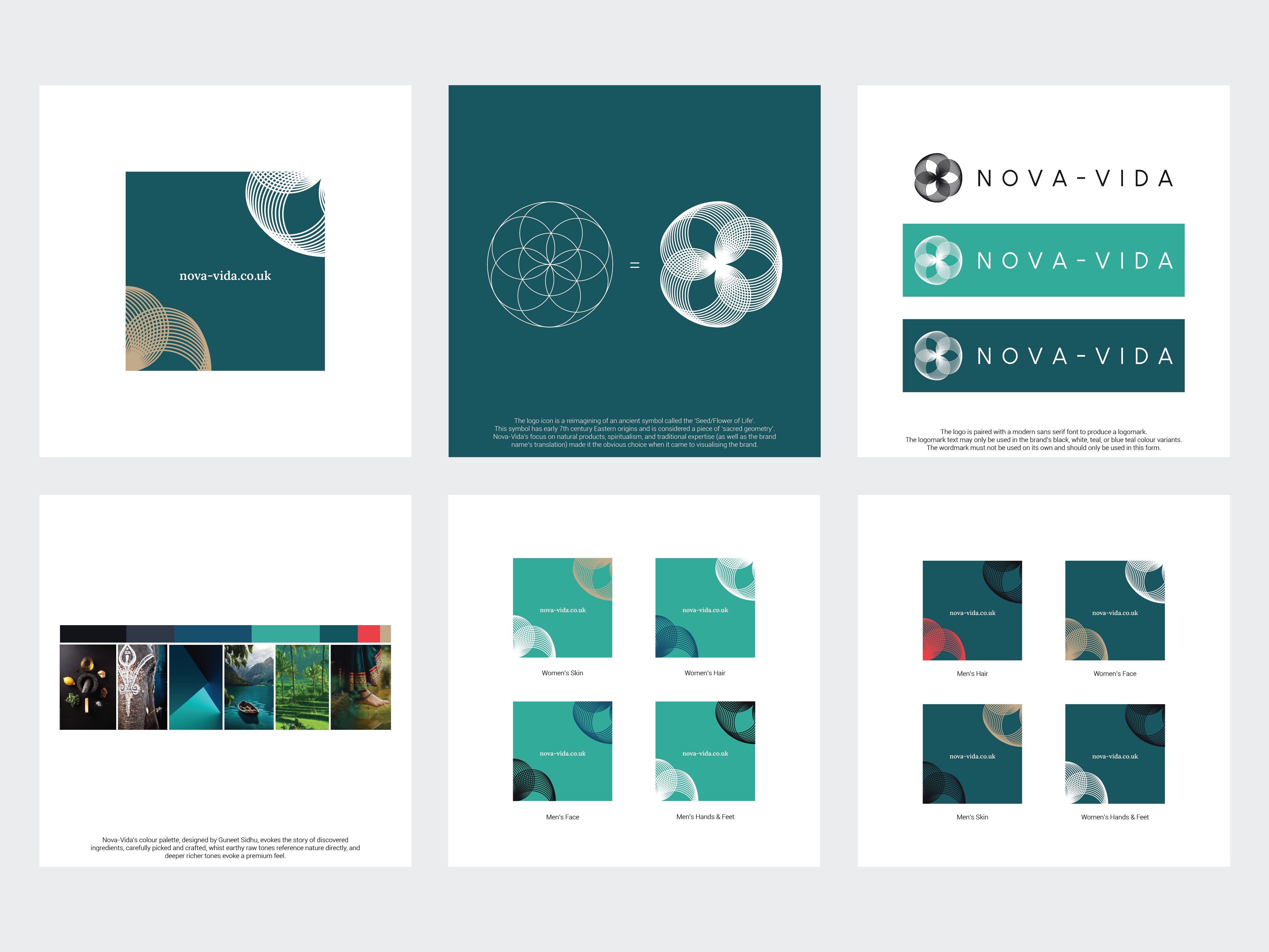
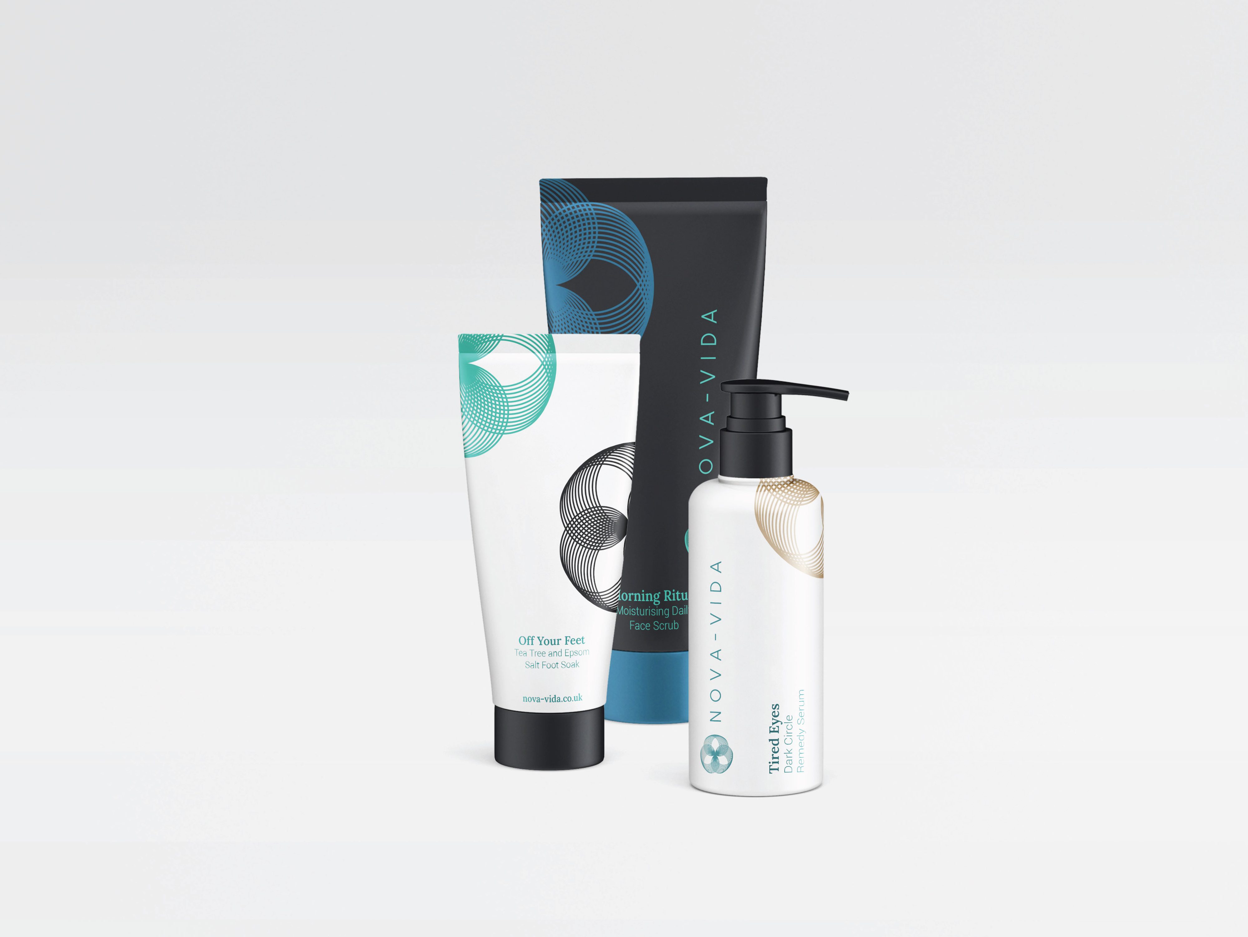
Visual identity for a spiritual & herbal wellness cosmetics company. The identity represents the brands’ values of health, spirituality, historic wisdom, and of course ‘new life’ (from which the company was named). The brand’s identity subtley integrates elements of Eastern philosophy & colours despite its western audience.
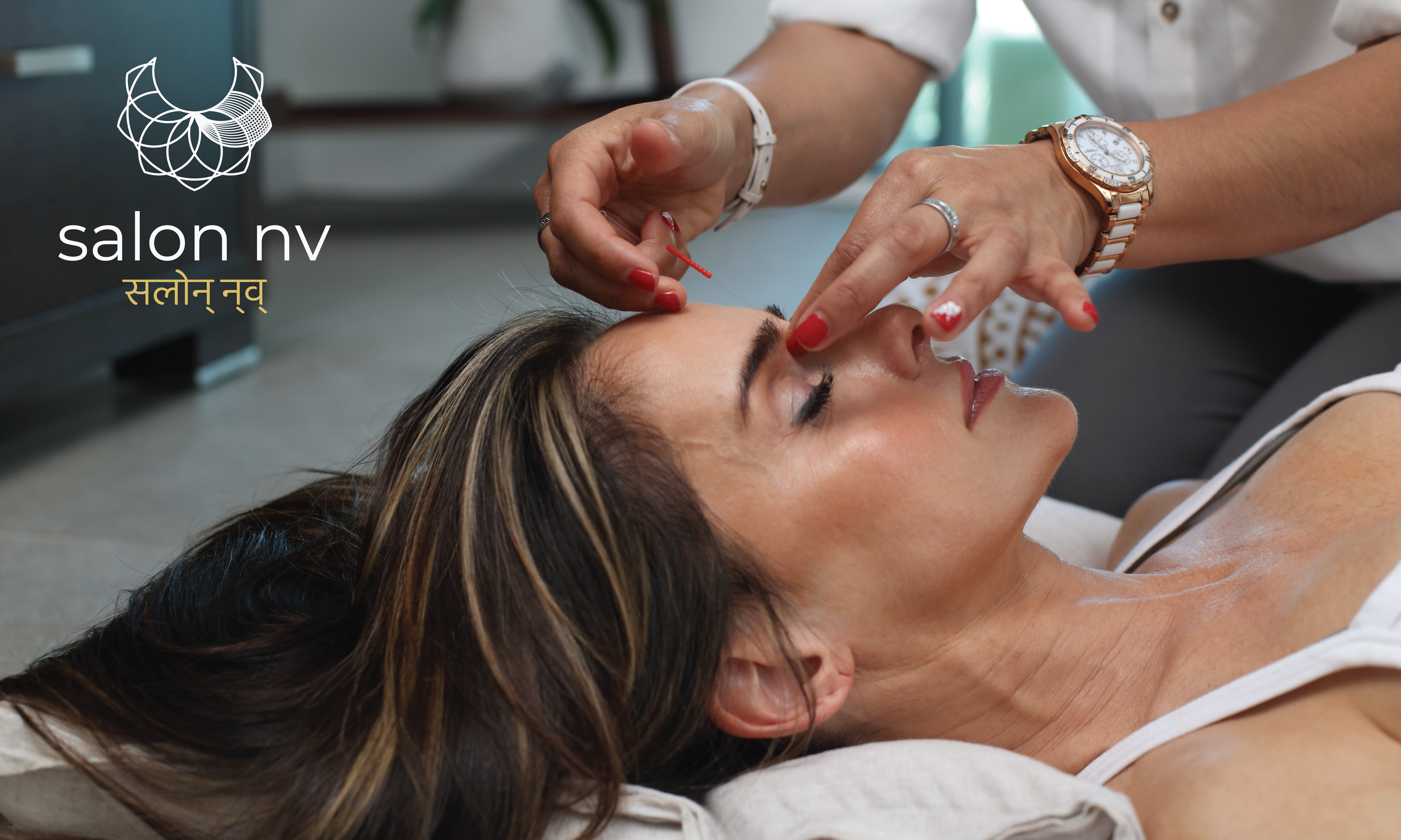
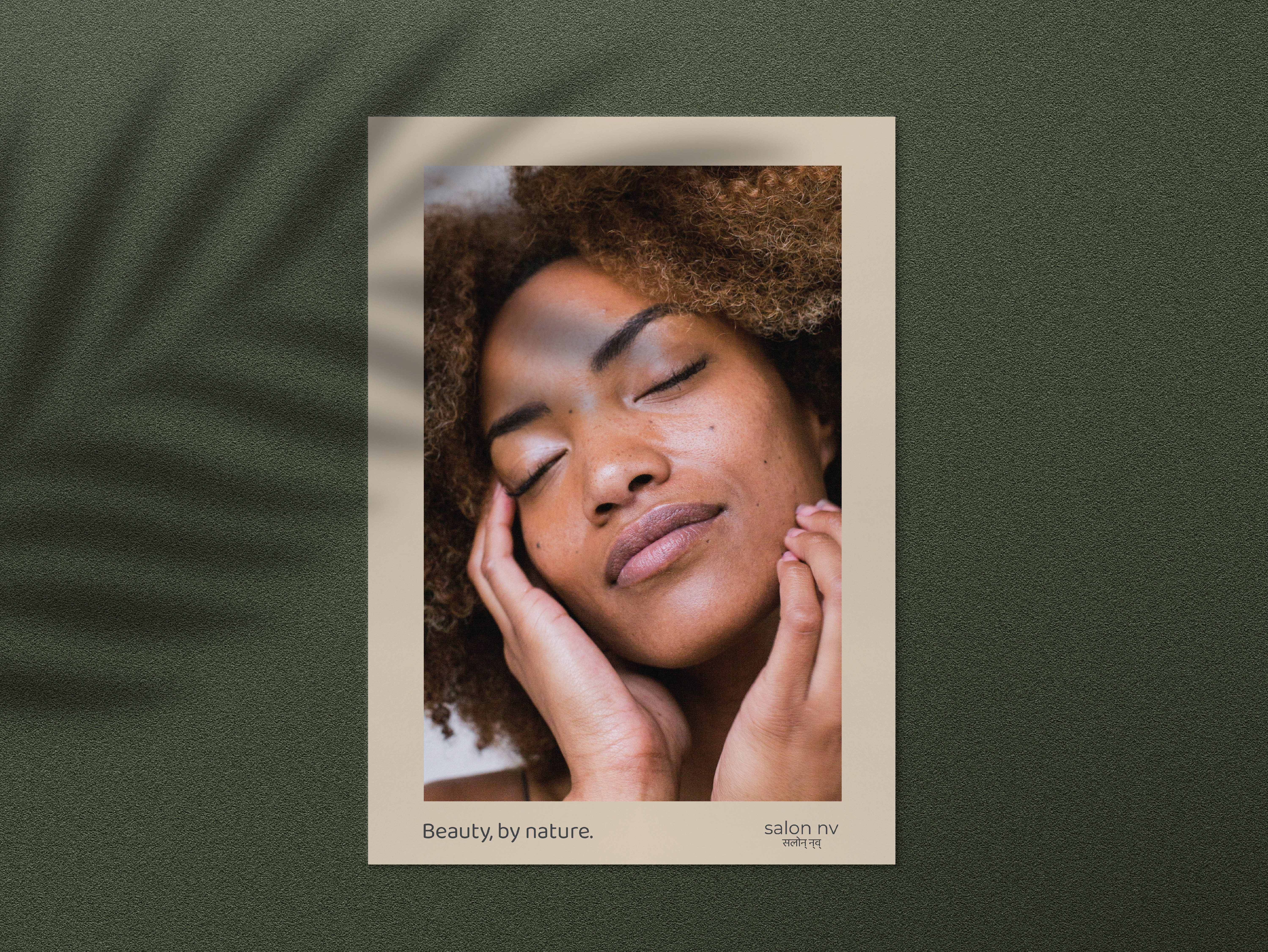
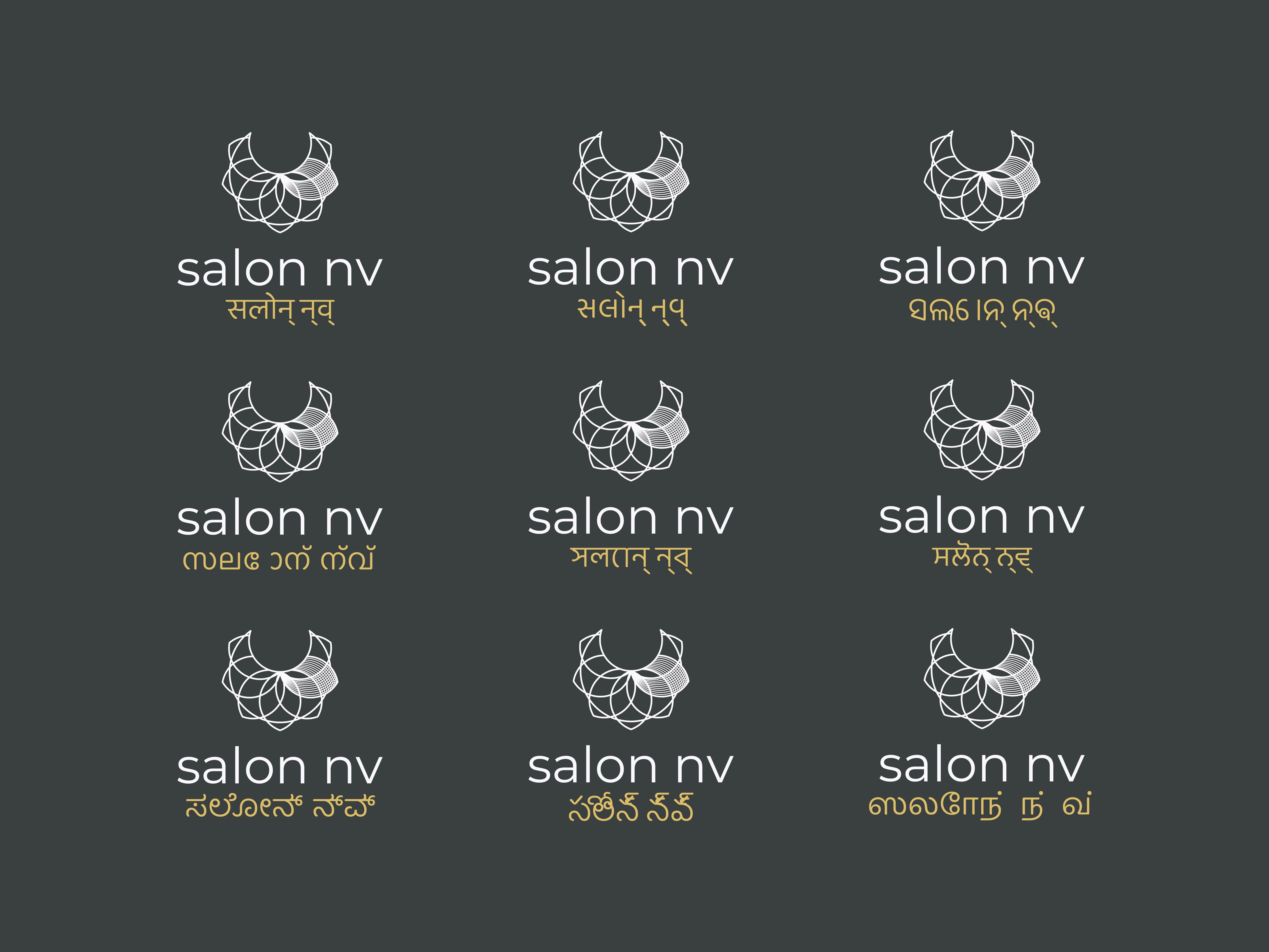
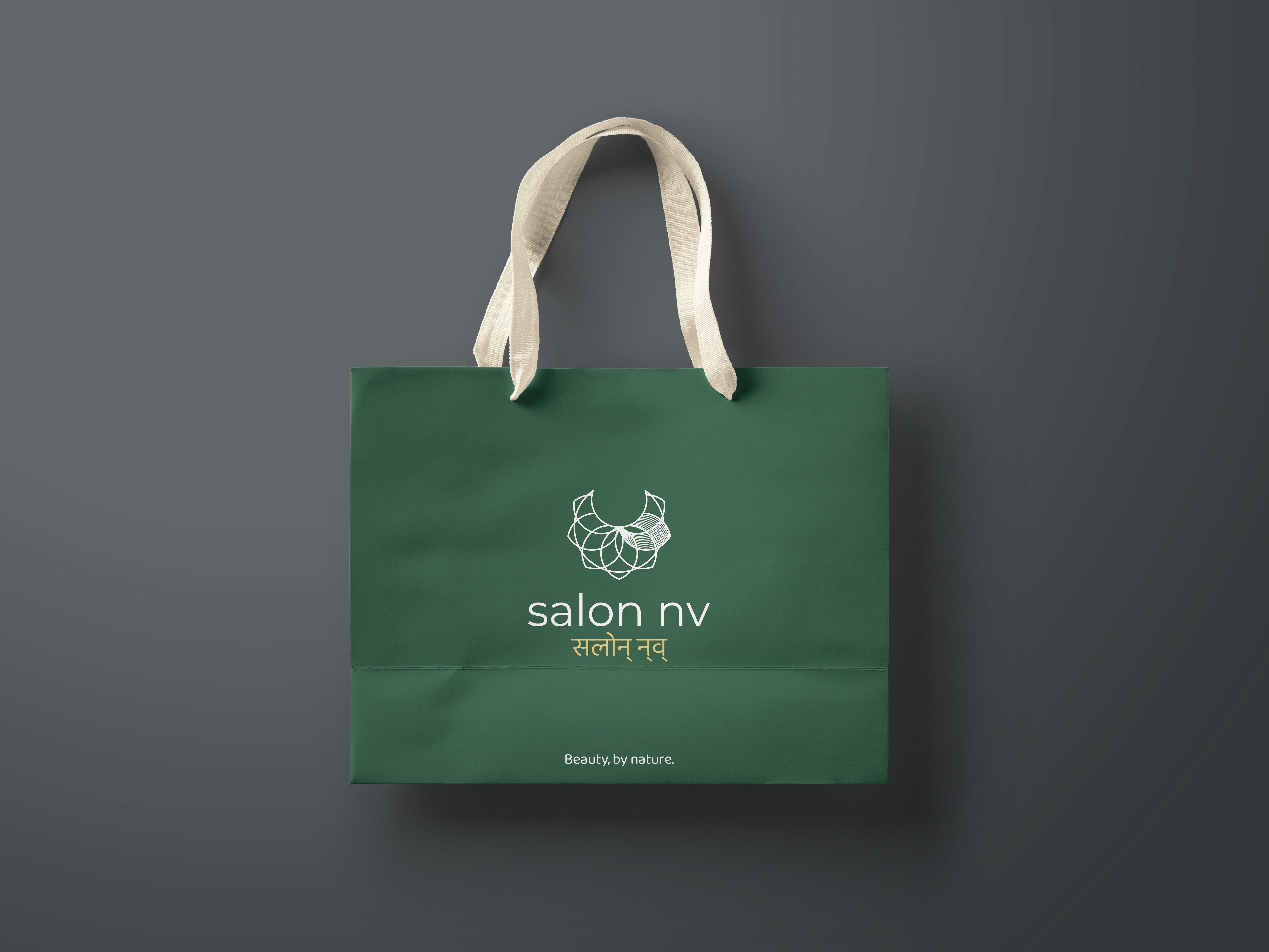
Logo & strapline for a sub-brand of Nova-Vida. The salon was founded to utilise Nova-Vida’s line of products (among others) to promote natural beauty and shed light upon the root cause of beauty obsession; envy. The logo remains familially connected to Nova-Vida whilst incorporating floral & jewllery elements to support the brand’s narrative. I developed the strapline “Beauty, by nature” to further strengthen this messaging.
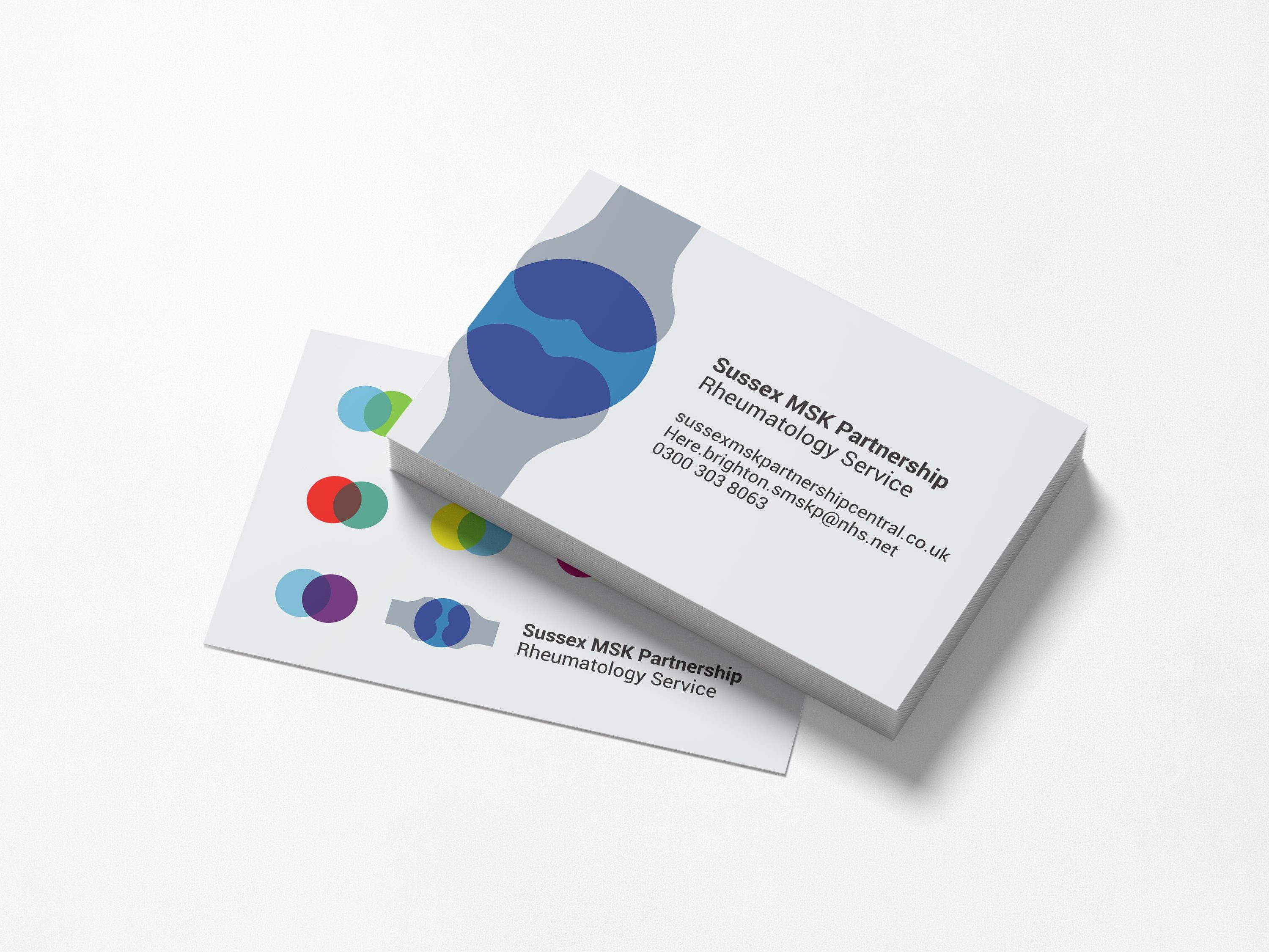
Brand identity for a healthcare organisation that needed to move away from traditional biomedical visuals & language to something more human, approachable, & accessible for patients. The identity also manifests their commitment to personalised care through interacting elements that create unique new elements when brought together (much like each clinician & patient interaction produces a uniquely tailored outcome).


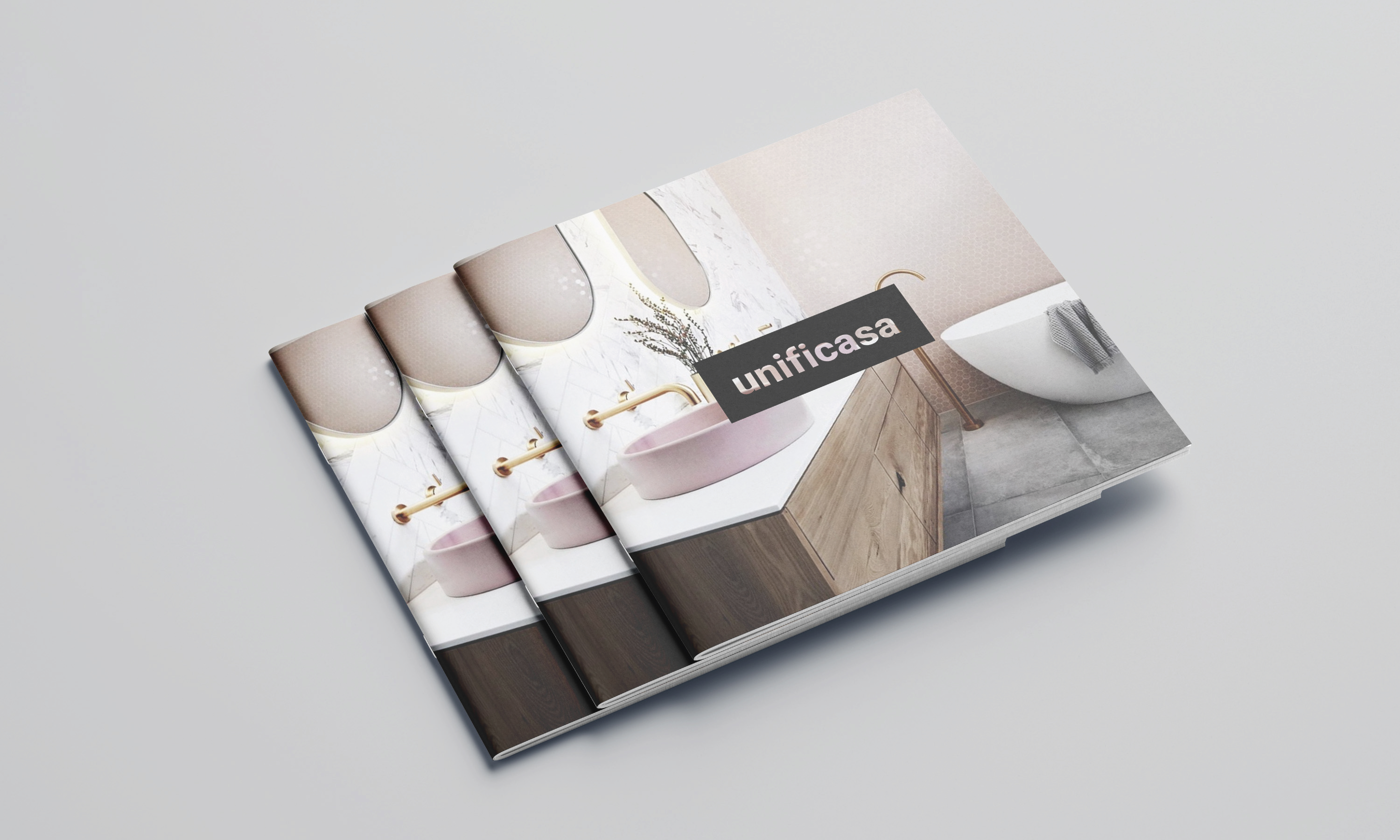
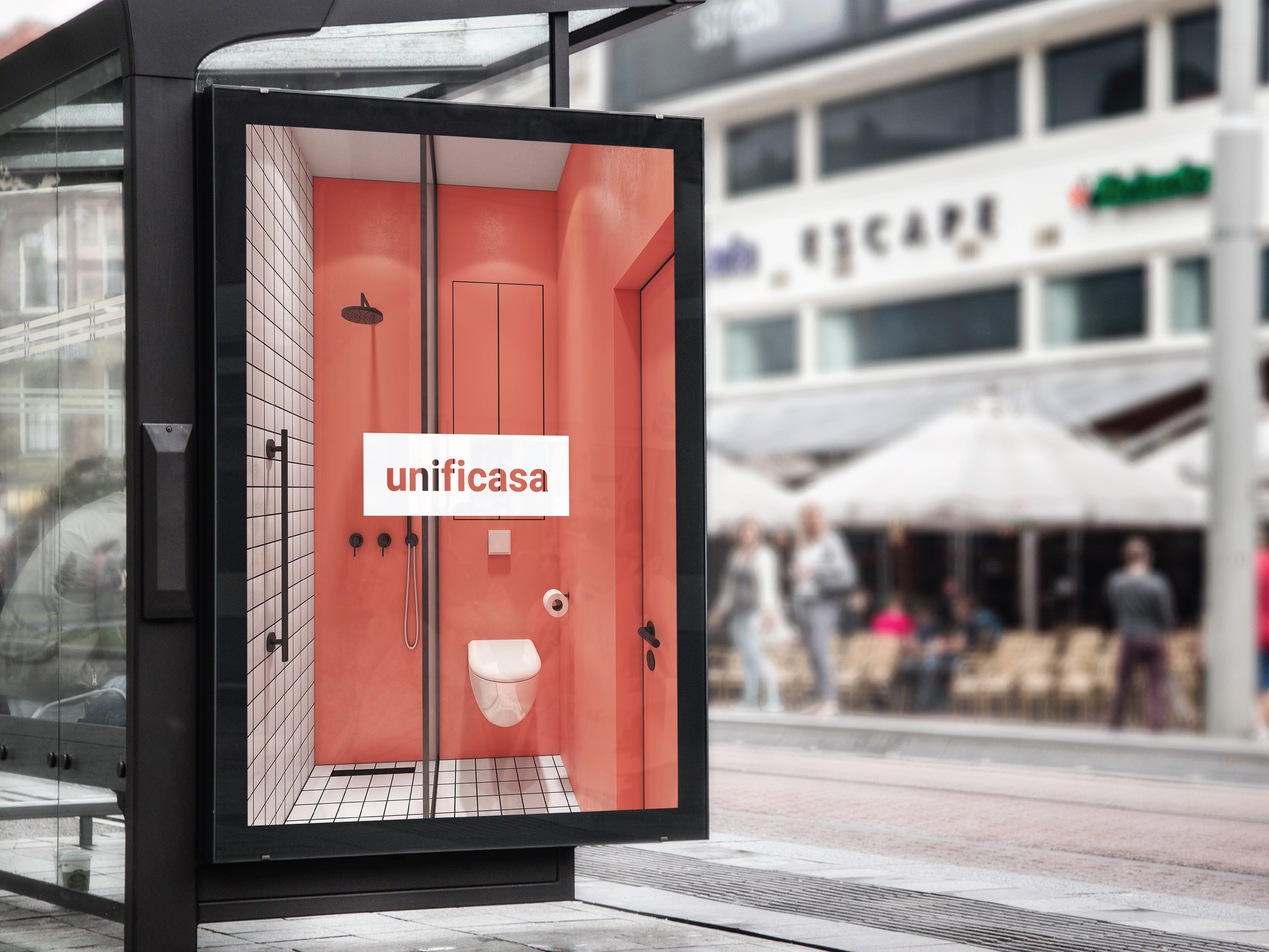
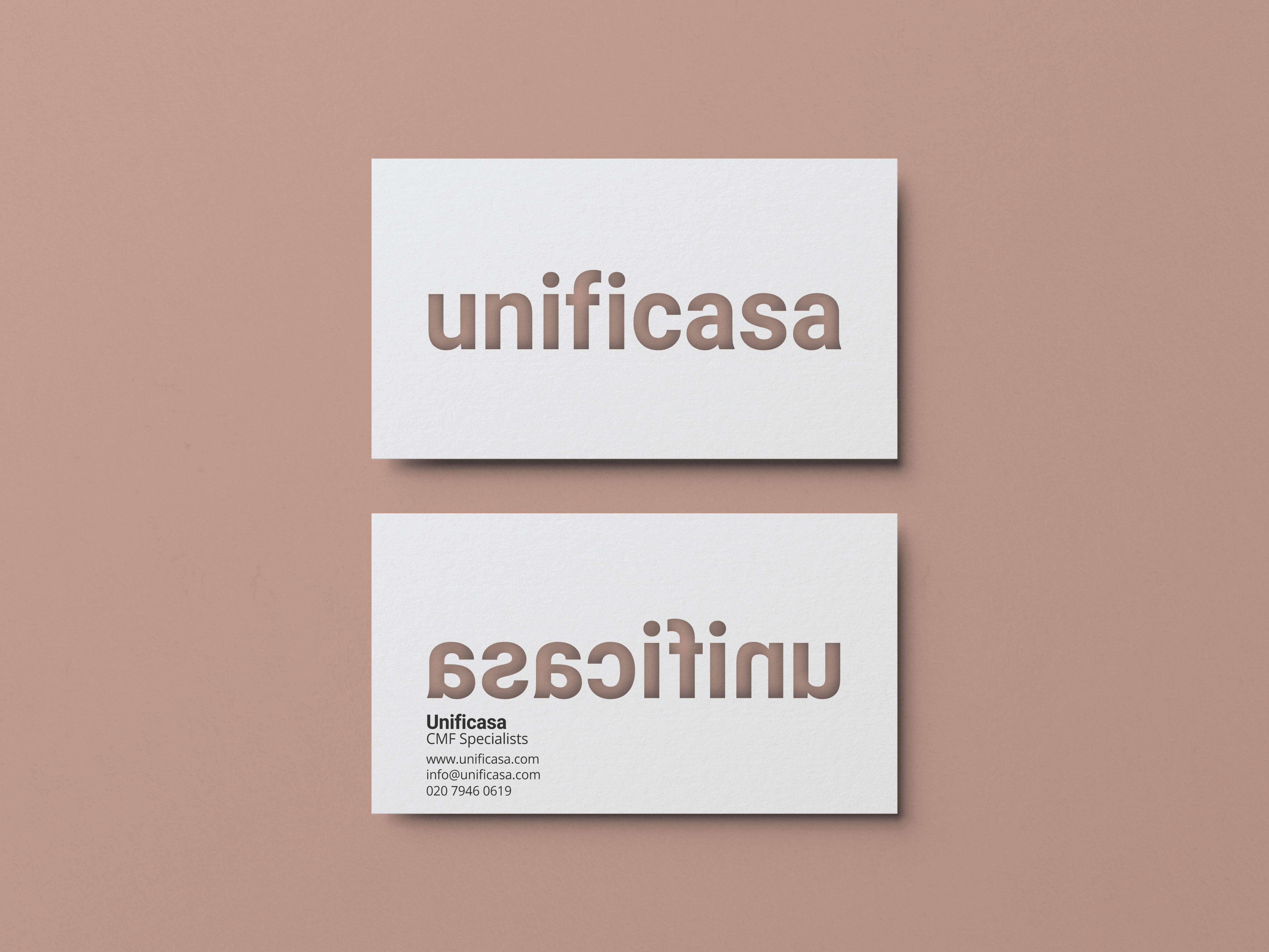
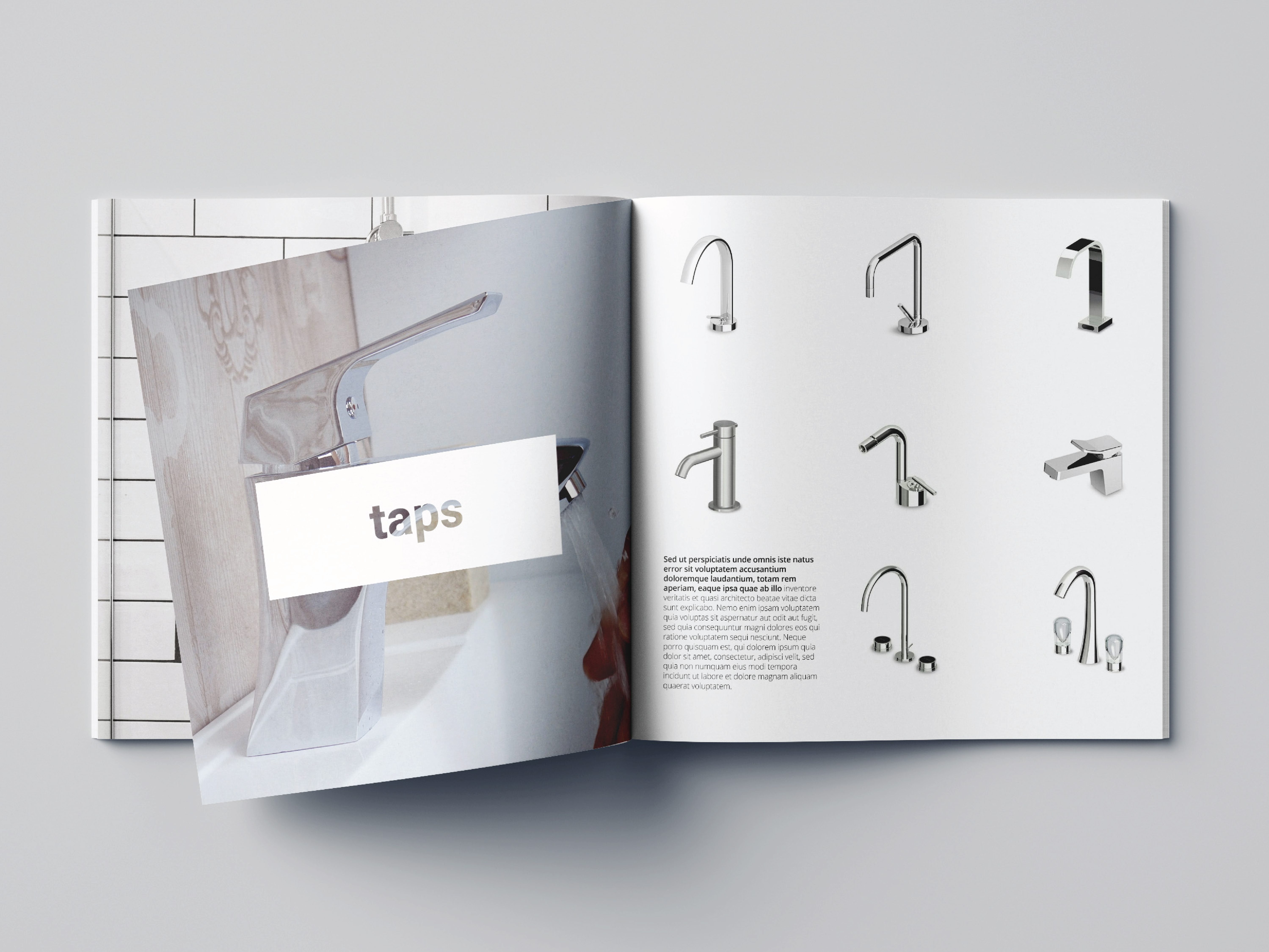
Naming & logo design for an Italian high end bathroom CMF (colour, material, finish) collaboration. They are uniquely able to procure and/or refinish any item in any colour allowing them to offer uniquely seamless bathrooms without the typical discrepencies in colour & finish.
The name is a portmanteau of ‘unificata’ (unified) and ‘casa’ (home), keeping the brand’s Italian base focal whilst playfully explaining their USP. The logo was designed as a partly transparent ‘sticker’ element that allows their bold, cohesive design environments to be highlighted through it. This also allows for playful applications on business cards and other peripherals.
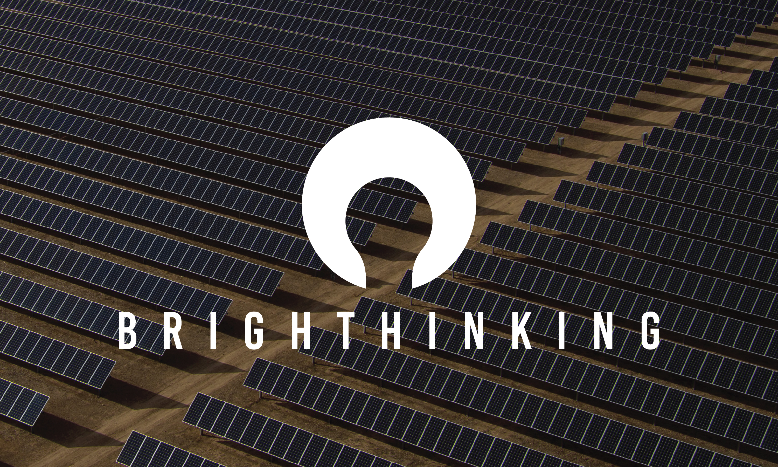
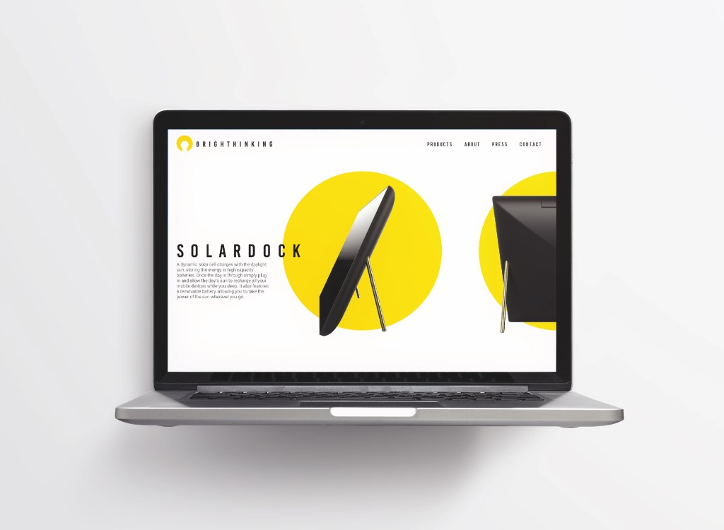
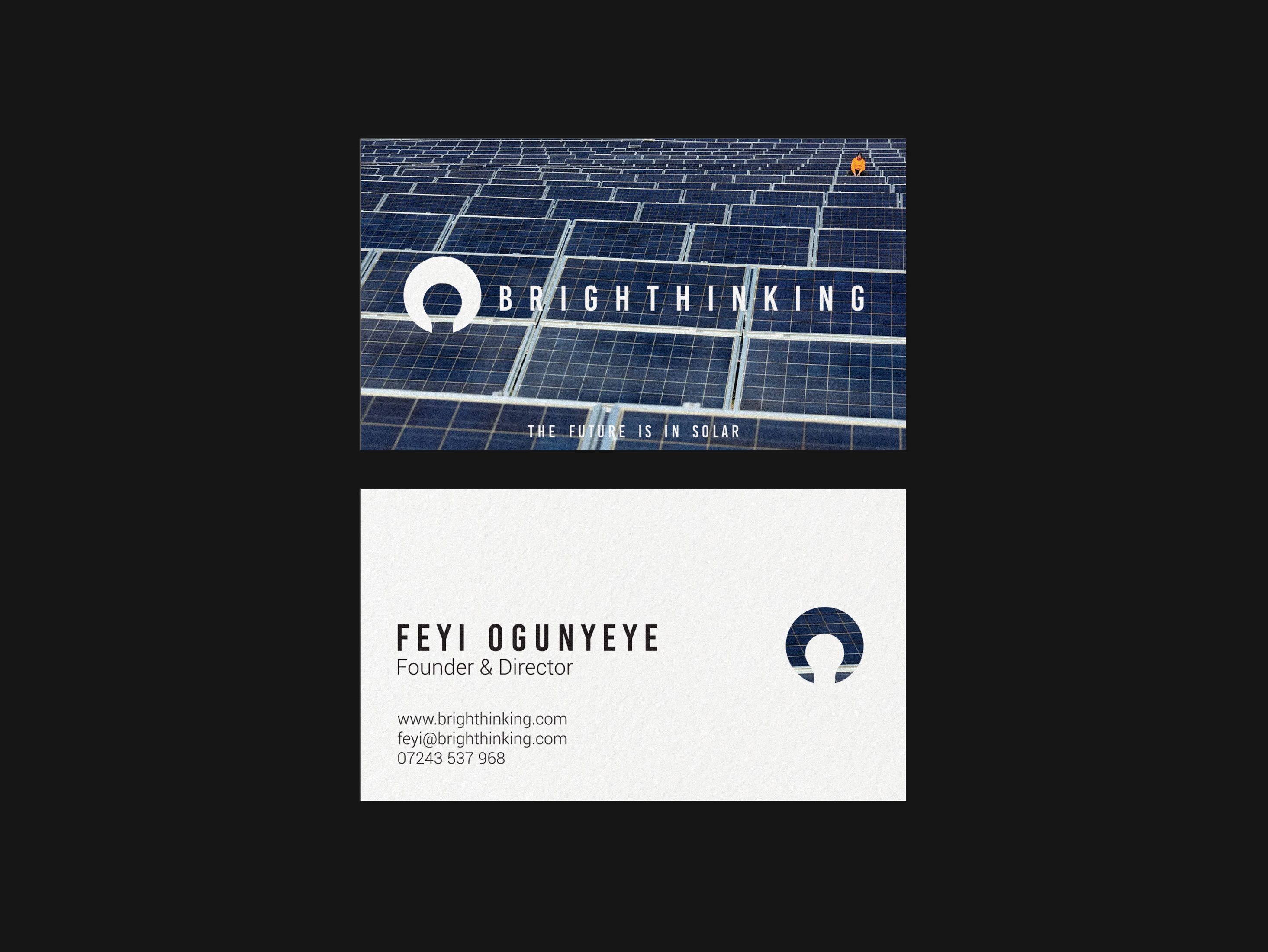
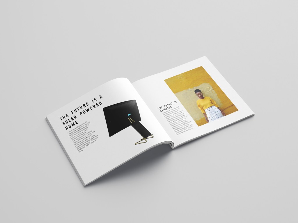
Logo development, strapline, and simple visual identity for an ecological technology products company. The company had been founded using a lightbulb sketch created by the founders young sister, they were keen to retain this concept but modernise it to sit comfortably within the modern technology market. Throughout our conversations a bold and bright future was regularly mentioned. These elements were incorporated through a flexible palette of golds and yellows, a bold cinematic font selection, and a repeated slogan: ‘the future is..‘
This project was featured at no.1 in DesignRush’s ‘Best Green Technology Branding Examples’.
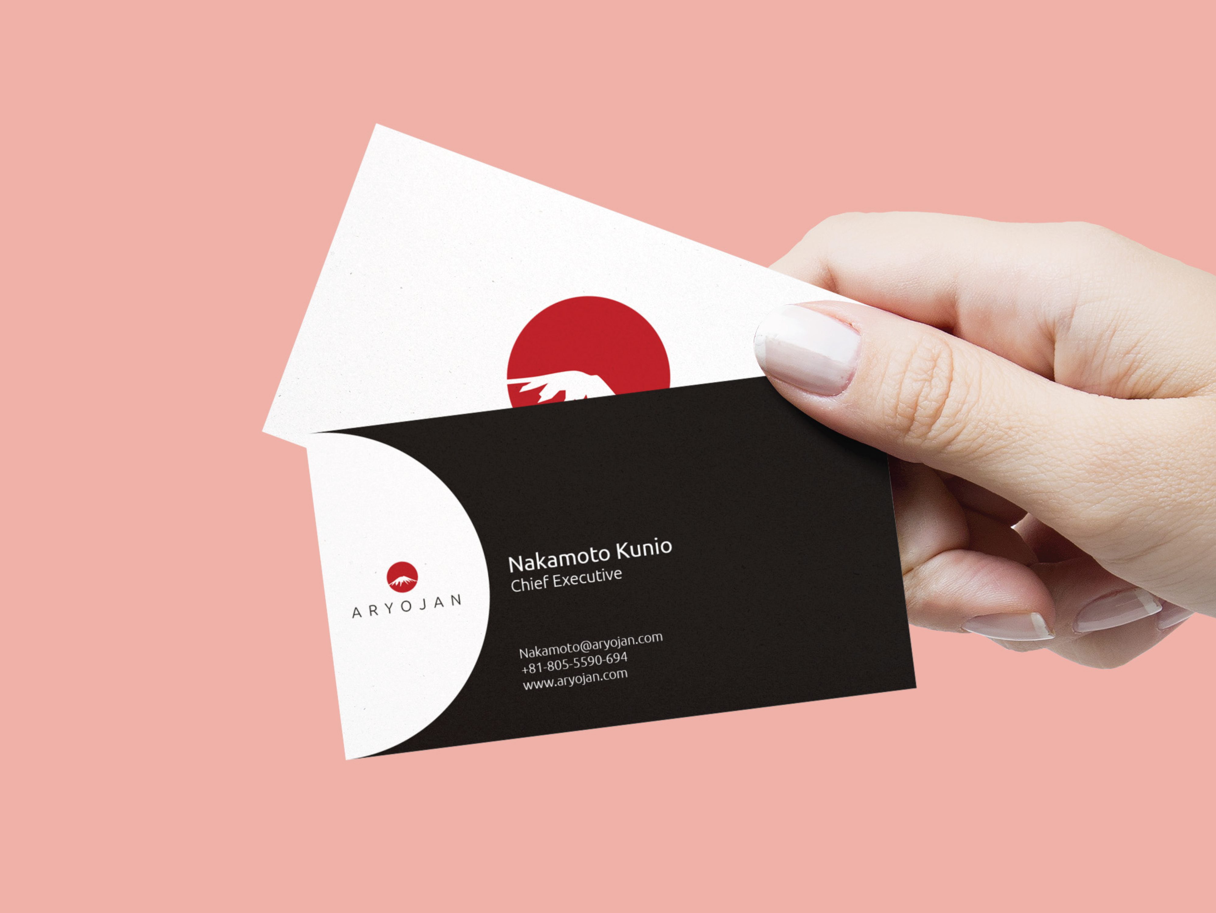
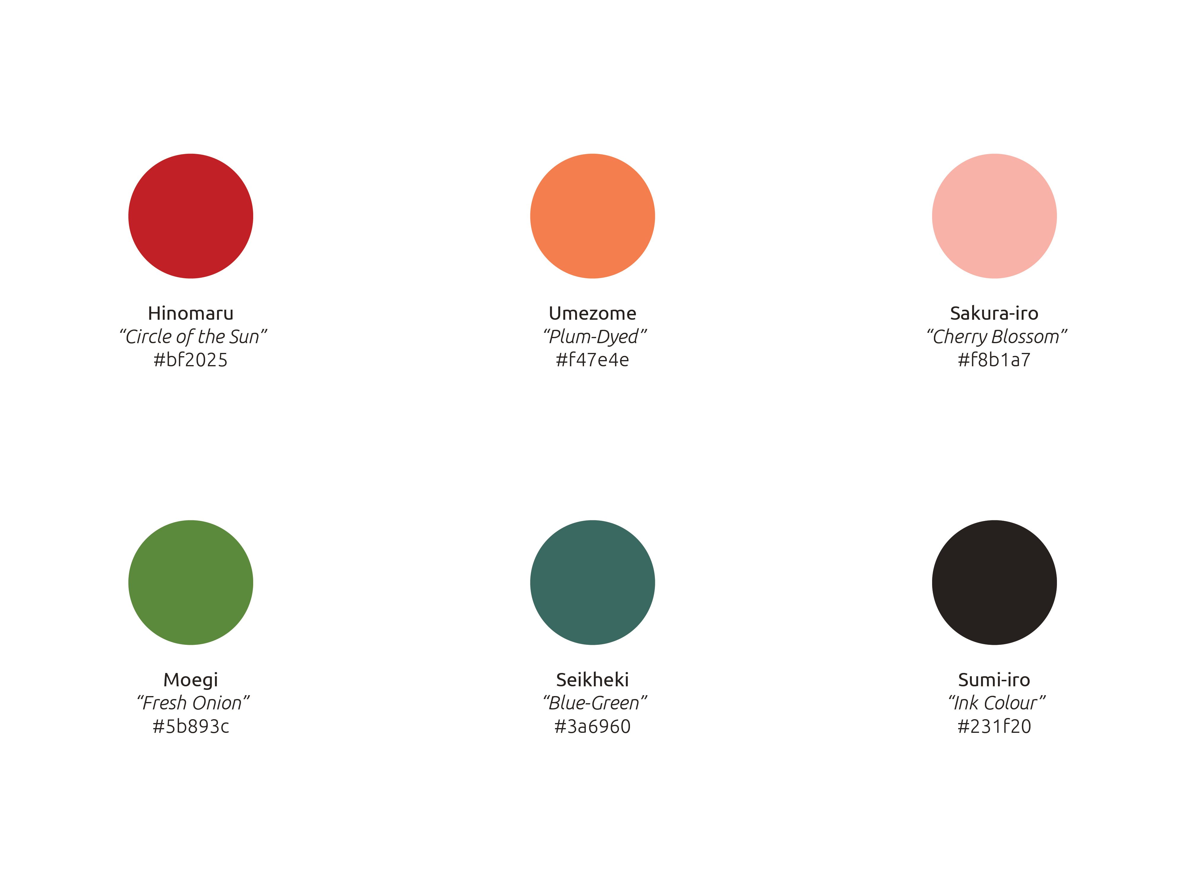
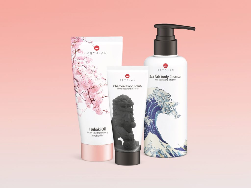
Logo & visual identity for a Japanese ‘medicated personal care & cosmetics brand’ looking to enter the Western market. By leaning heavily into Japanese cultural imagery, we developed a brand that would stand out on shelves, and appeal to those looking for more wisdom from their cosmetics.

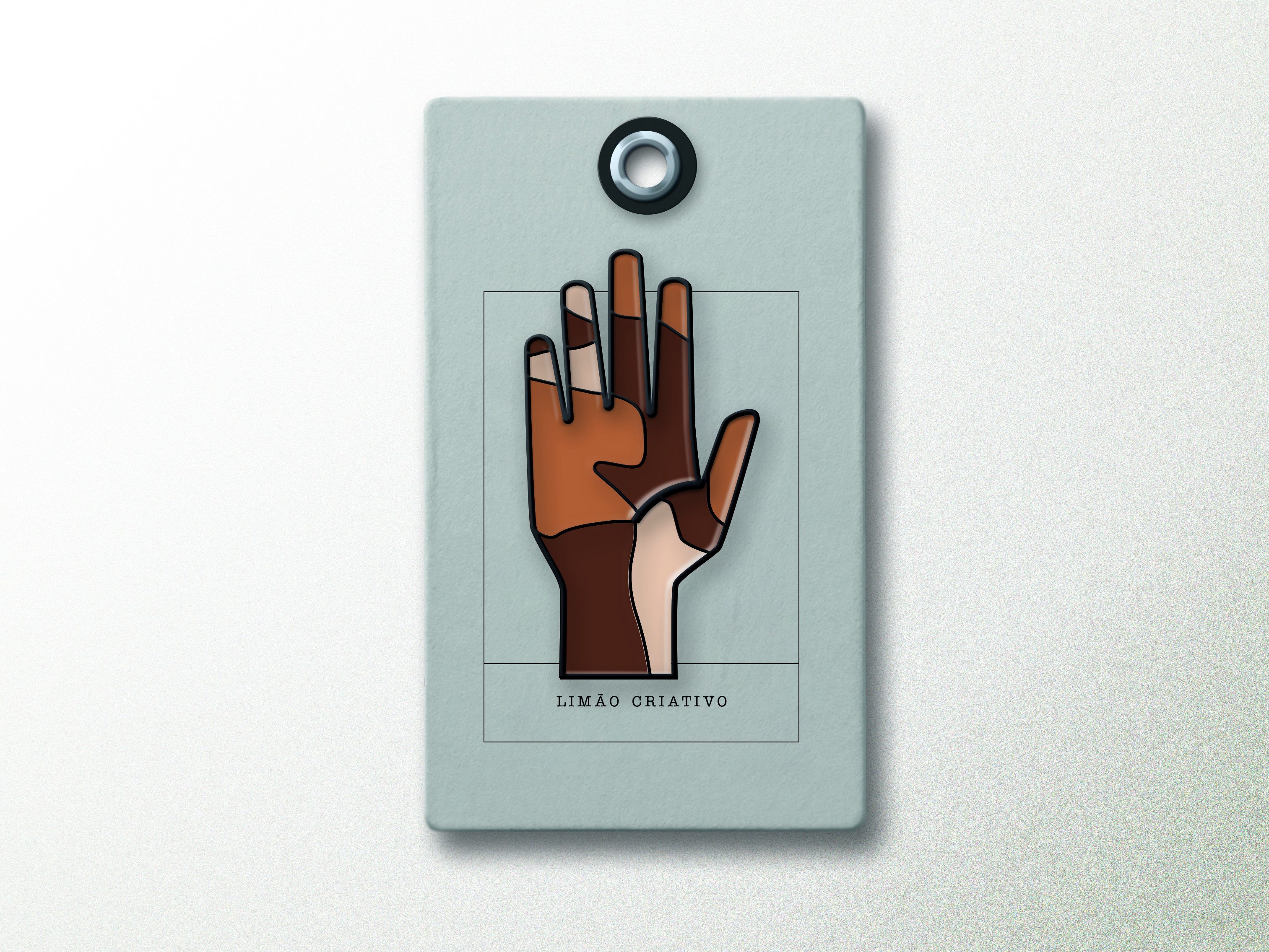
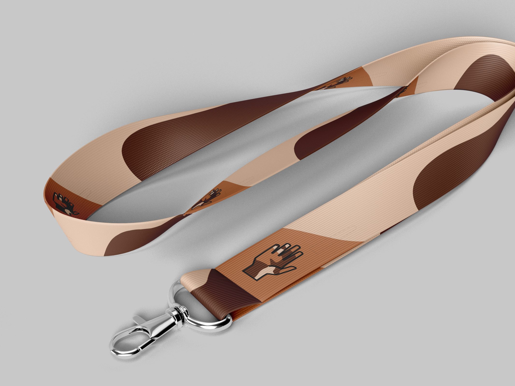
Logo design for a school ‘Culture Club’ that champions diversity & inclusion. A competition was held for students to create artwork for the Culture Club with the winning submission featuring overlapping hands of various races. As someone known to the school, I was approached to convert this artwork into a logo that could be used by the club and worn by students & staff as a pin badge and/or lanyard.