CONTEXT
Maker Coating Systems specialise in the specification & supply of high performance industrial paint & maintenance products to mostly professional clients. They supply materials to contracters, builders, painters & decorators, maintenance crews, the MoD, & Royal Navy (to name a few).
As the leading independent supplier in the UK, Maker Coatings had estabished a strong reputation & core customer base over their 40 years of business. However, the owner was aware the business could do more and wanted to expand their customer base & improve brand awareness.
Whilst a single logo had been consistently used (and appropriately modernised a few years previously), surrounding brand assets lacked appropriate market positioning and were unstructured & inconsistent in their application.
STRATEGY
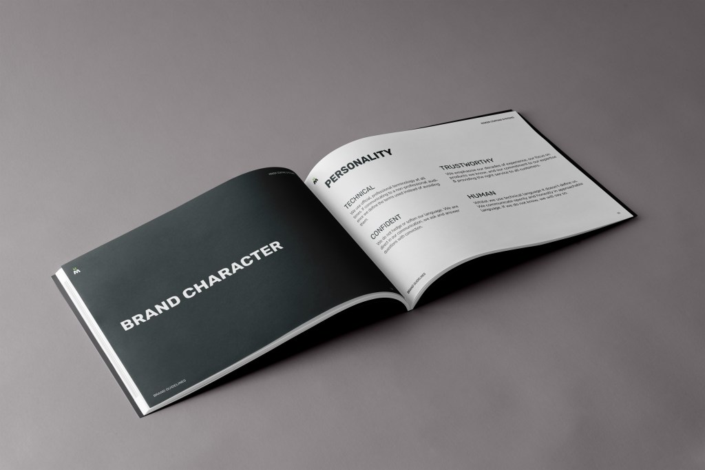
Interviews with the owner & discussions amongst the team lead to the realisation of a unique value proposition based on 4 strands:
Expertise – “We have 40 years of experience providing advice & support to professionals & non-professionals. We provide our expertise at no additional cost with no requirement of purchase.”
Knowledge – “We only stock what we know, we will not sell a product that we do not know in detail. We support our clients before, during, and after sales.”
Liability – “We hold all risk & liability for our specification selection, we are confident in our accuracy & hold full liability insurance for this.”
Trust – “Once people buy from us they come back to us. The vast majority of our business comes from returning clients because they trust us to do right by them.”
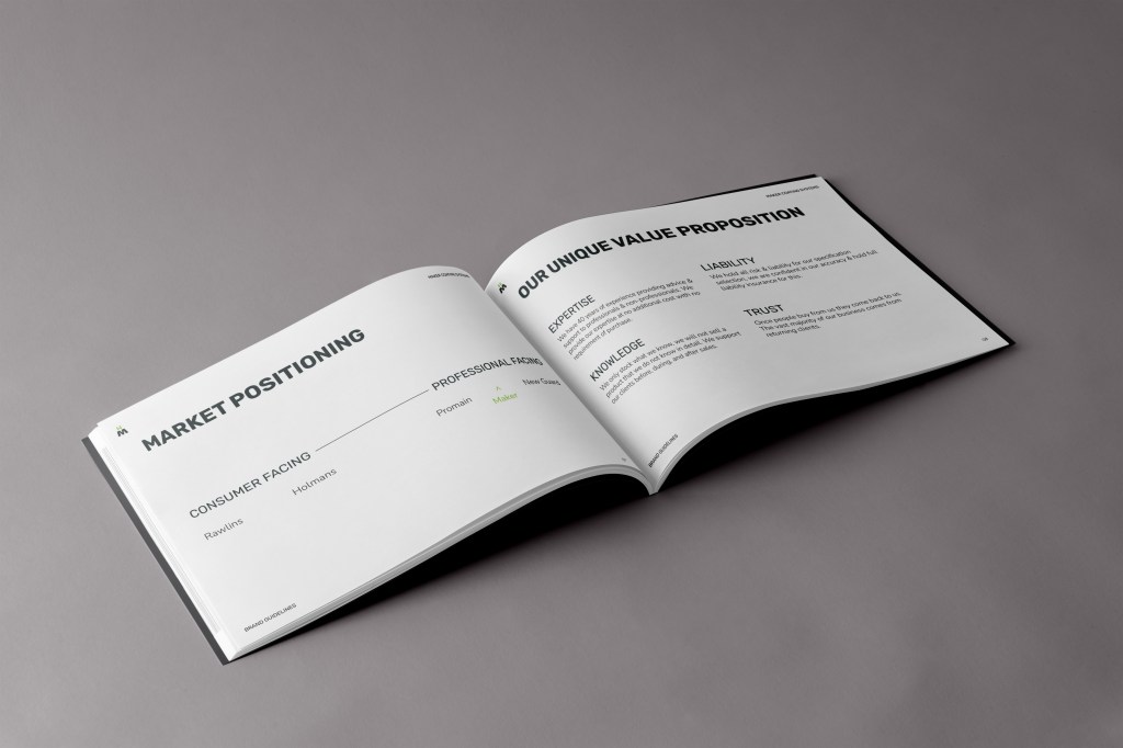
It was vital that the identity project these values whilst also differentiating Maker from its competitors visually & tonally. Working within such a niche sector meant working from very limited brand interactions (possibly limited to a single experience/product across multiple years), making boldness & memorability even more important.
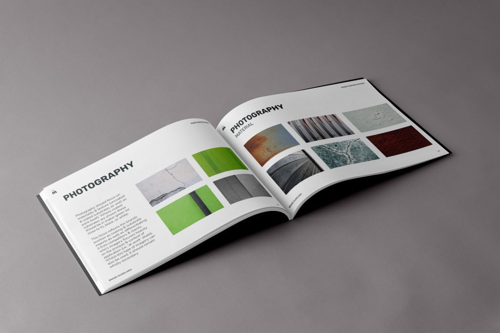
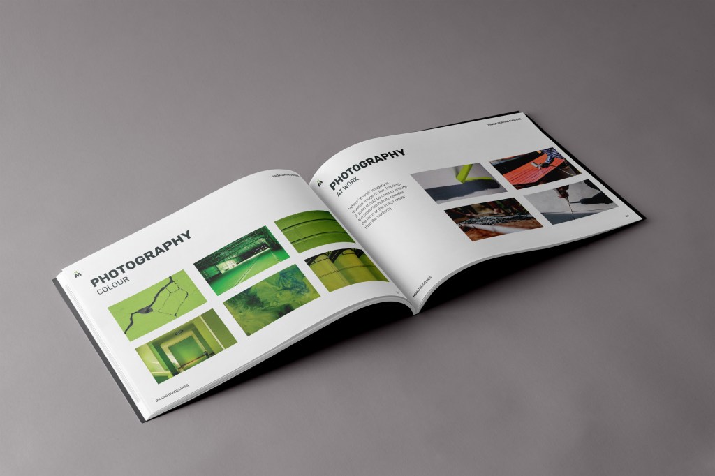
Competitor analysis established consistent use of ‘at work’ imagery (i.e. professionals using the products), however, this fails to differentiate those who specialised in the substrates & coatings from those who specialised in their application. Focusing Maker’s imagery on materiality & texture allowed the brand to clearly represent their area of expertise & strongly differentiate themselves from everyone else in the market.
SCOPE
Visual Identity
Brand Identity
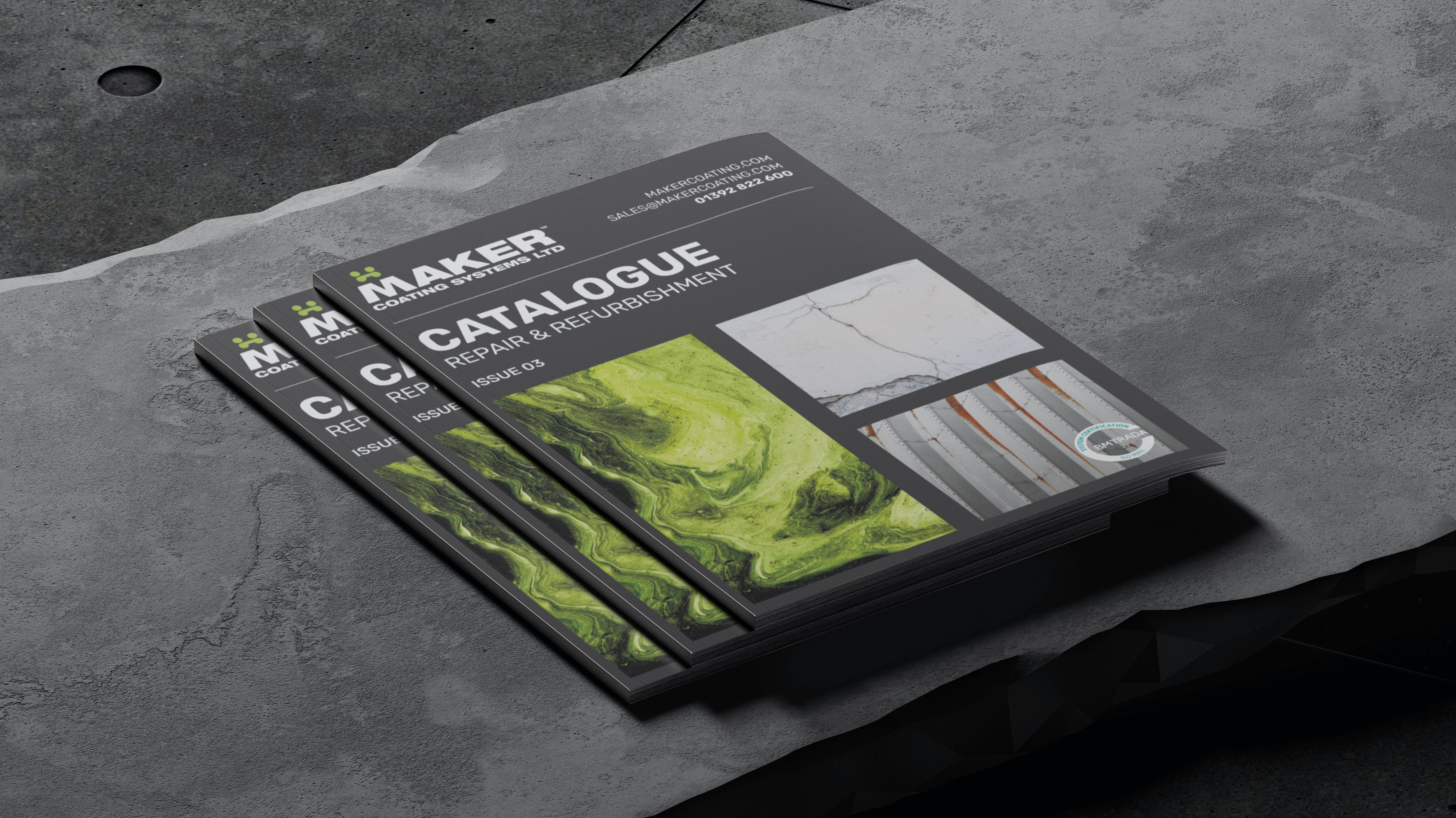
Packaging/Labels
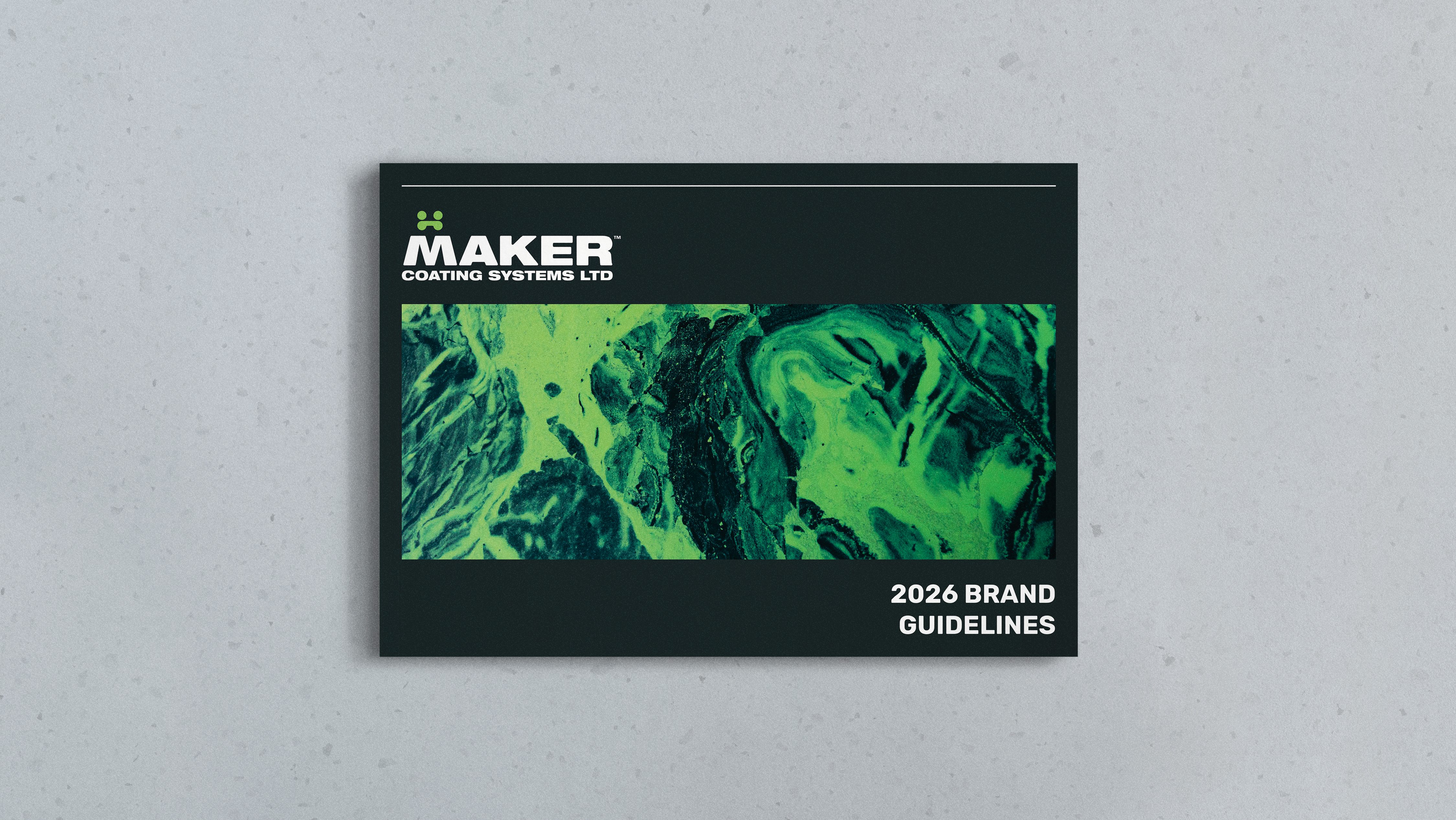
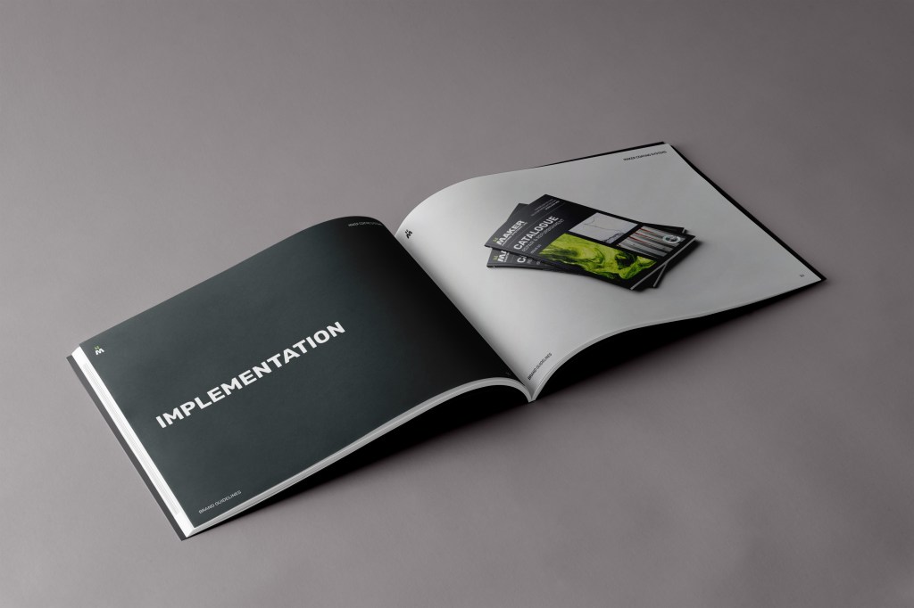
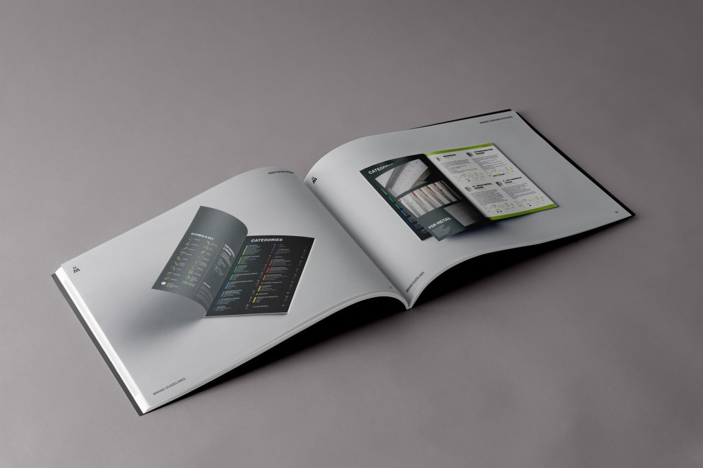
Brand Guidelines
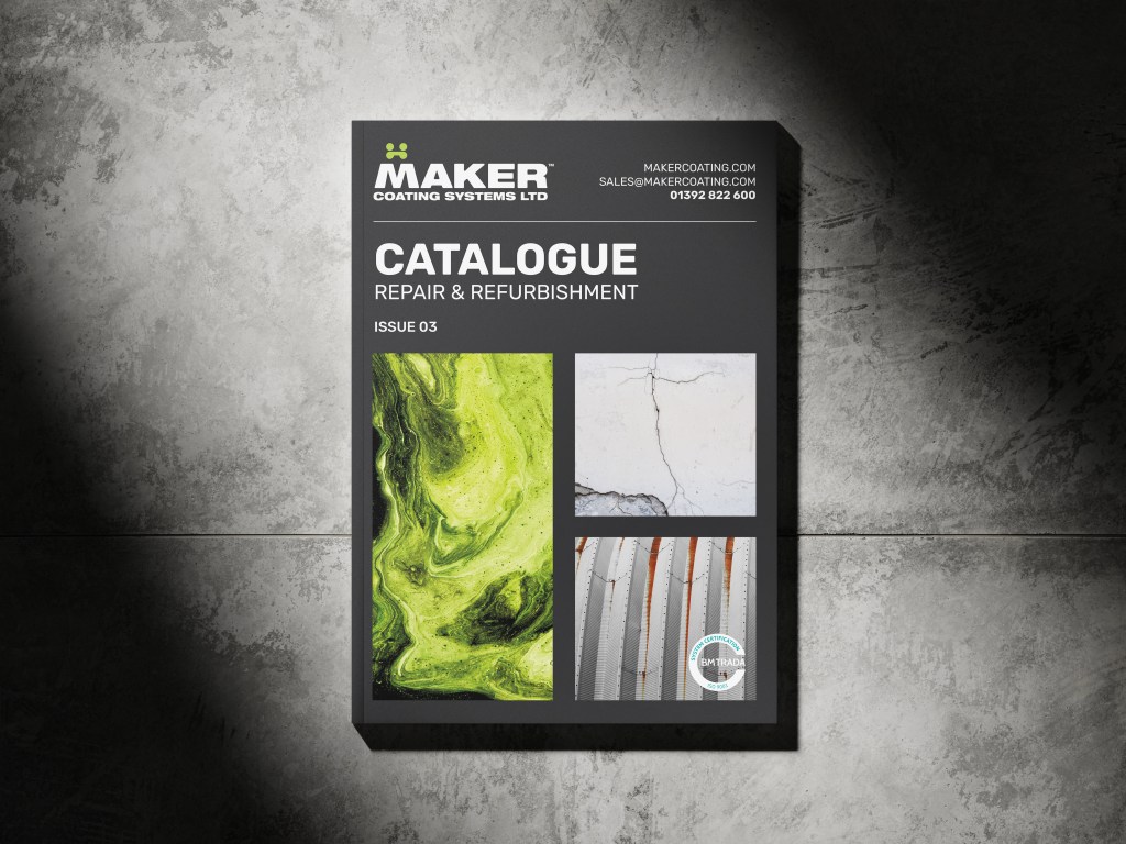
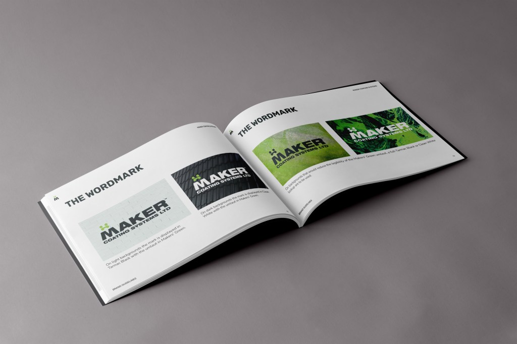
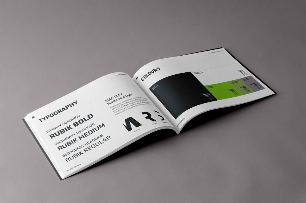
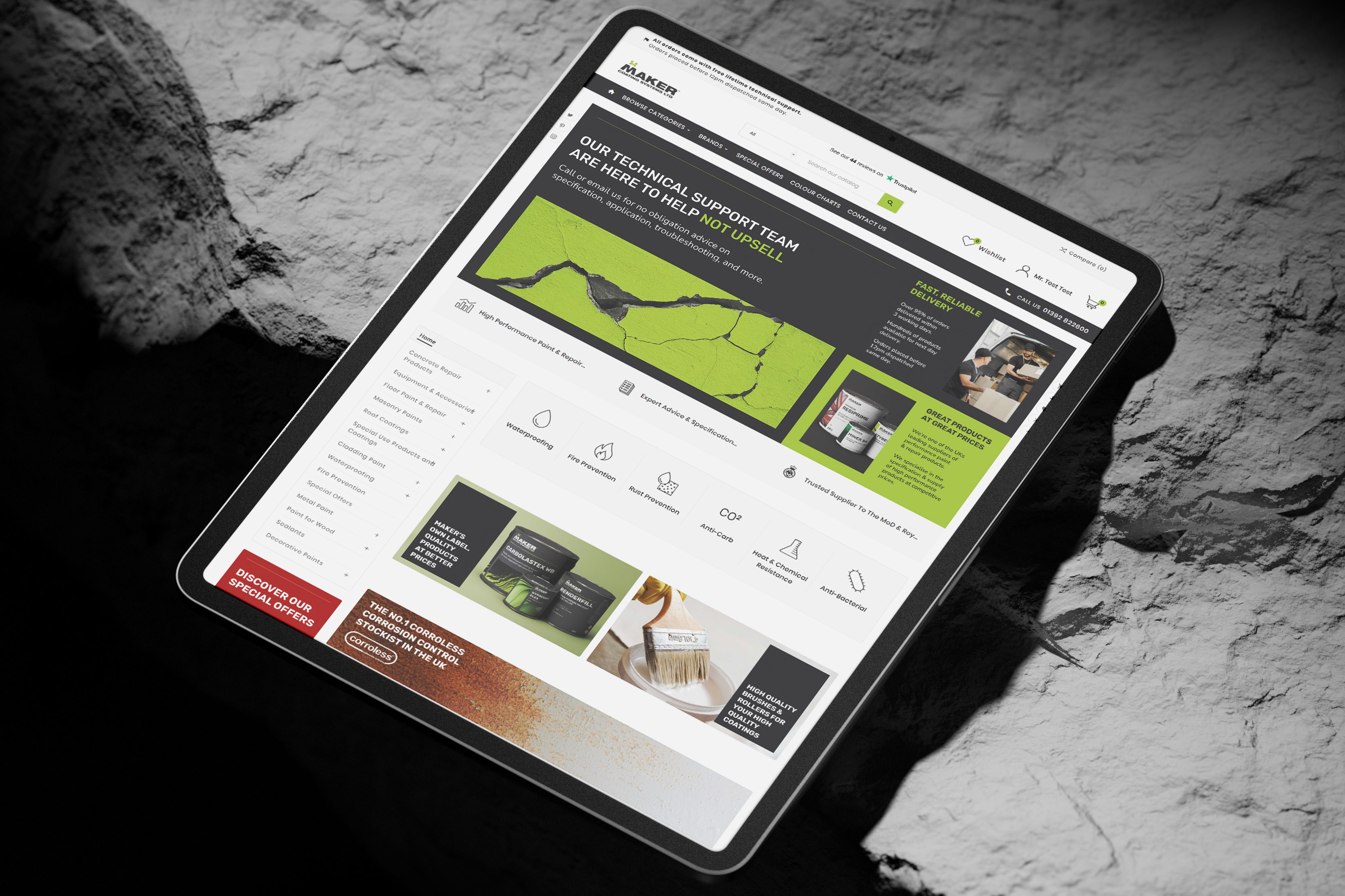
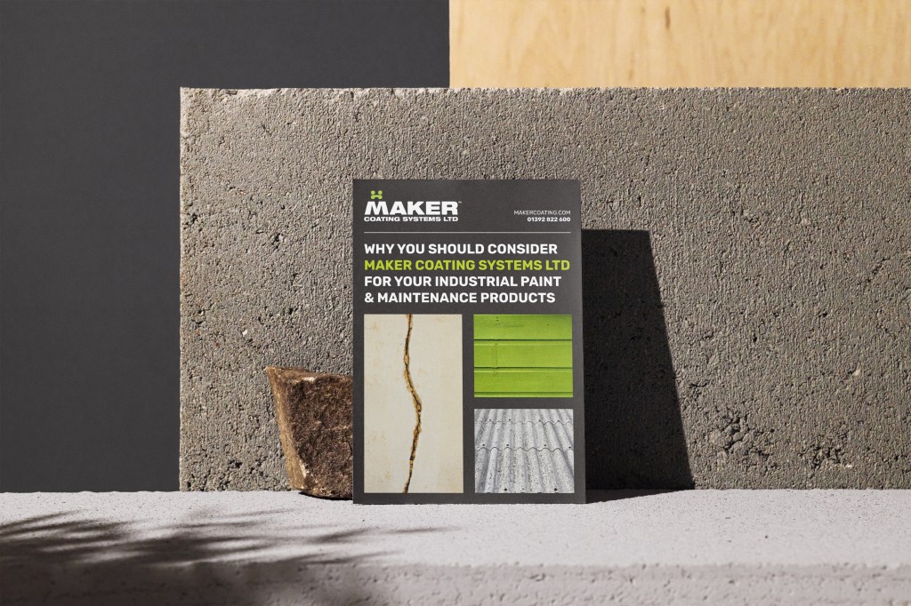
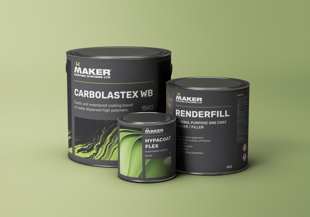
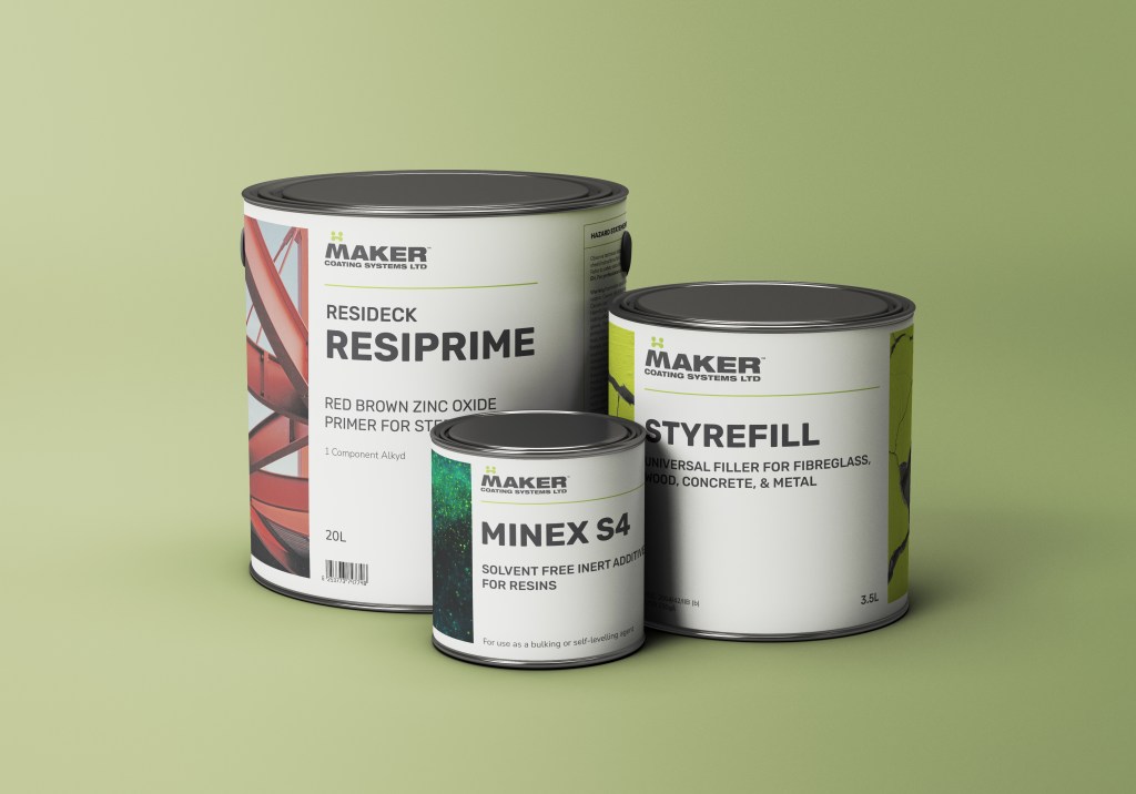
A clean industrial colour palette was developed to solidify Maker Coatings as a technical, premium brand (moving away from overuse of the Maker Green which was cheapening the brand).
The typography selection follows industry norms (caps sans-serif) but with a typeface that referencing the softer letterforms of the logo & more approachable service Maker offers.
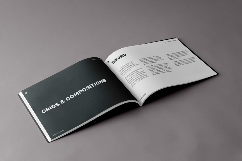
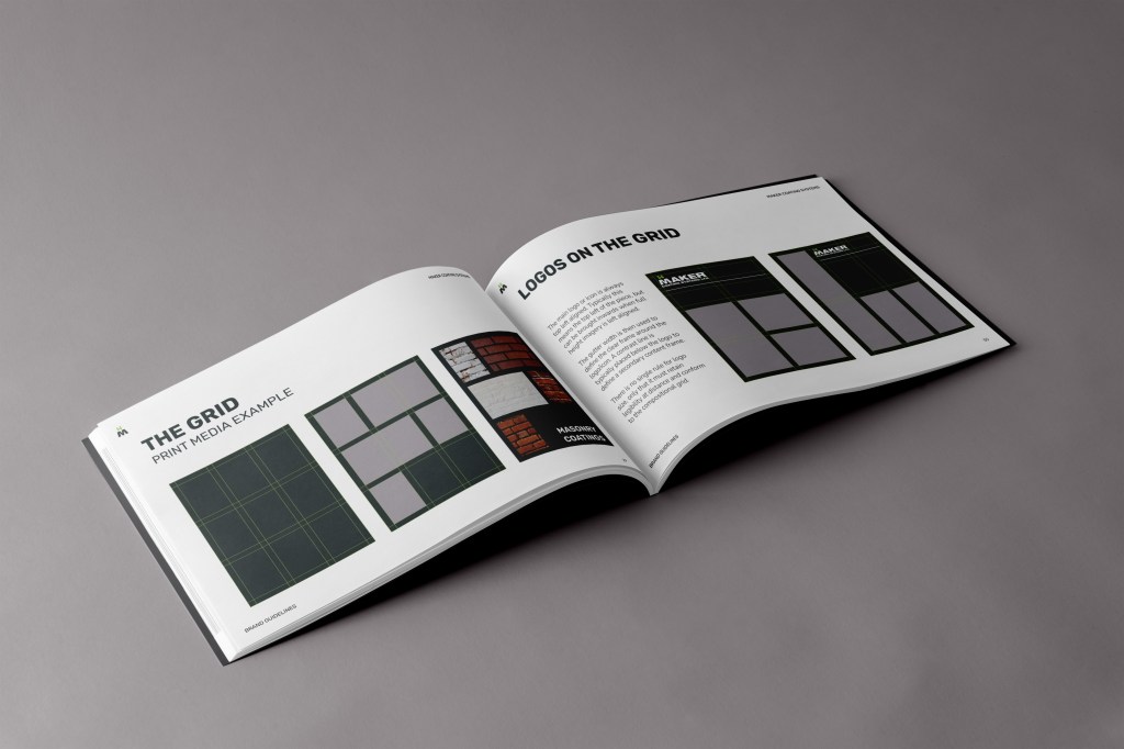
Rigid compositional grids ensure a technical, mathematical feel whilst also referencing brick & tile layouts to further enforce the companies sector.
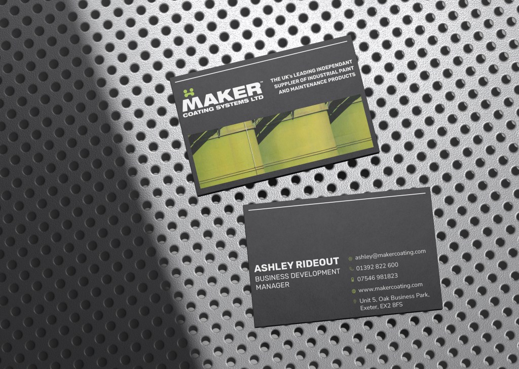
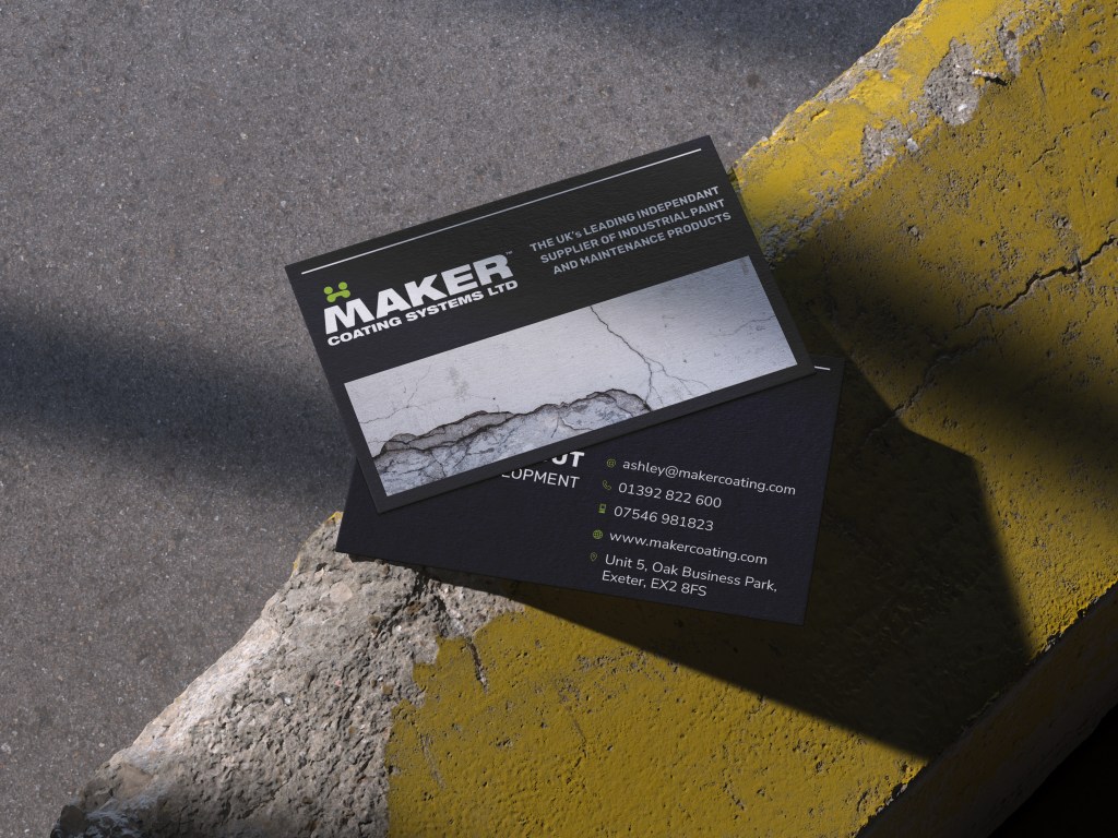
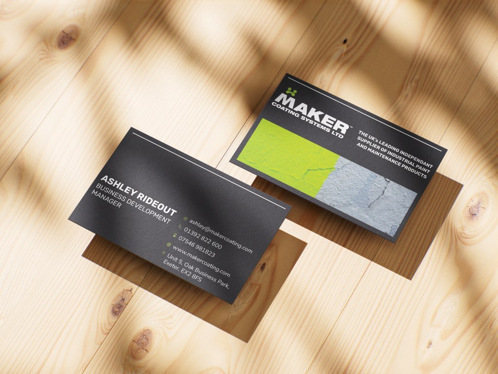
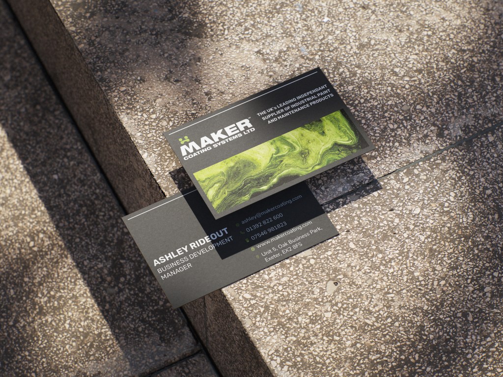
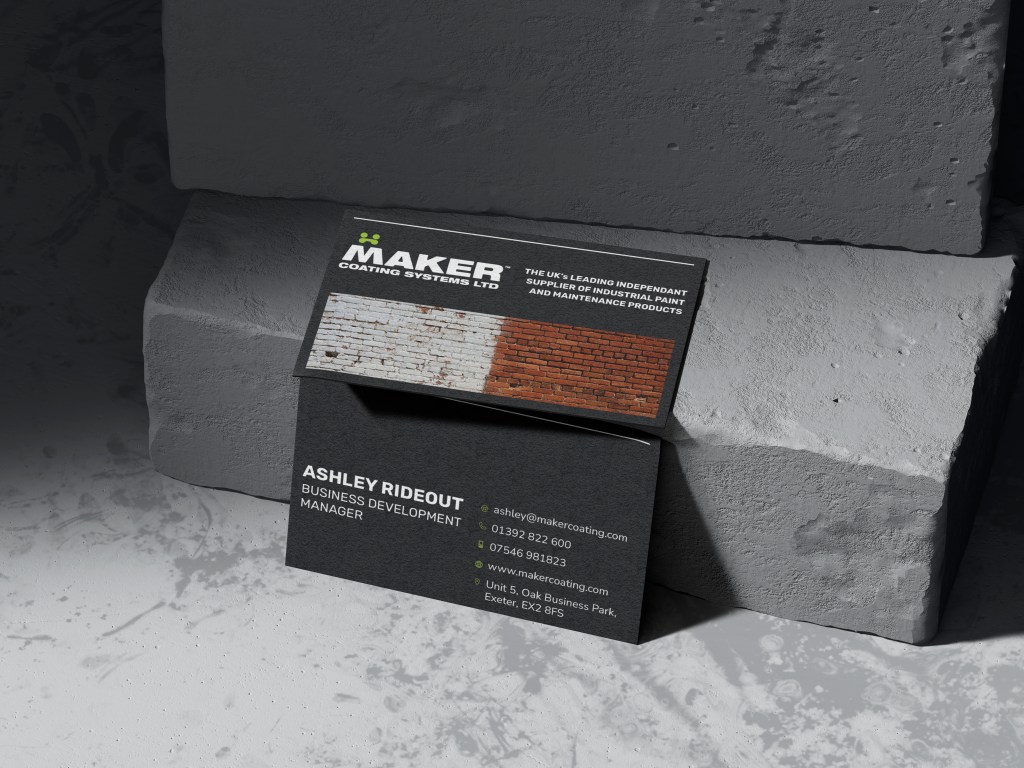
In their business cards, an opportunity was recognised to create a design that could prominently feature industry/substrate specific imagery, allowing sales staff to tailor the card given to the potential client’s industry whilst also showcasing Maker’s breadth of expertise.
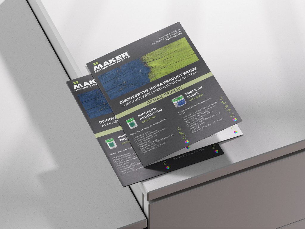
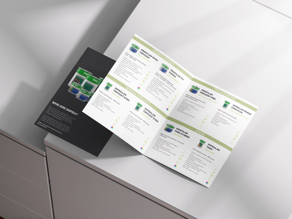
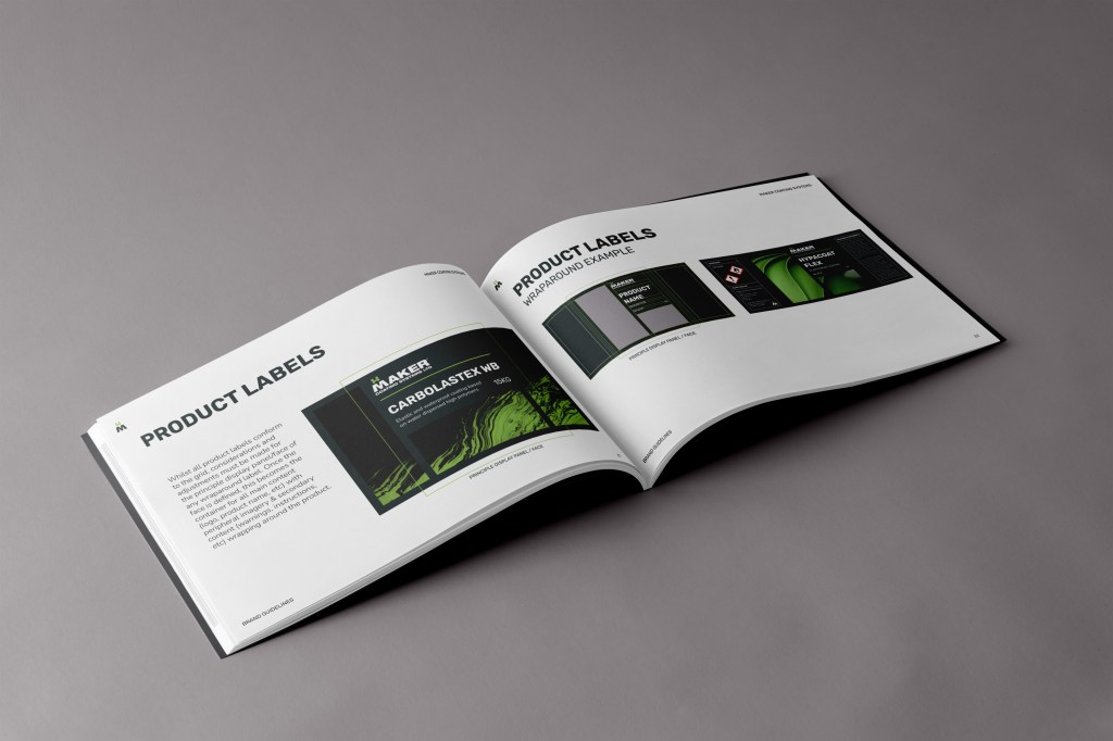
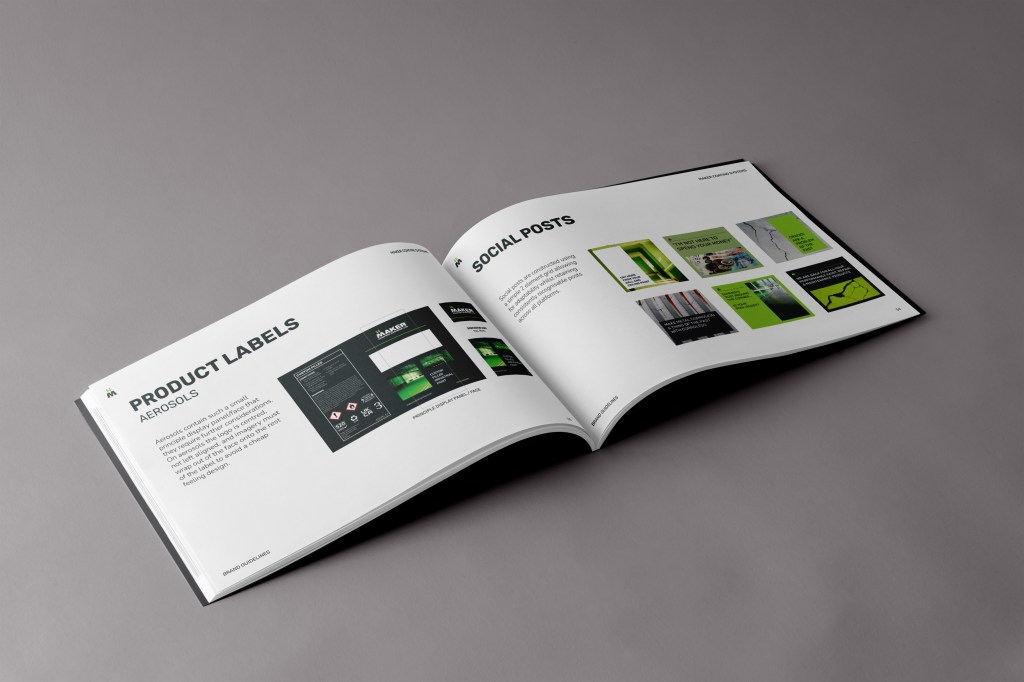
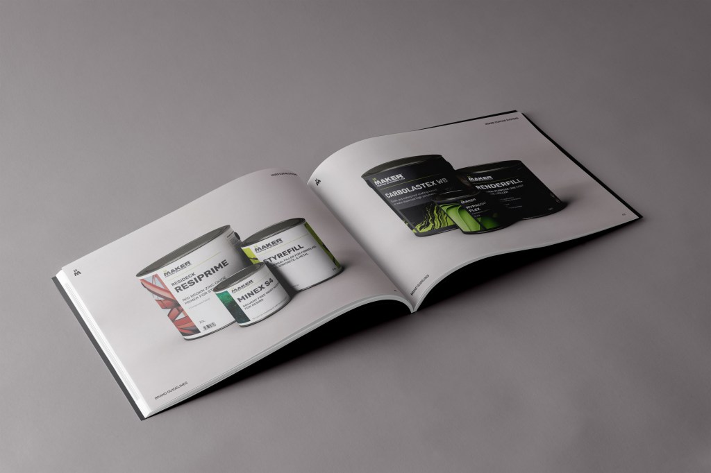
Maker’s sell a number of own brand products who’s labels needed to follow the new brand whilst also bridging the aesthetic expectations of their diverse market which ranges from industrial professionals to DIY consumers.
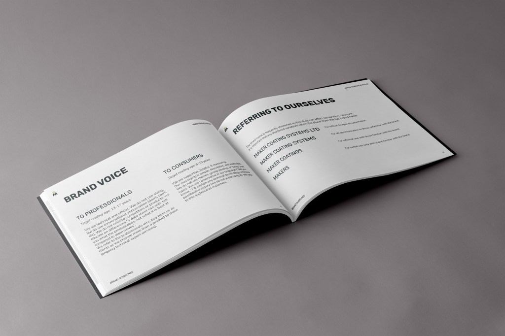
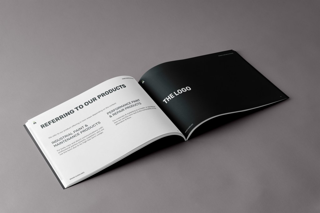
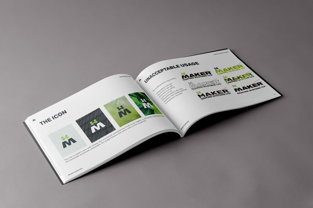
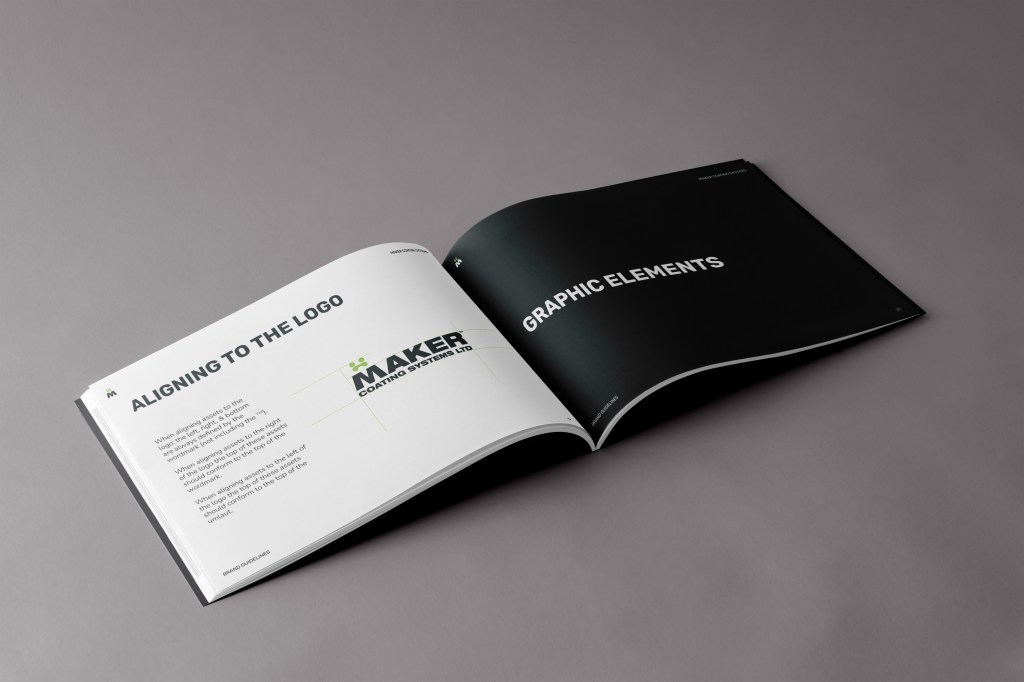
Full brand guidelines were developed (including brand voice & specific language) to solidify the Maker brand across various touch-points & staff and ensure consistent presentation.