CONTEXT
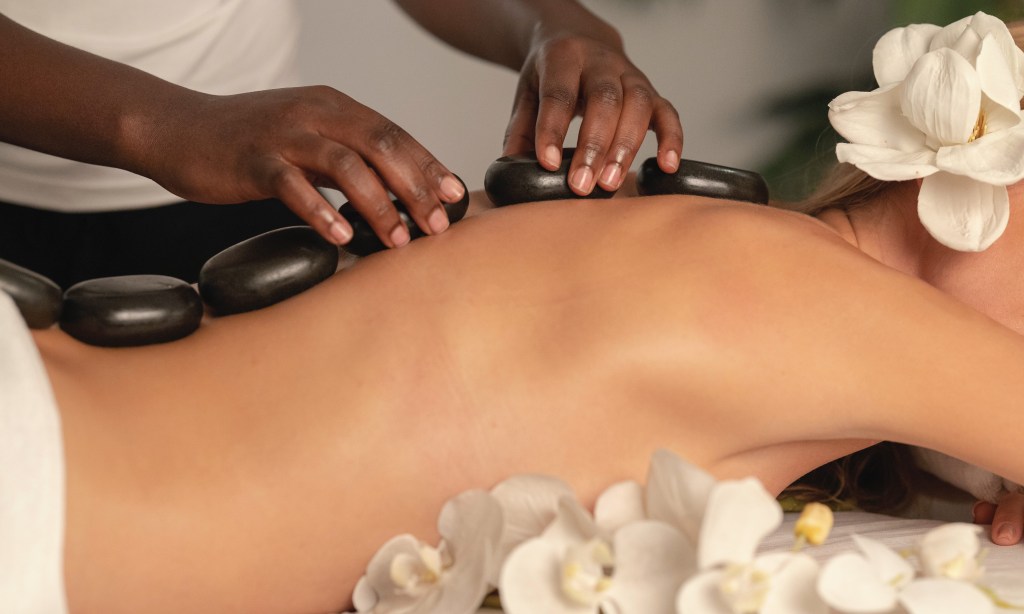
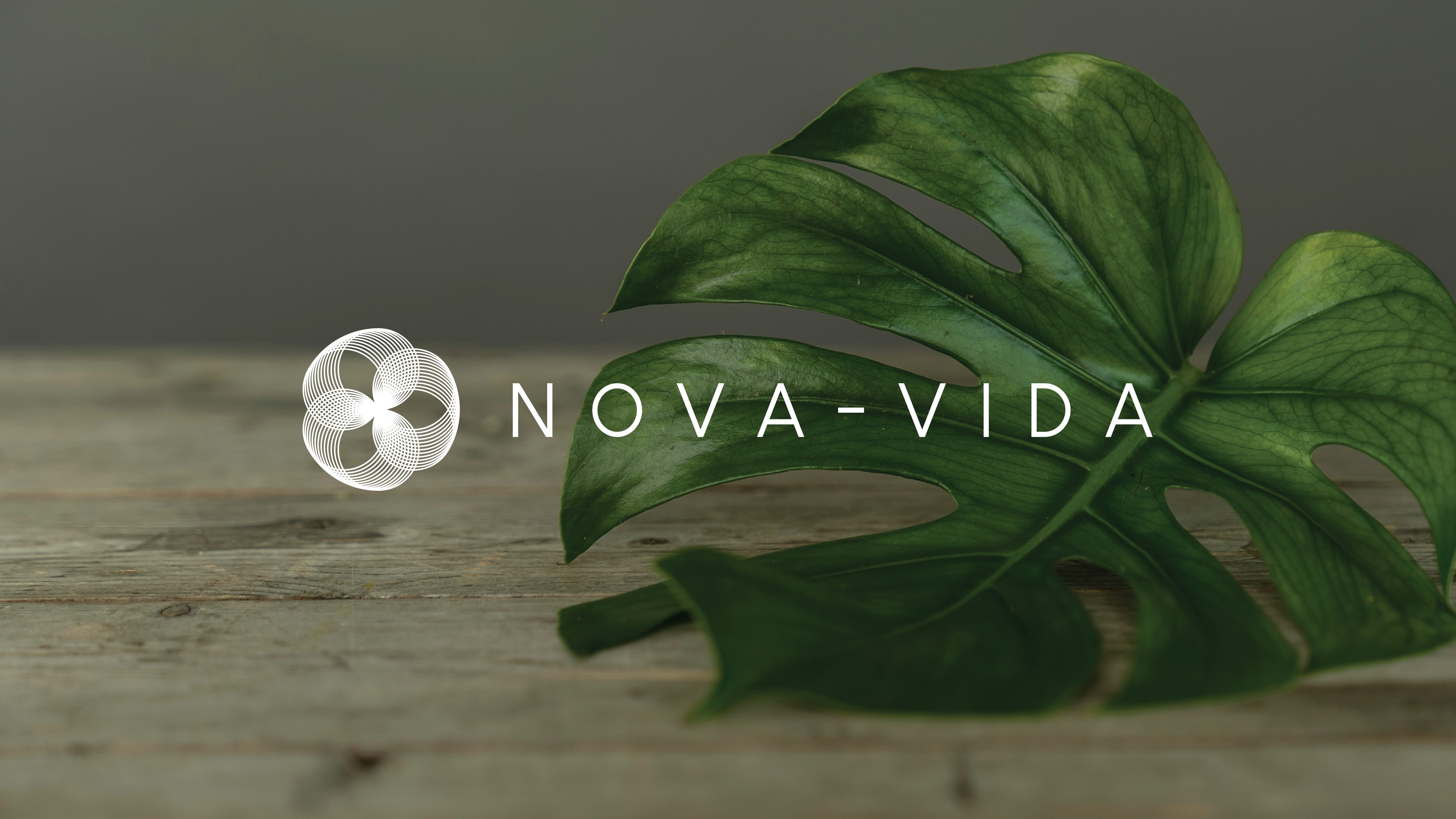
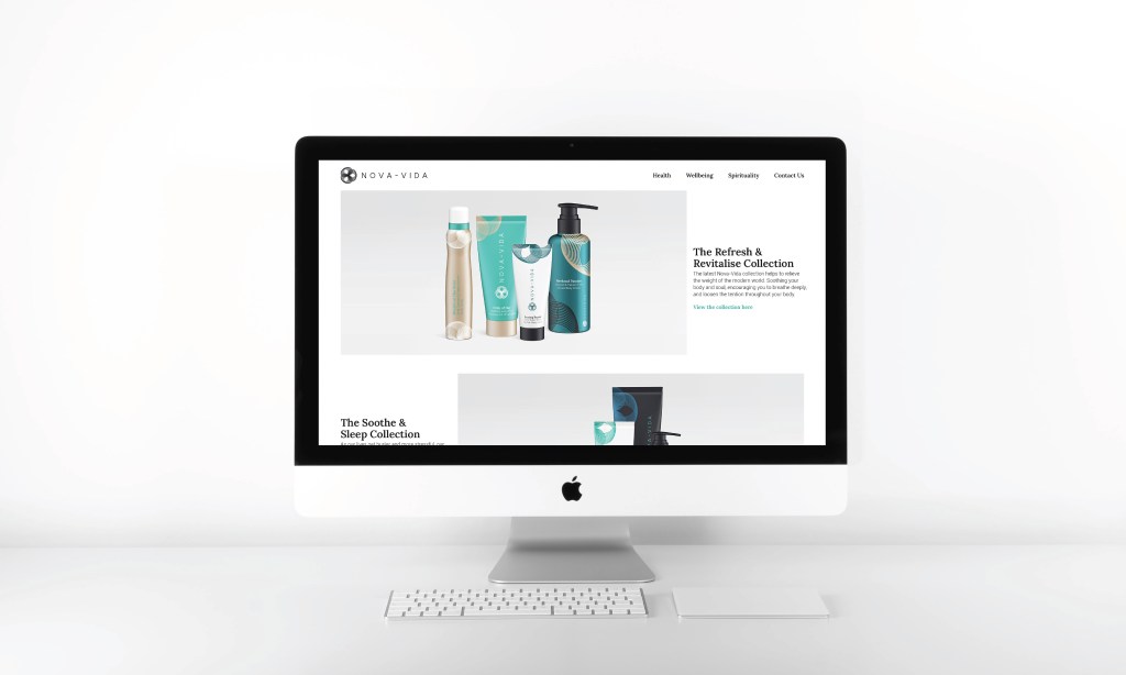
Nova-Vida, a spiritual and herbal wellness company, were looking for an identity that could represent what they stood for: health, spirituality, historic wisdom, and of course ‘new life’.
A lot of the brands wisdom stems from Eastern philosophy and medicine, as such this was an element that they were keen to subtly integrate into their visual identity despite their Western market.
STRATEGY
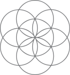
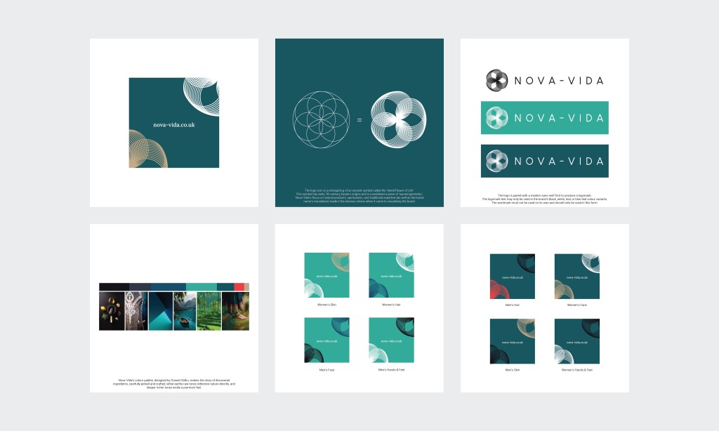
On researching eastern philosophy & history, I discovered what became the keystone of their identity: an aspect of eastern philosophy & mathematics known as the sacred geometries. The logo icon was produced by re-imagining one of these images known as the Seed/Flower of Life.
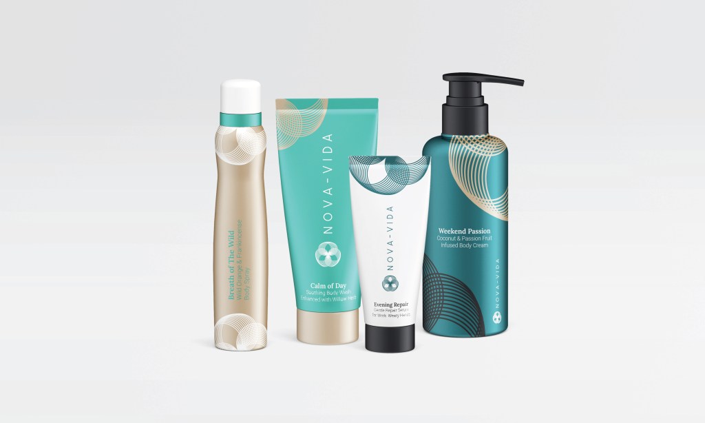
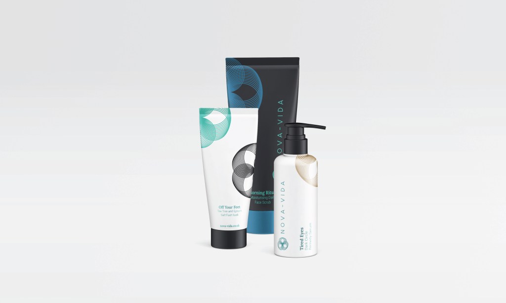
The brand’s palette evokes the story of discovered ingredients, carefully picked and crafted. With earthy raw tones referencing nature directly, and deeper richer tones evoking a premium feel.
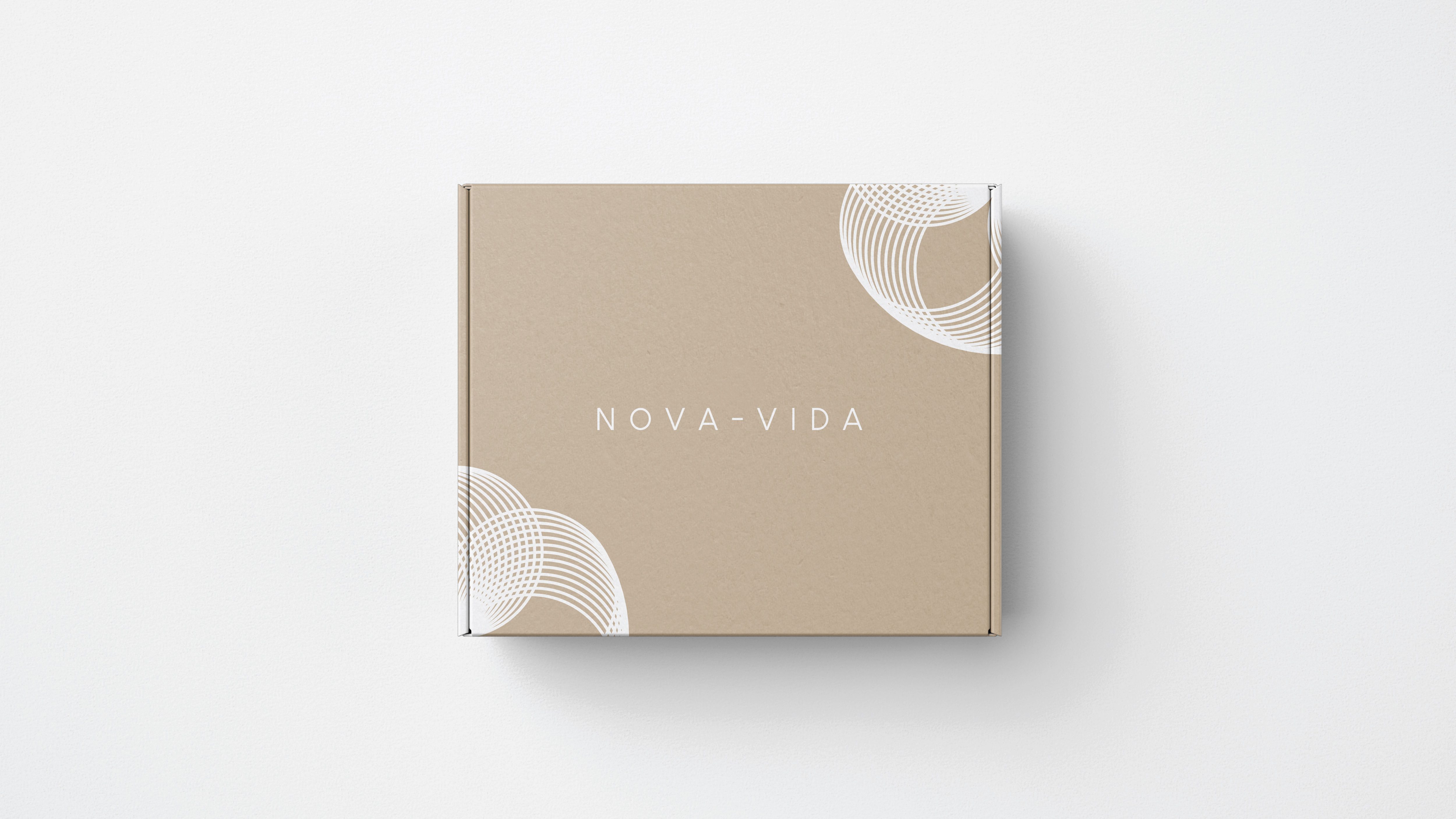
To support the brands implementation & investor marketing I subsequently developed a number of product & delivery packaging design proposals.
SCOPE
Visual Identity
Logo
Strapline/Copywriting
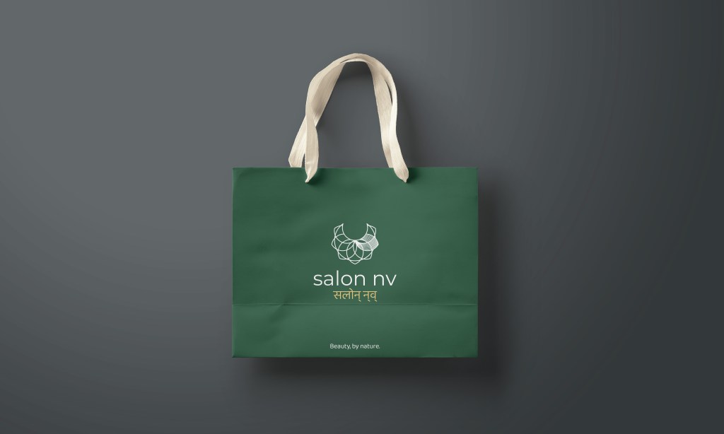
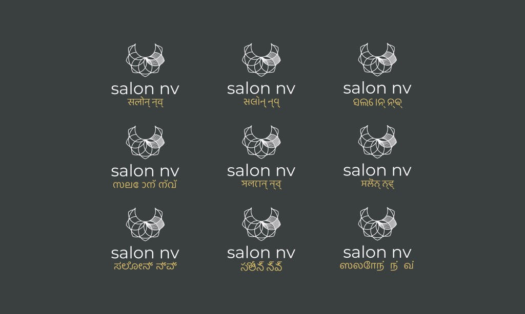
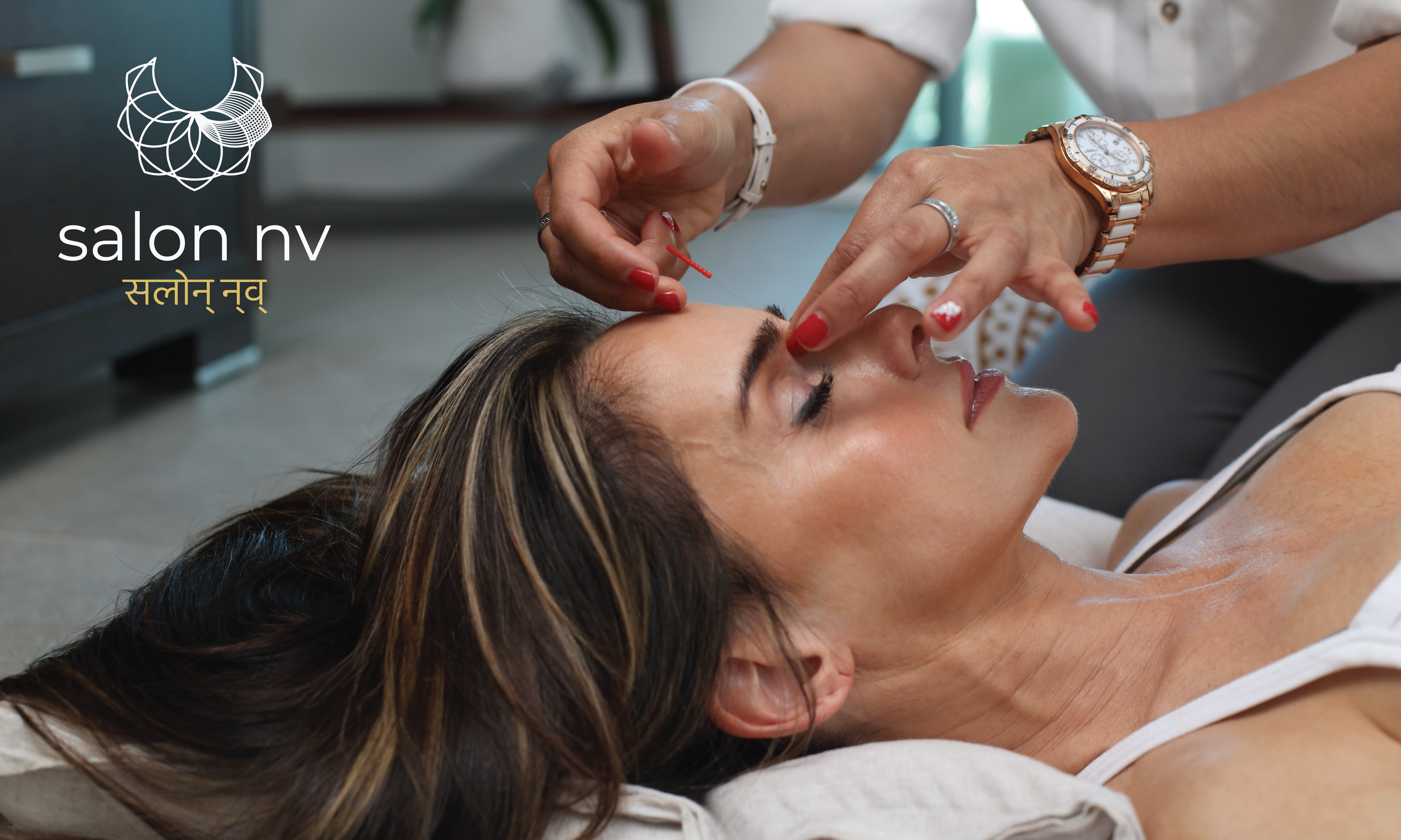
Following the success of Novia-Vida, Bakuli (co-founder of Nova-Vida), wanted to open a salon in India (under the Nova-Vida ‘family’) following the same principles of natural health and well-being. However, she also wanted to use this platform to comment and shed light upon the root causes of beauty obsession: envy, and the inherent irony of using chemical heavy products to enhance our natural selves.
Starting again with the flower of life gave the icon a natural foundation and helped align it directly with Nova-Vida’s logo. With some further adjustment and re-imagining I was able to create an icon that combines elements of florals and jewellery, with the 6th of 7 petals visually highlighted in a quiet reference to the 6th of the 7 deadly sins, envy.
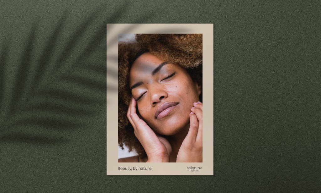
The brands messaging was strengthened by the development of a strapline which further plays with the association & relationship between natural and enhanced beauty: “Beauty, by nature.”