CONTEXT
Sussex MSK Health was founded on the promise to provide patient centred, de-medicalised, personalised care with a focus on community outreach & public behaviour change. As a newly formed service, they needed a distinct brand identity (to support their ambitious community outreach work) whilst also following national NHS identity guidelines.
Interviews & collaborative sessions with service leadership, staff, & patients revealed a complex group of values that ranged from ‘warm, calm, human connection’ to ‘authoritative, professional, expertise’. Research into local & national perceptions of the NHS revealed that whilst it projects professionalism & expertise, it is frequently criticised for feeling cold, corporate, and emotionally distant.
STRATEGY
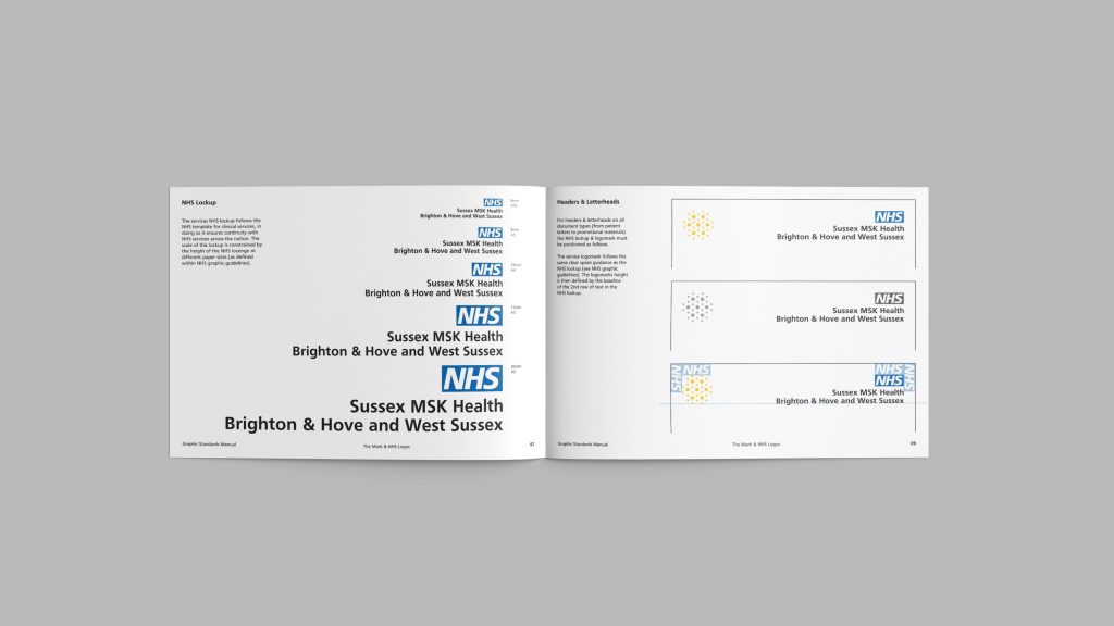
Being an NHS service, following national NHS identity guidelines is a basic requirement. However, significant interrogation & interpretation was required in order to transform the ‘cold, corporate’ look & feel of the NHS into something more welcoming, approachable, and positive.
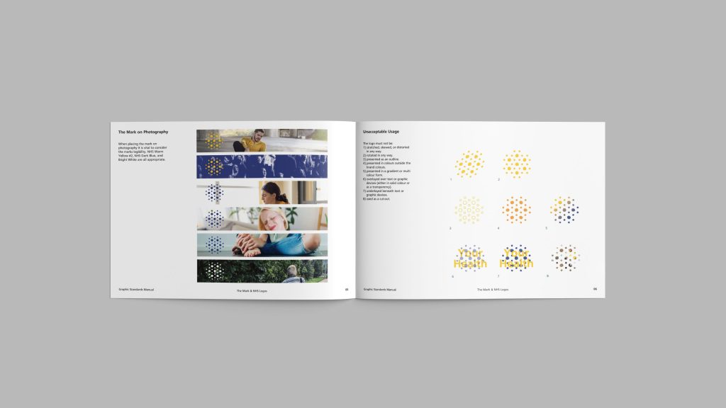
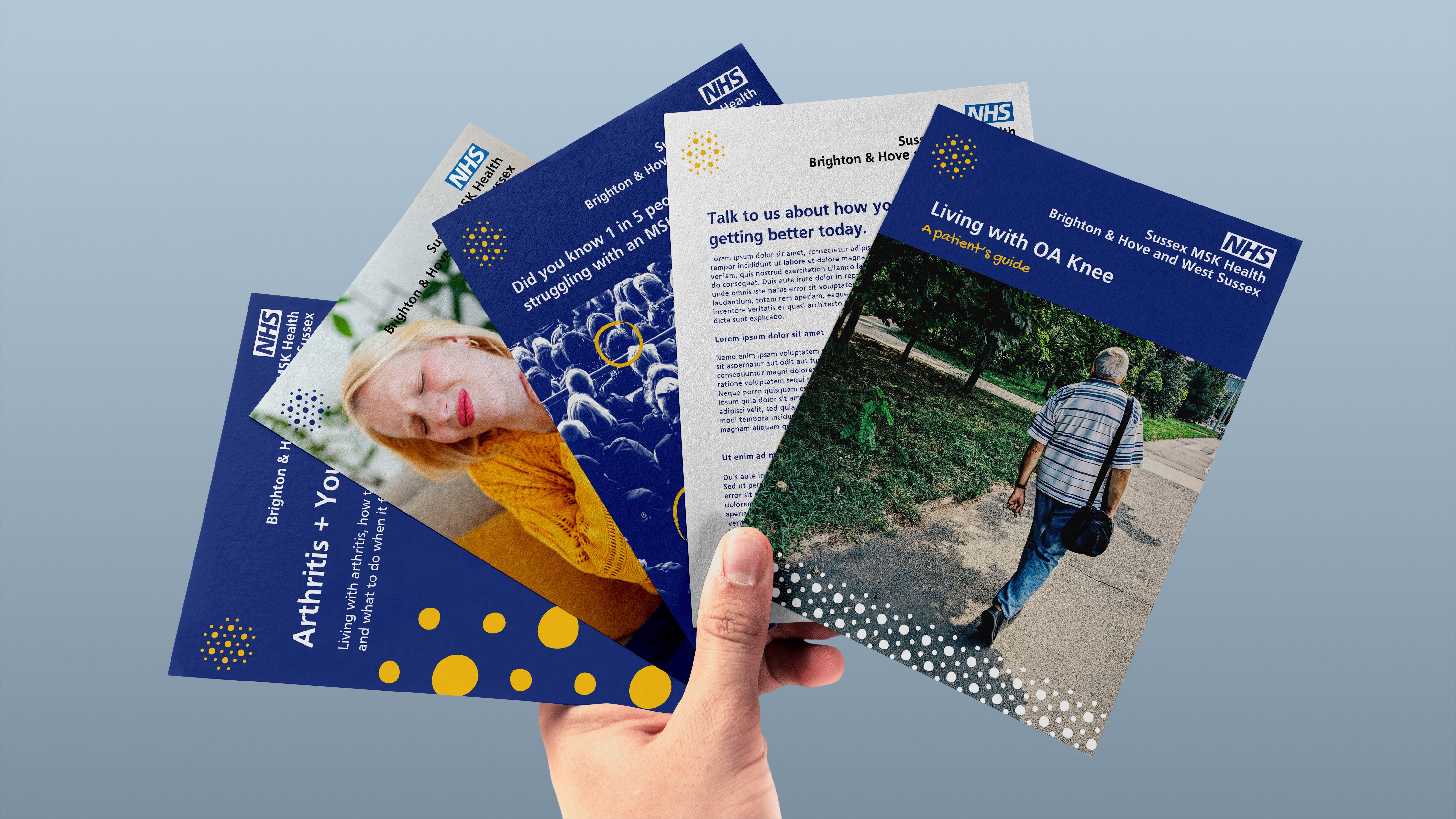
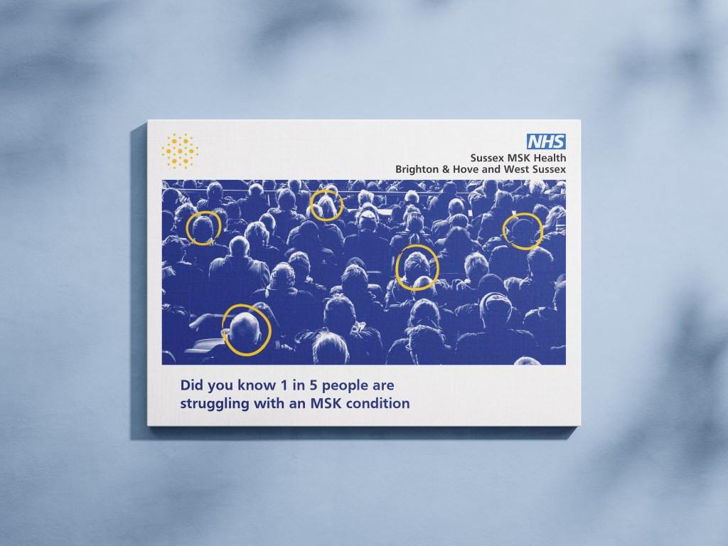
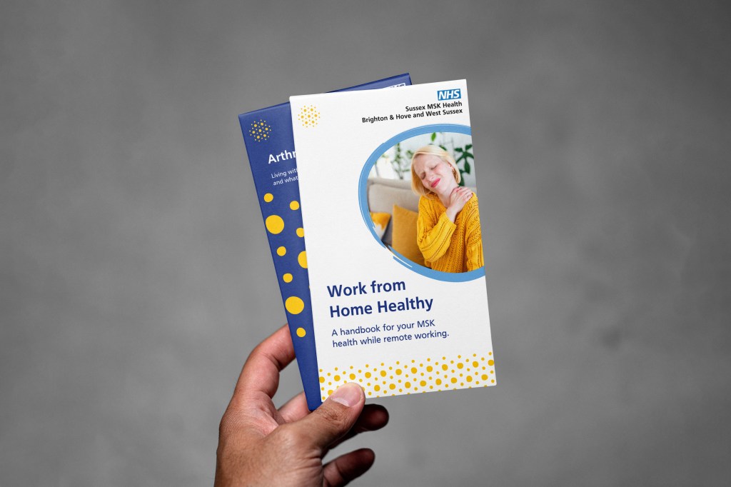
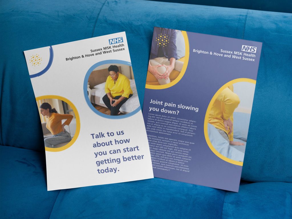
In all instances the identity moves away from the medical, focusing on the human element of healthcare. Naturalistic photography, humanistic graphic imperfections, and an informal conversative tone are paired with a warmer interpretation of the NHS palette & semi-traditional document layouts to create a service identity that is clearly NHS whilst embodying the more human emotive side of healthcare.
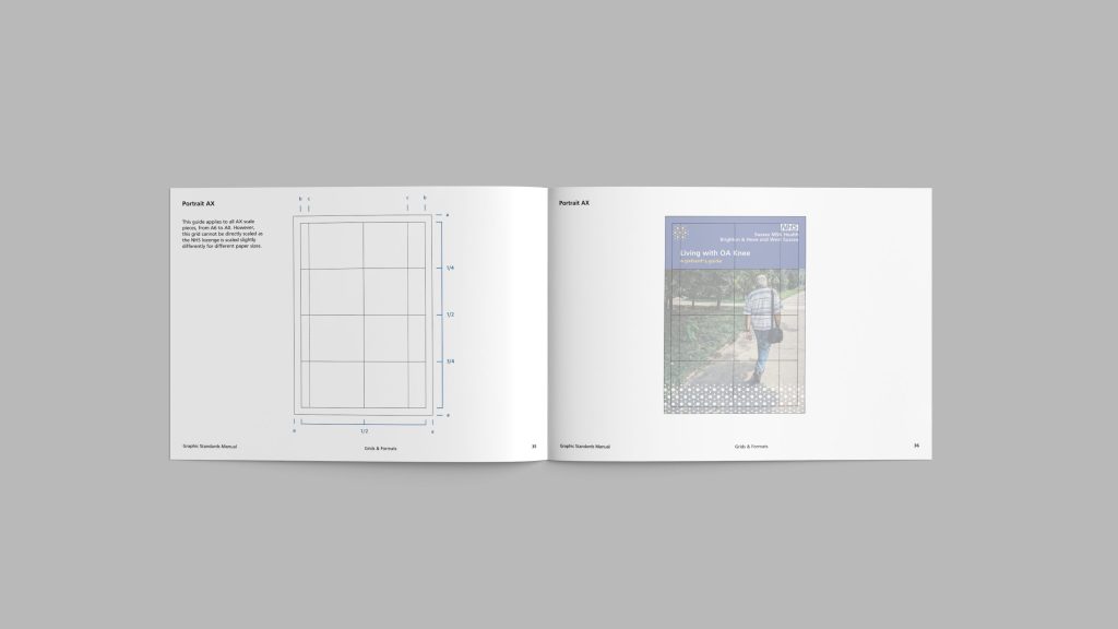
Given that the service does not employ in-house design staff, the identity needed to be constructed from minimal elements and simple yet flexible layouts to allow for maximum brand versatility & effectiveness despite the lack of professional design staff.
SCOPE
Brand Identity
Visual Identity
Logo
Brand Guidelines
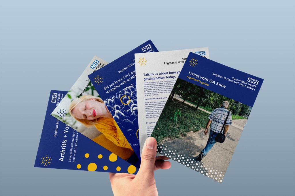
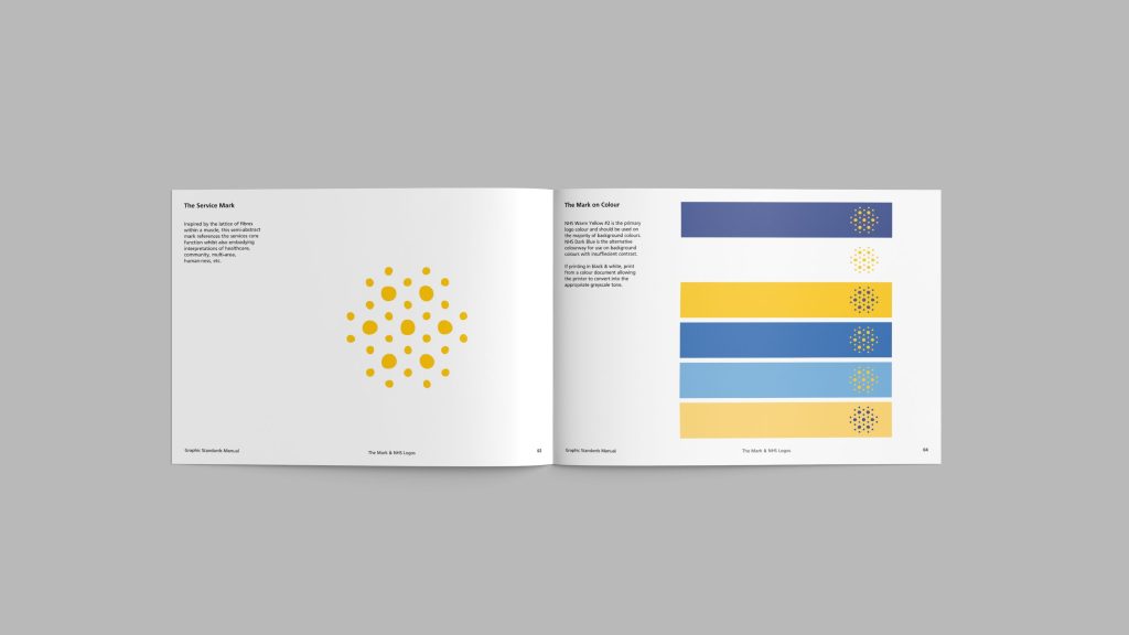
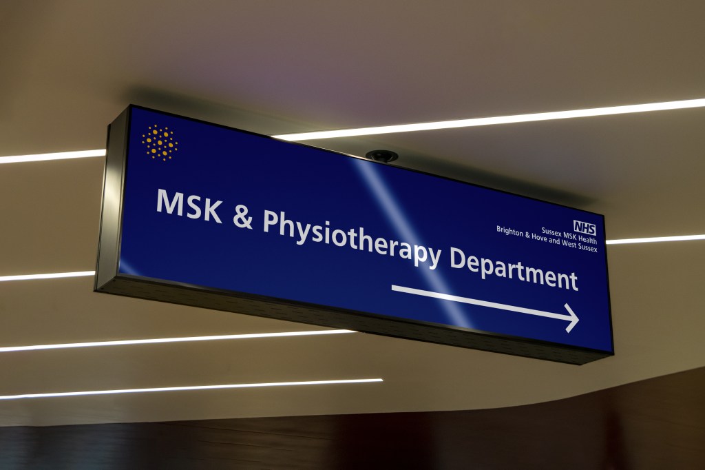
A service icon was created to be used as a ‘logo’ as well as being developed into multiple graphic devices. The icon traces the lattice of fibres within a muscle, guaranteeing a medical feel & connecting the service to its Physiotherapy function. In early testing this icon was also interpreted as ‘communities’, ‘people’, and ‘multi-region’, all of which also reflect the service.
As noted in NHS England’s 2015 research, Blue is the main recognised colour of the NHS, a fact this palette leans heavily on using it as a core tone for backgrounds and text to soften the otherwise cold & stark white backgrounds of the NHS.
This is paired with a warm yellow accent tone (also from the NHS palette) to provide differentiation, quick recognition, & a bright warm feel to all pieces.
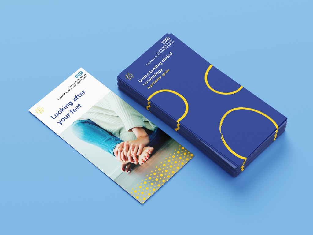
Elements including naturalistic photography, reduced formal grammar & punctuation, and a custom handwritten font further expand on the ‘human touch’ presented by the graphic imagery.
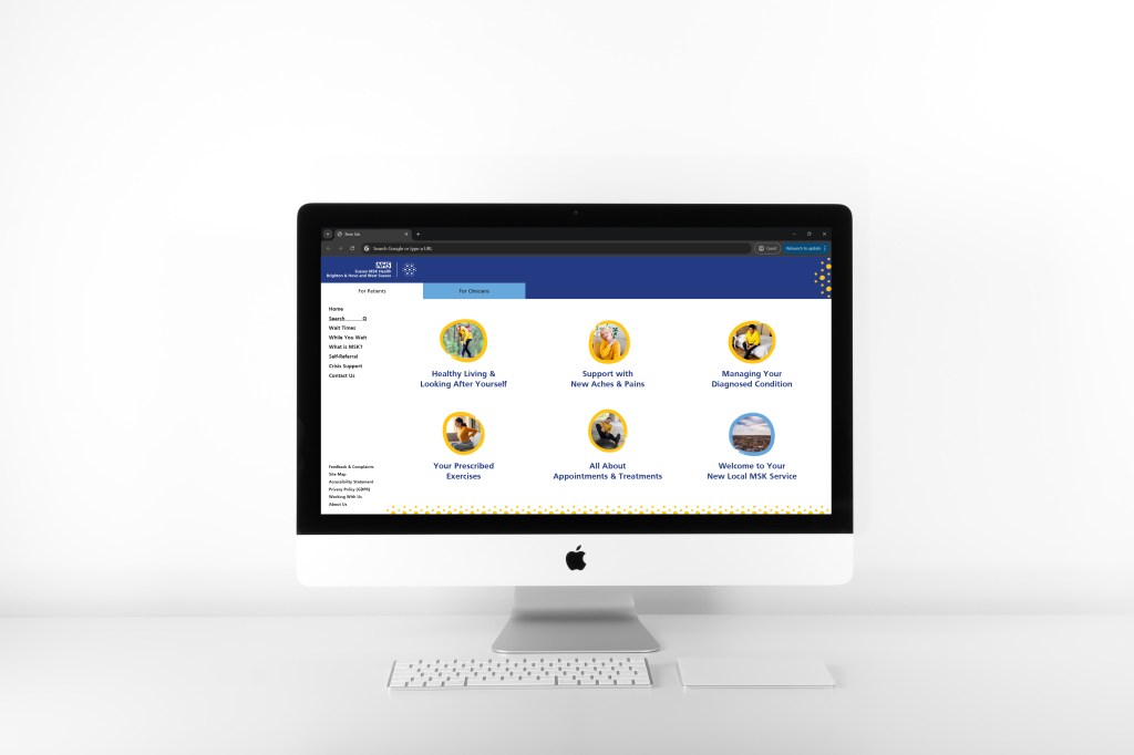
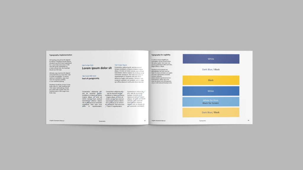
Comprehensive brand guidelines were developed to ensure the in-house communications team had full control of the identity, ensuring all future pieces remain on brand, aligned to NHS guidelines, and appropriately accessible (sample pages shown below).