CONTEXT
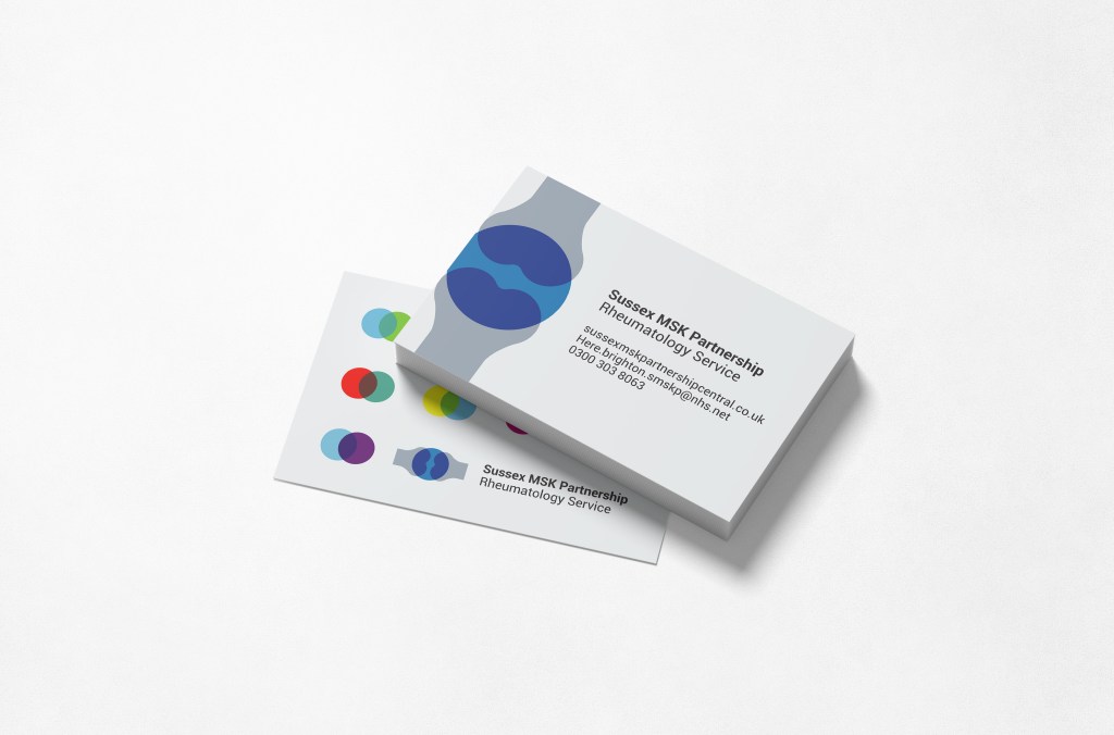
During patient partner & website development sessions it became clear that Sussex MSK Partnership needed a full visual identity (at this time they only had a simple logo) to support their positioning as a friendly, trusted resource and to support the promotion of new initiatives to the public.
STRATEGY
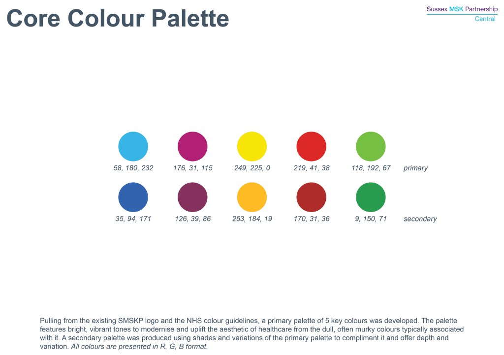
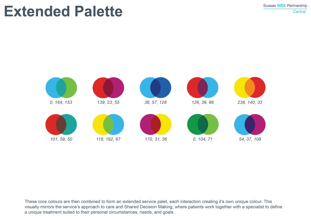
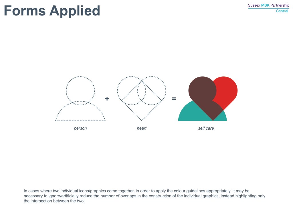
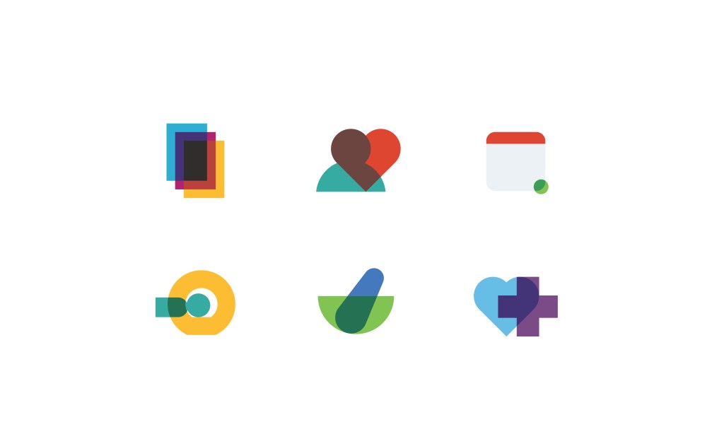
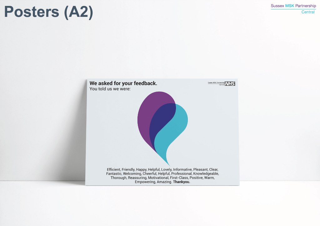
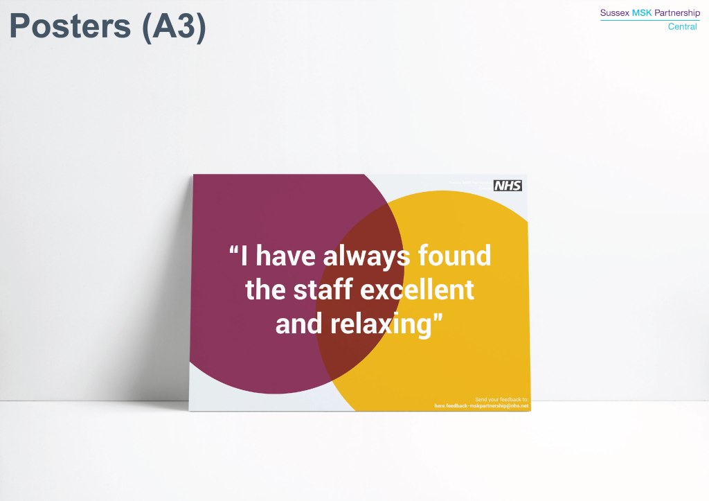
From patient interviews and discussions it was clear the identity needed to be warmer, friendlier, and replace the complex clinical language & visuals with a more approachable alternative. However, it was also critical to recognise that as an NHS organisation the service did not have any in-house design expertise of software. As such, the brand style was inspired by the mid-century Swiss graphic style to encorporate simple geometric forms, uncomplicated layouts, and bold rich colours which would allow for future assets to be produced in non-design programs like PowerPoint & remain on-brand.
SCOPE
Visual Identity
Brand Identity


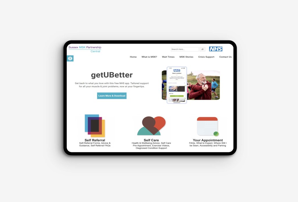


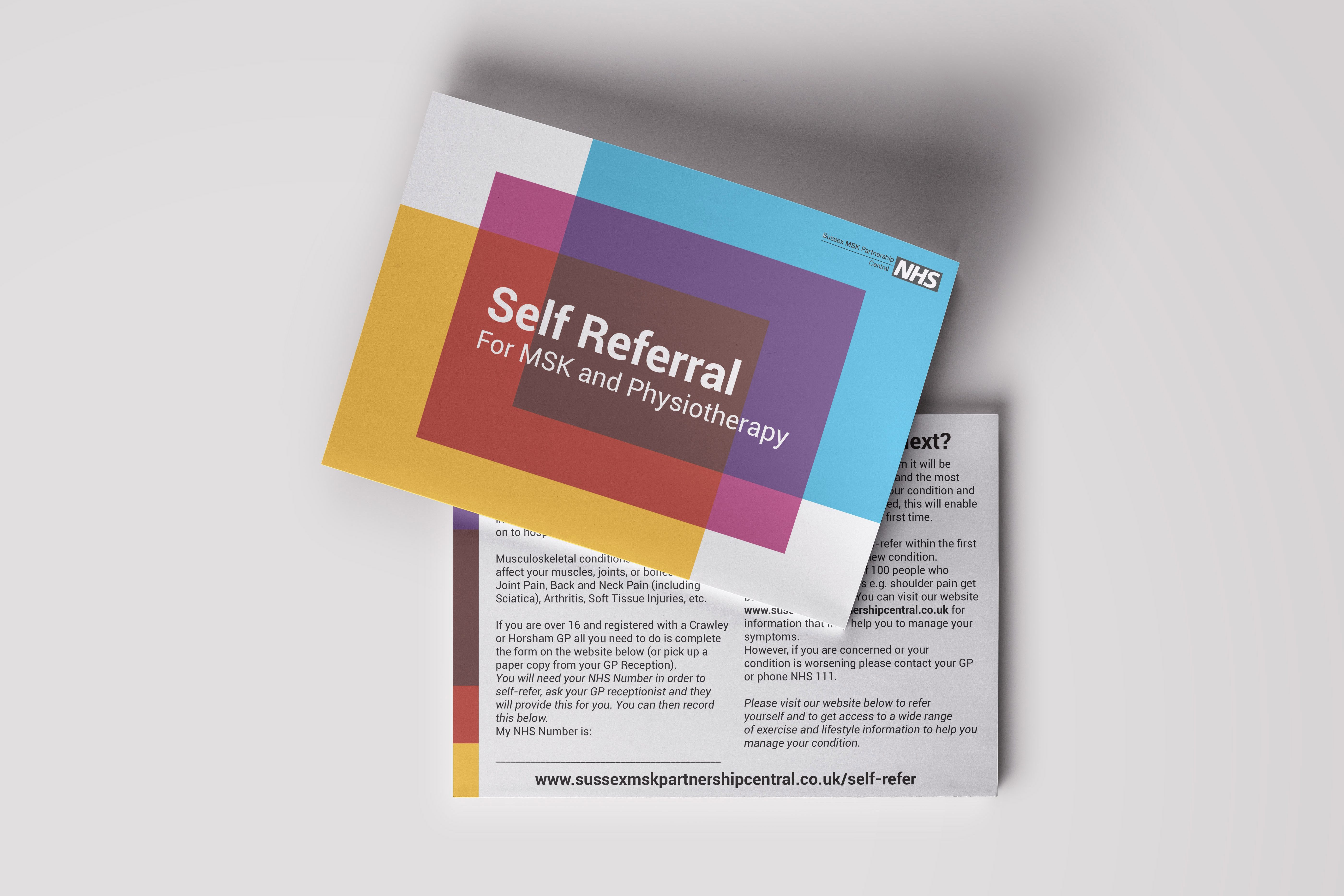
Self Referral was the first major service product presented to the public using the new identity. For the first time patients were able to refer themselves to the service rather than needing to see their GP first.
With such a new offering, the identity needed to be bold and clear. Above all it needed to be easy to recognise from the first poster in a waiting room, to the icon on a webpage. The self-referral itself was comprised of 3 A4 sheets, the icon references this literally, presenting them in bright colours with rich overlaps between them.

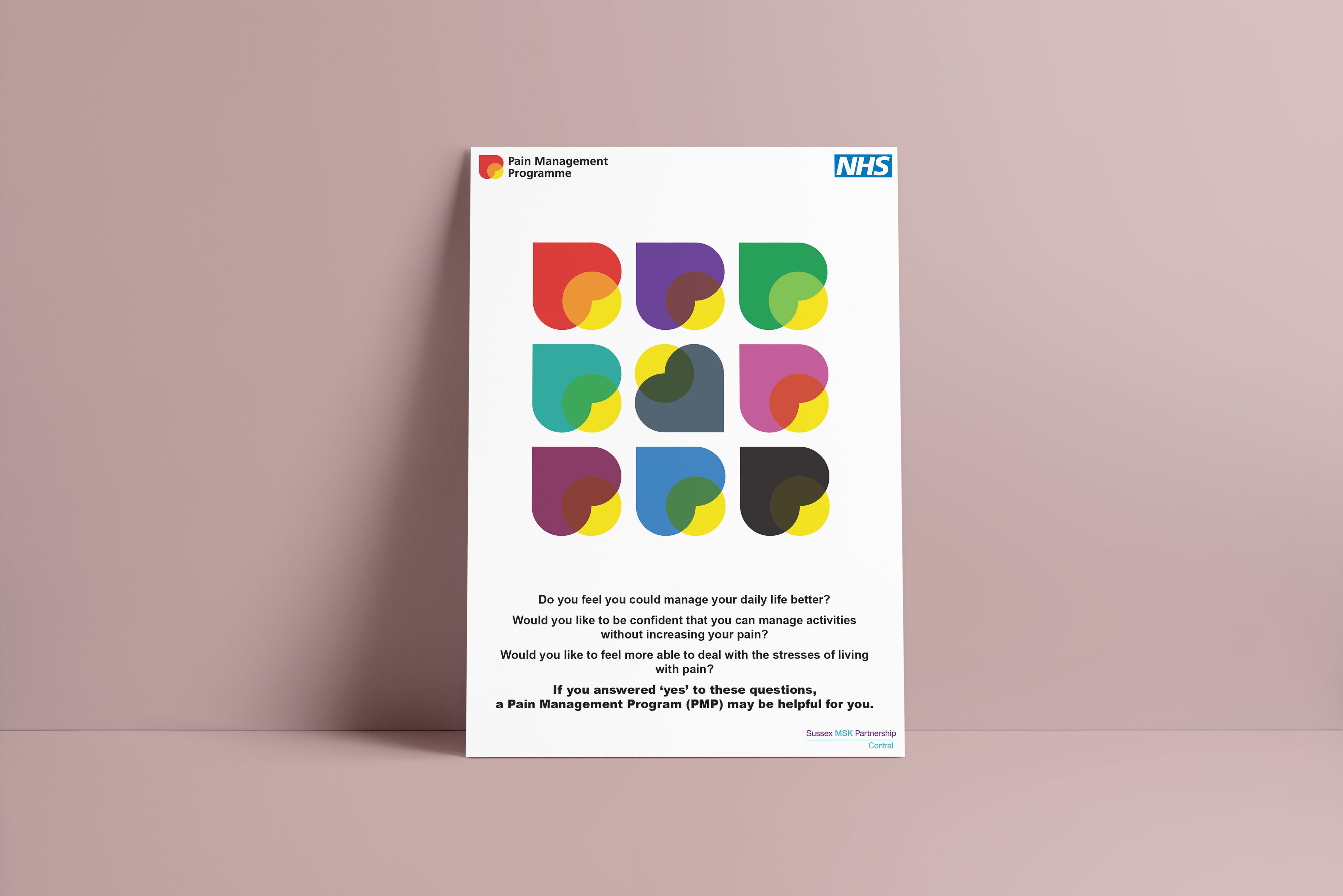
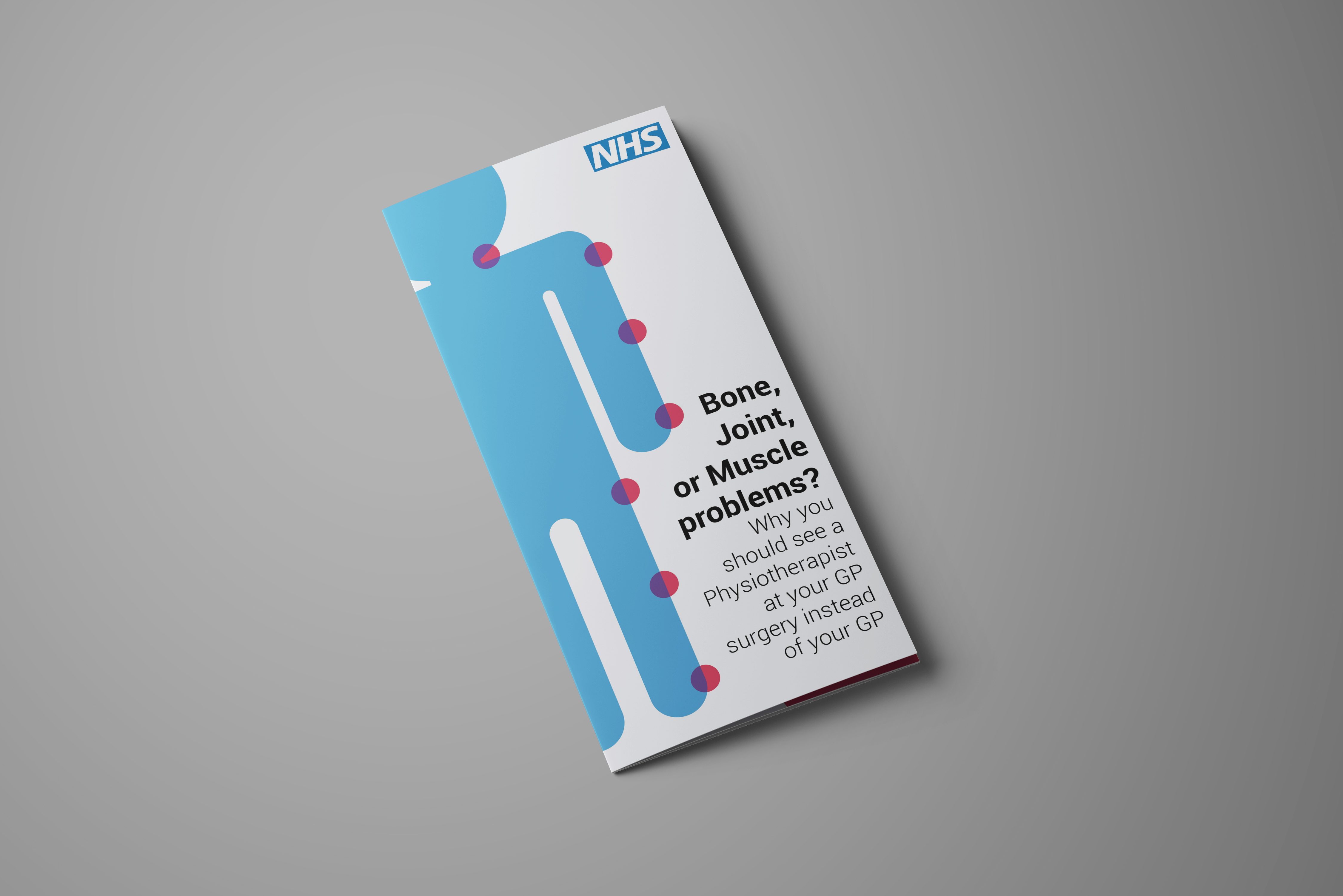
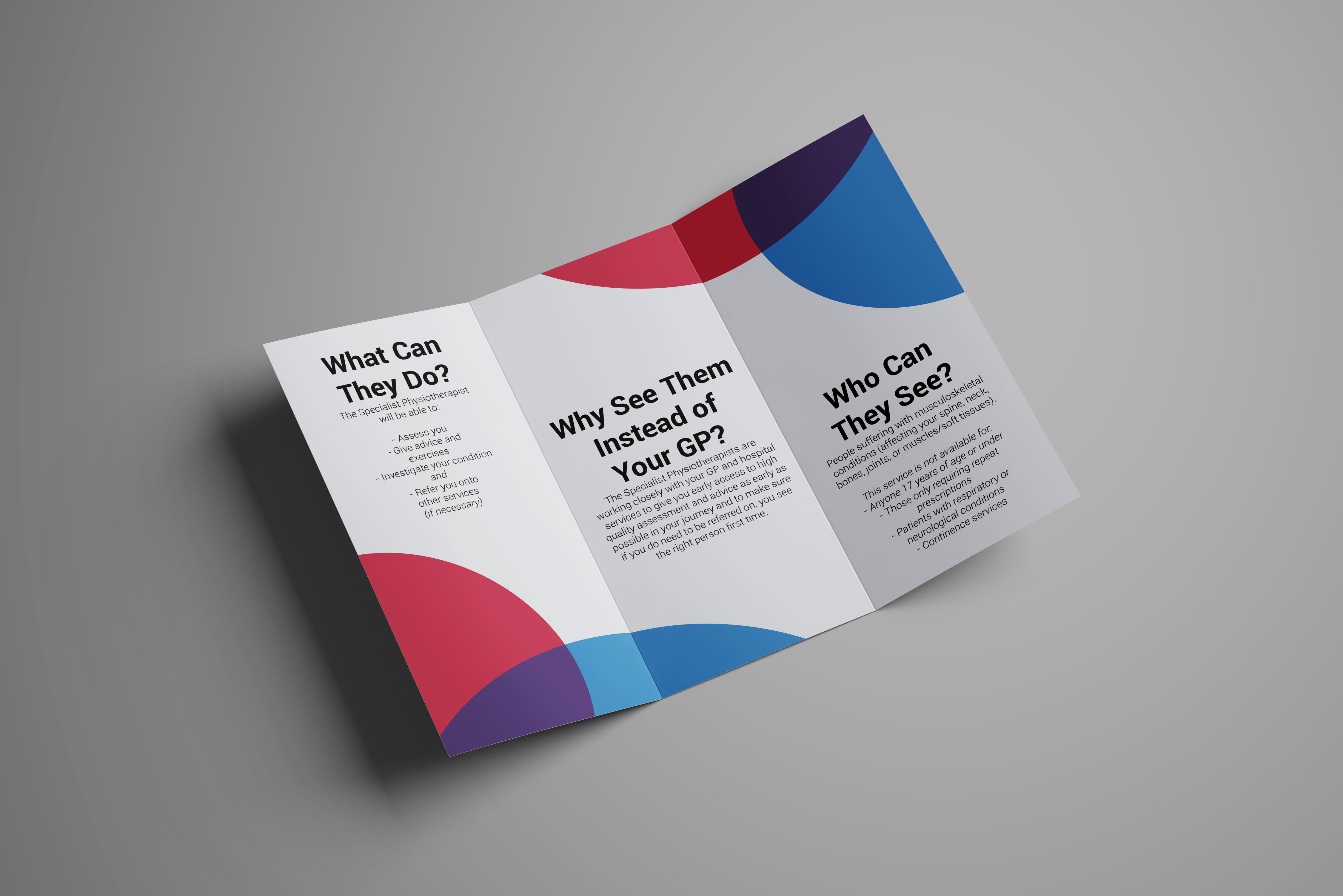
First Contact Practitioners are musculoskeletal specialists working from GP practices. The first challenge was explaining to patients what musculoskeletal means. In the past the service had used anatomical drawings to do this but, with the new identity moving away from clinical imagery, a softer form was needed for this.
I initially developed a simplified version of the anatomical model, aligning this under the new brand identity. The ‘pain points’ from this image were then expanded to form a recurring corner icon/motif that could be used to identify the FCP offering whilst also visualising the collaboration between SMSKP and GP services.
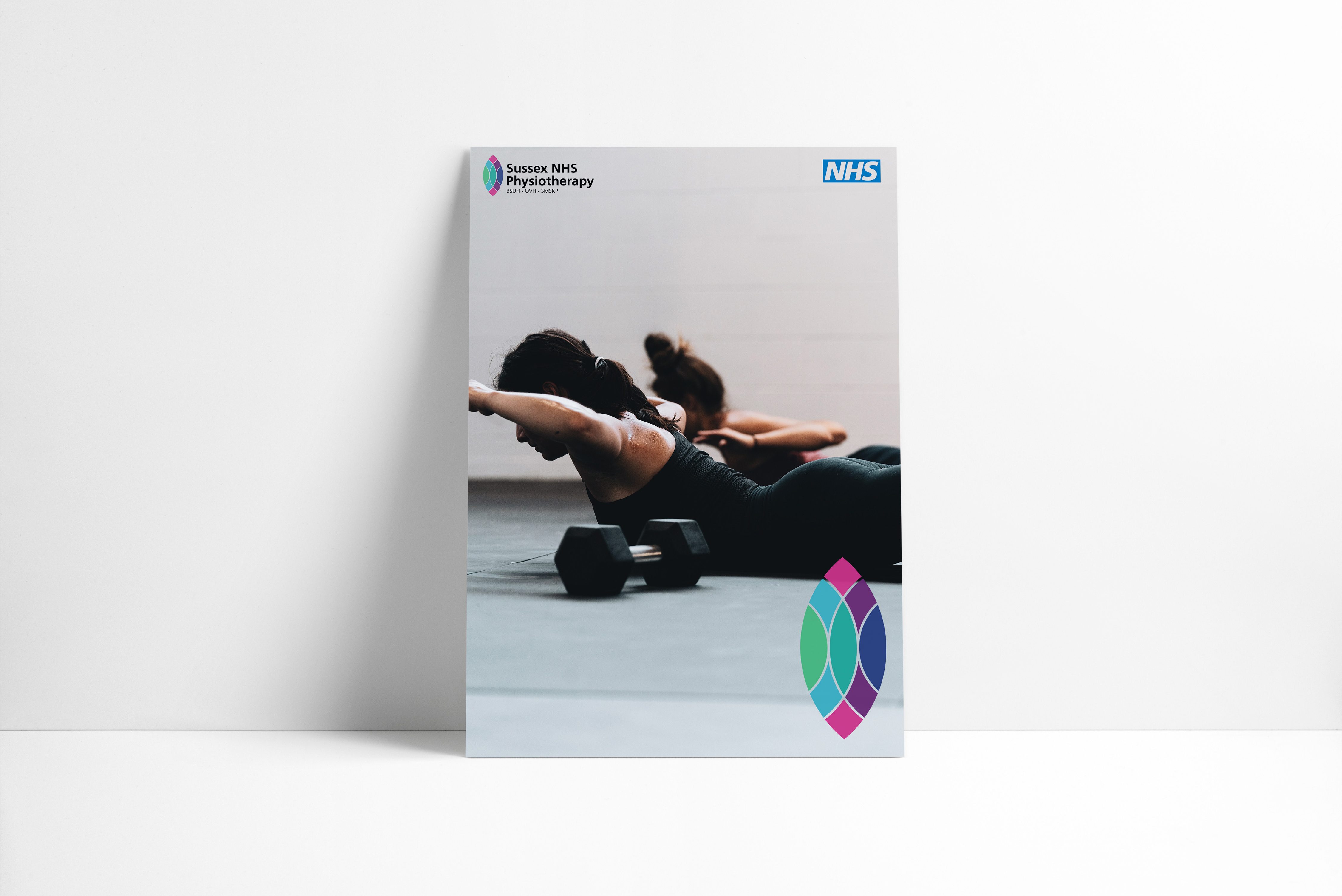
In response to the COVID-19 pandemic, the three Sussex physiotherapy trusts (BSUH, QVH, & SMSKP) proposed coming together to create a unified comprehensive collection of patient information. I was asked to produce a single logo for the collective that could be used across all media rather than their 3 individual logos.
The logo I developed was focused on integrating all 3 organisations brands under a single unified icon. It takes the form of the Chartered Physiotherapist Crest and reinterprets it to feature the colours of each of the 3 contributing organisations:
BSUH – Dark Blue, & Mid Green
QVH – Dark Blue, Mid Green, Pink, & Light Blue
SMSKP – Light Blue, & Purple