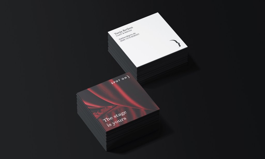
Problem: Representing a founders passion & beautiful approach to the business despite its disconnect to the target market.
Solution: A logo & identity that pulls heavily but quietly from the incompatible reference to maintain this emotional connection for the founder, whilst helping the business stand out amongst competitors.
The Brief
In Germany, students are required to perform a year in industry for all professions. However, many of the employing companies lack the time and resources to appropriately mentor these students. Spot On was created to resolve this, offering tailored support to students to help them get the most out of the experience, but they needed a brand.
The Approach
In our first meeting Tanja described herself as:
“like a director, shining a spotlight on talented young people.”
This struck me as a particularly beautiful and personal way to differentiate the brand from the usual business/consultancy look.
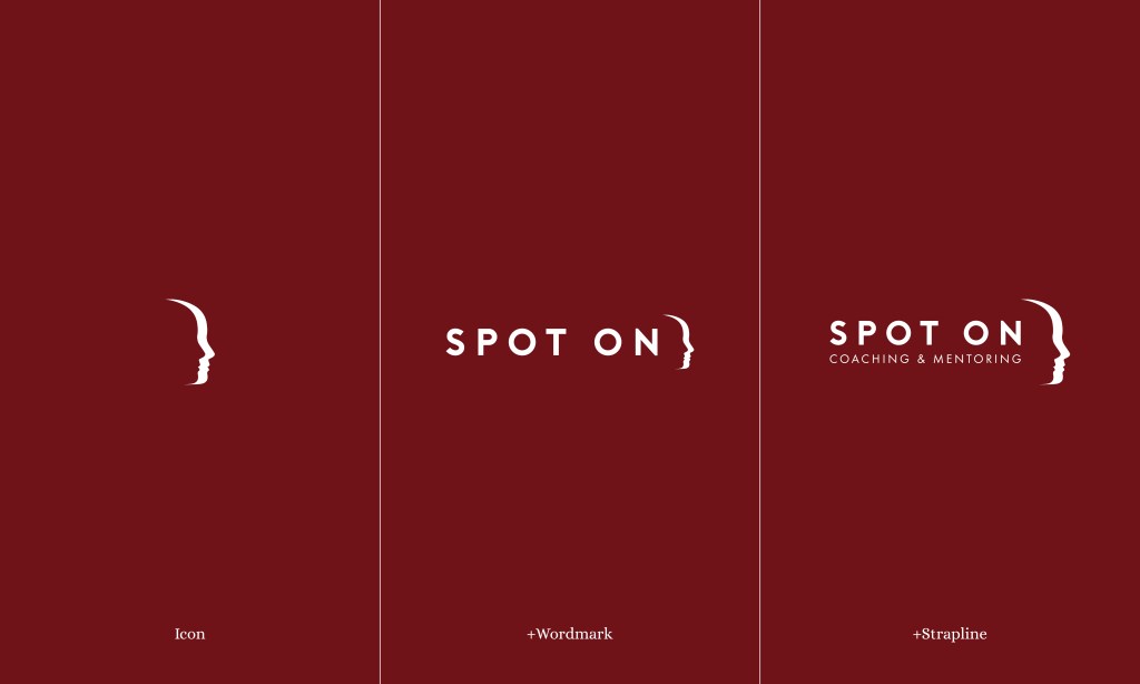
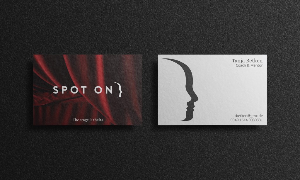
In exploring light and shadow I stumbled upon the ability to create an icon that could change its focus.Emphasising the spotlit student when presented in black, and behind the scenes mentor when presented in white.
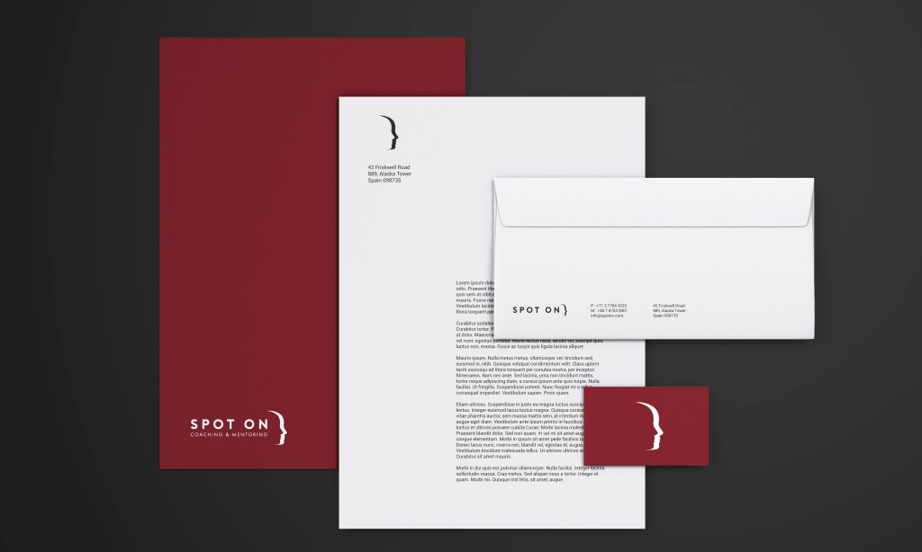
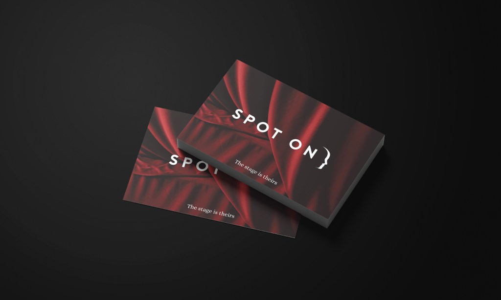
The wider identity pulls heavily from the phrase “the stage is theirs” (another phrase Tanja used frequently) using this as a tagline along with a theatrical deep red to help stand out against the typical corporate blues, greys, and blacks. Seperate business cards were the produced for the hiring business (rectangular) and the mentored students (square).

