CONTEXT
This new NHS service needed a website designed to support a ‘digital first’ model for patient resources, as well as support prevention & promotion campaigns, and enable the service to expand into general health support (as required by NHSe).
The service was also bringing together 3 seperate organisations, each of which had their own existing website & differing information & presentation approaches that would need to be assessed.
STRATEGY
User observations & interview sessions lead to the critical insight that whilst medical services across the world organise their content by category (shoulder – condition – exercises), this does not align with patient behaviours who approach information discovery from a ‘need centric’ perspective (exercises – condition). This insight informed the core of the site’s information architecture, alongside patient personas & scenarios (produced using service referral data) ensured that all site architecture decisions aligned to real world patient behaviours & needs.
This project had an extremely tight turnaround, to be launched just days after the name was agreed and before any brand assets were established, as such the visual aspects of the site were kept minimal, aligning to NHS guidelines but allowing space for the addition of visual assets once the brand was developed.
The full website can be explored at www.sussexmskhealth.co.uk (though it remains in a post-rollout development phase).
SCOPE
Experience Architecture
Information Architecture
UX
UI
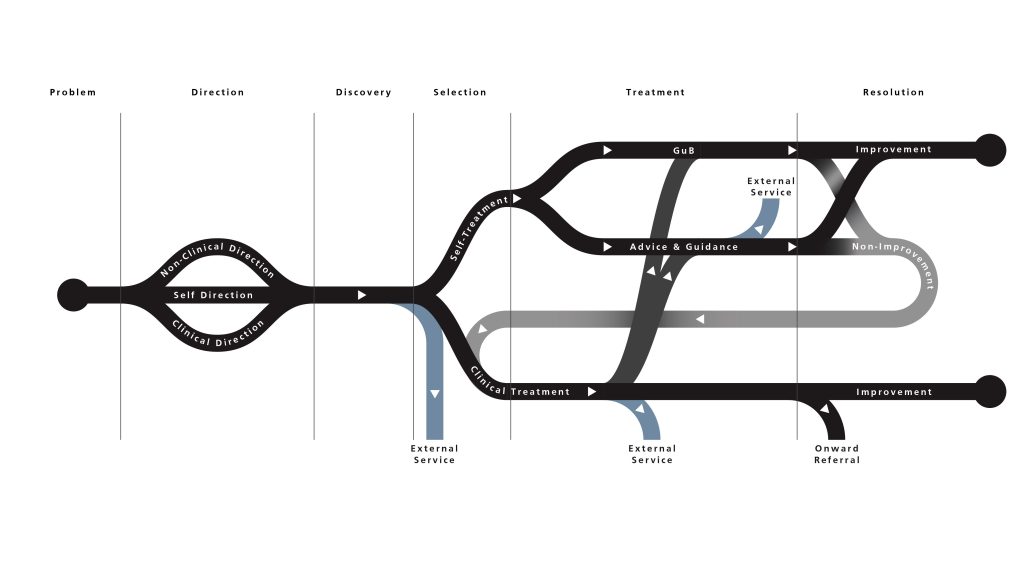
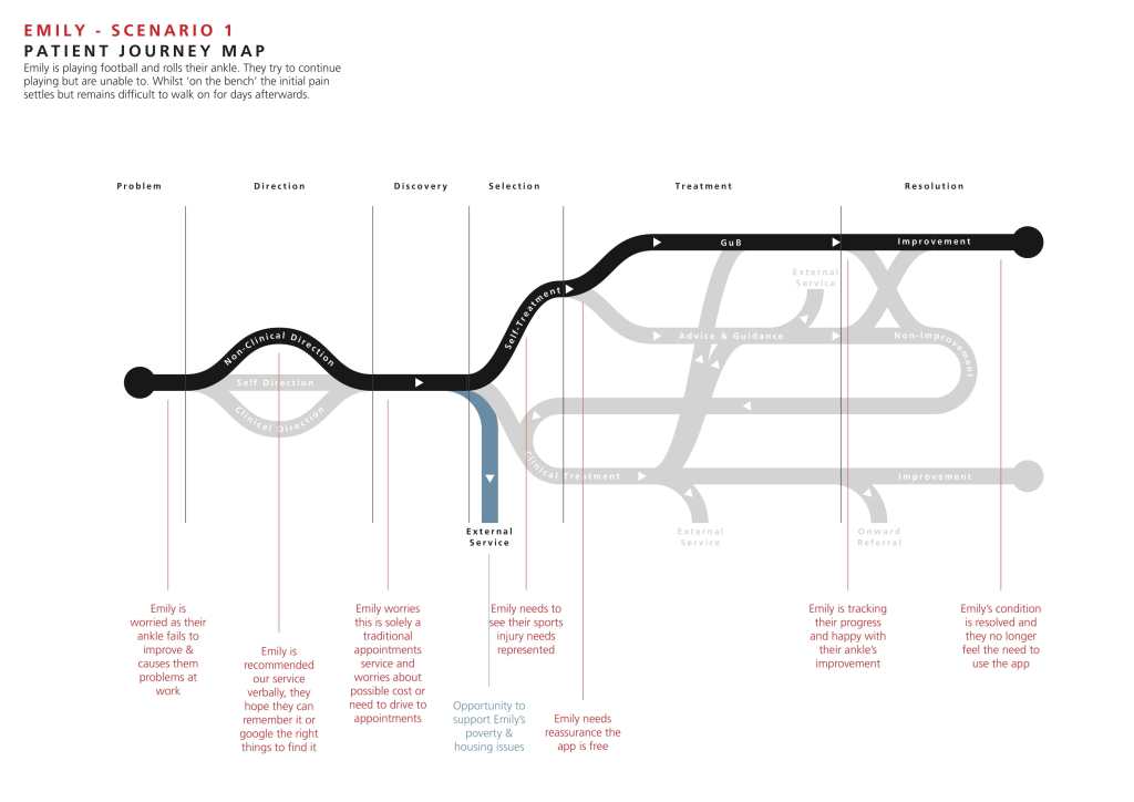
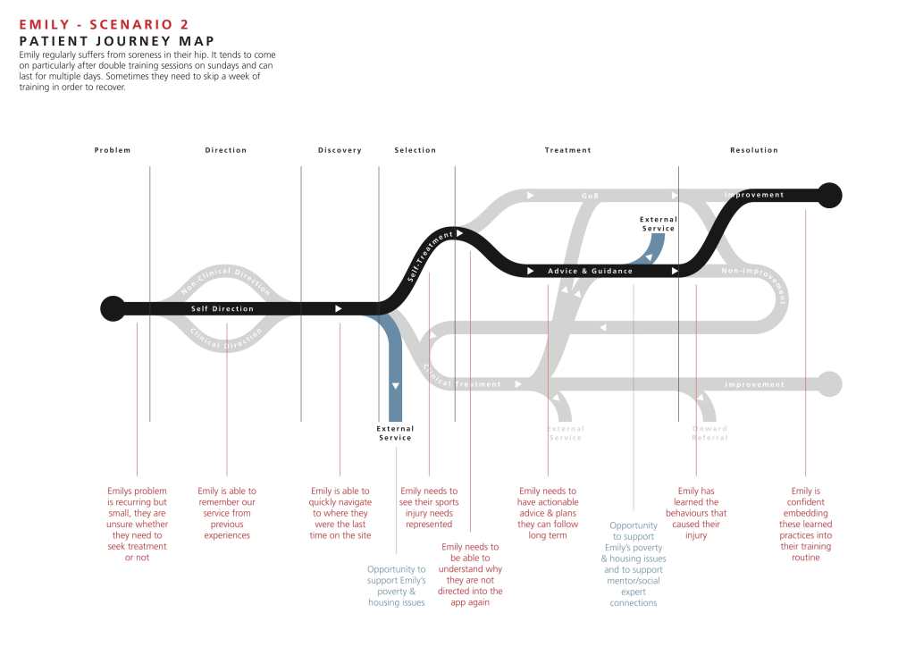
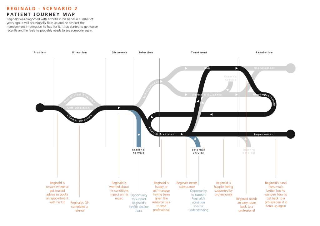
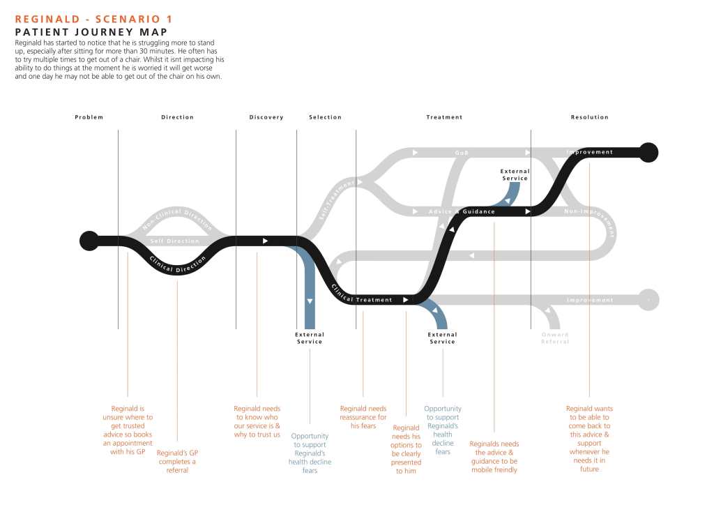
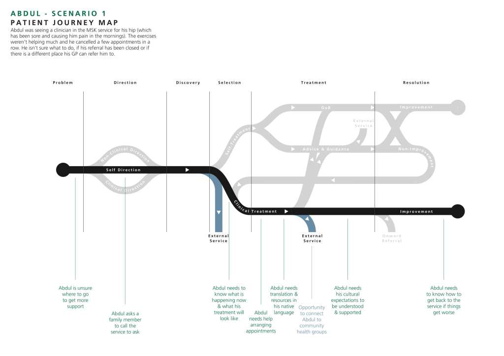
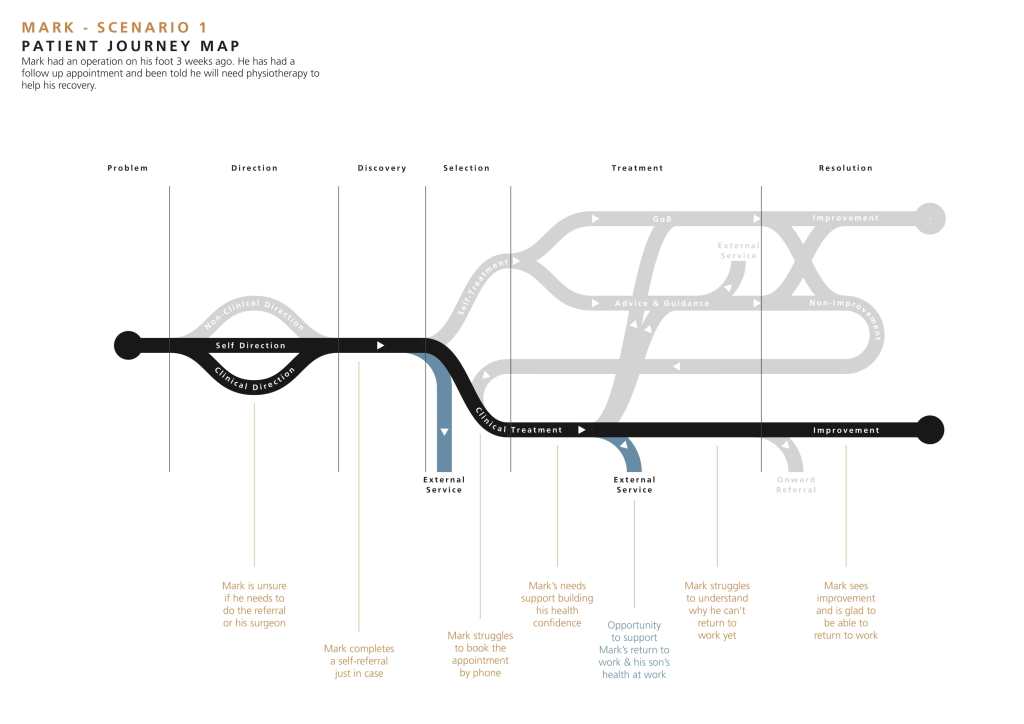
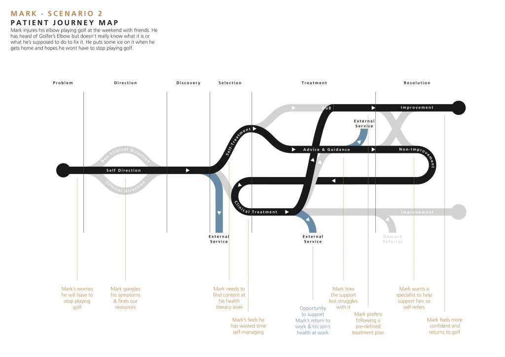
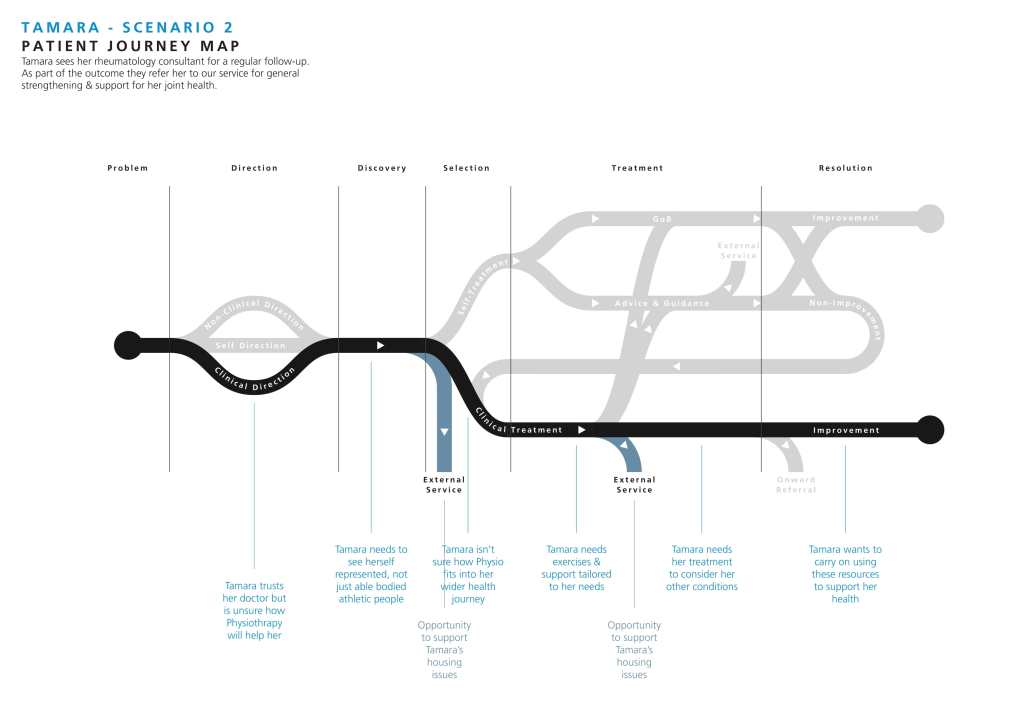
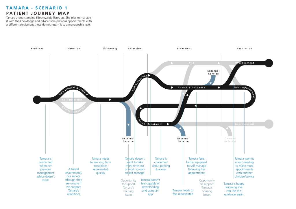
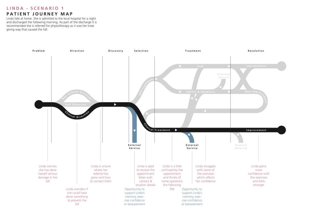
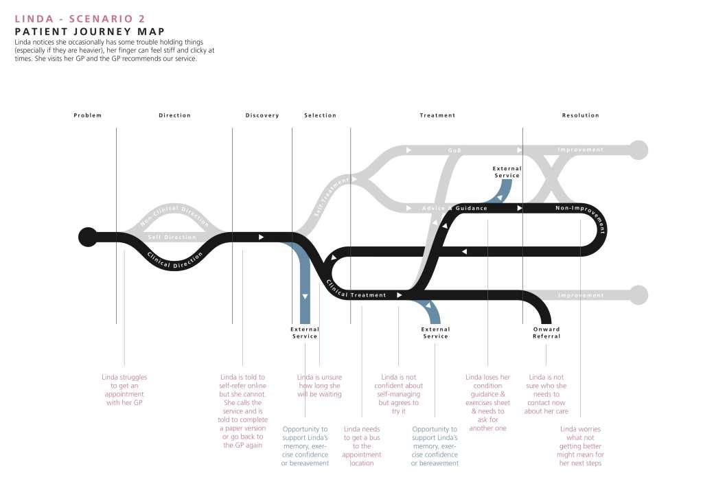
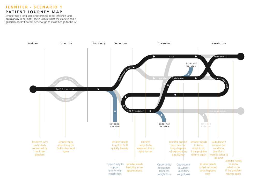
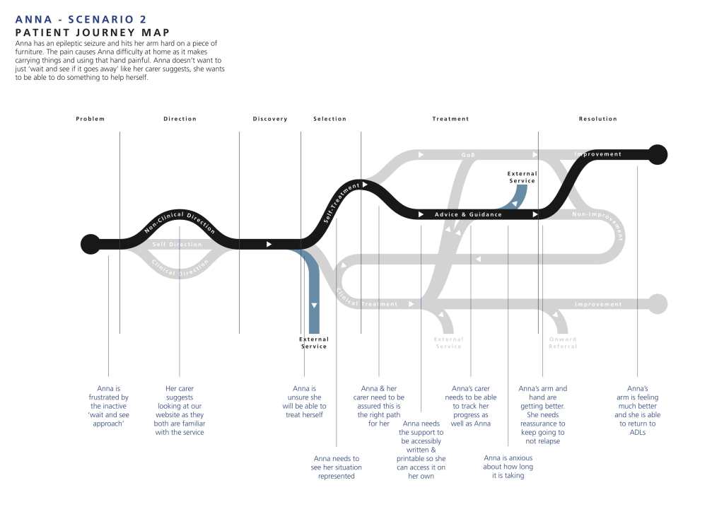
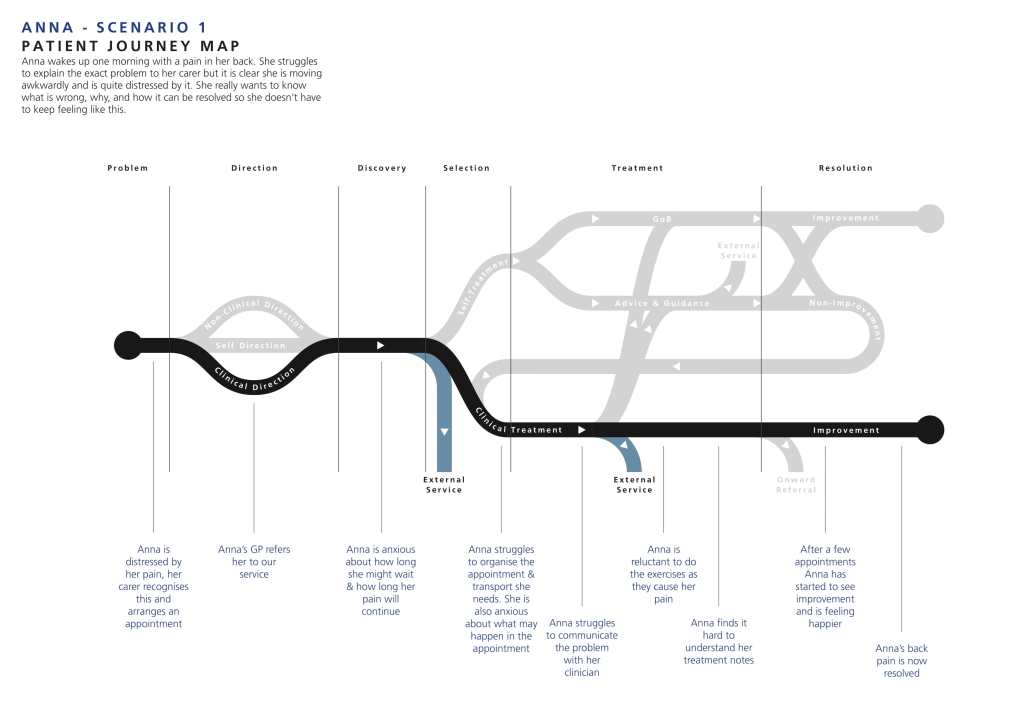
In order to understand how the website fit into patient’s journeys, we needed to understand what patient journeys looked like. I developed a User Journey Map to visualise all potential patient journeys and their respective interactions.
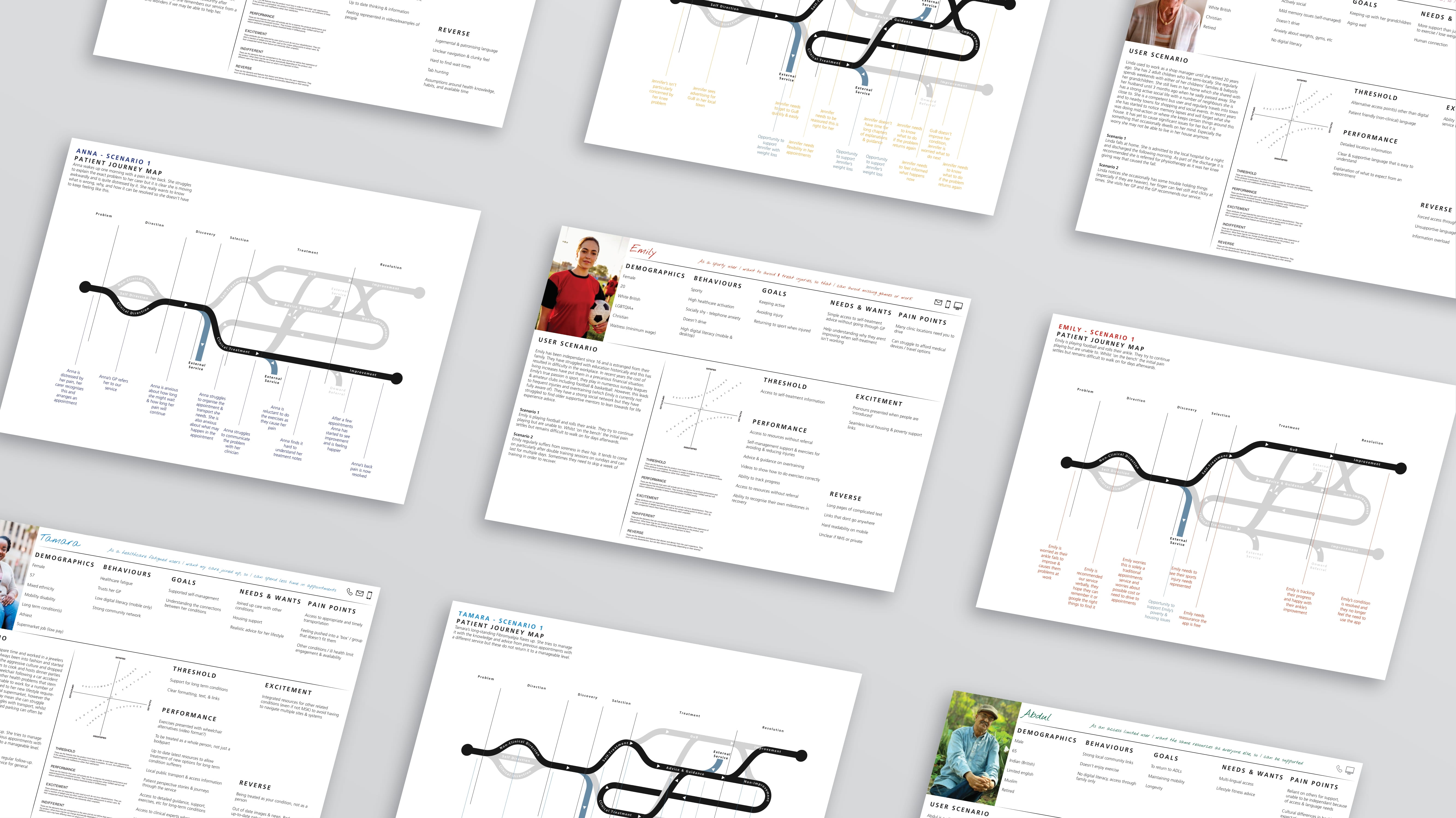
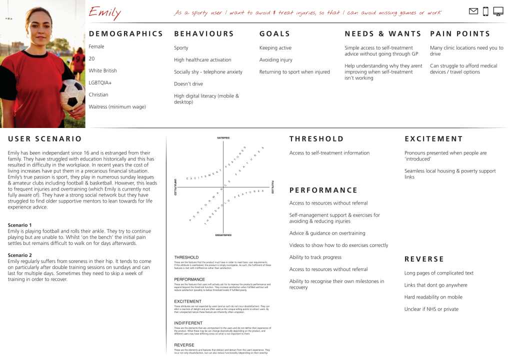
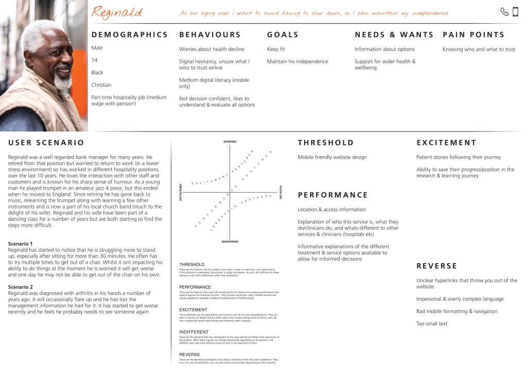
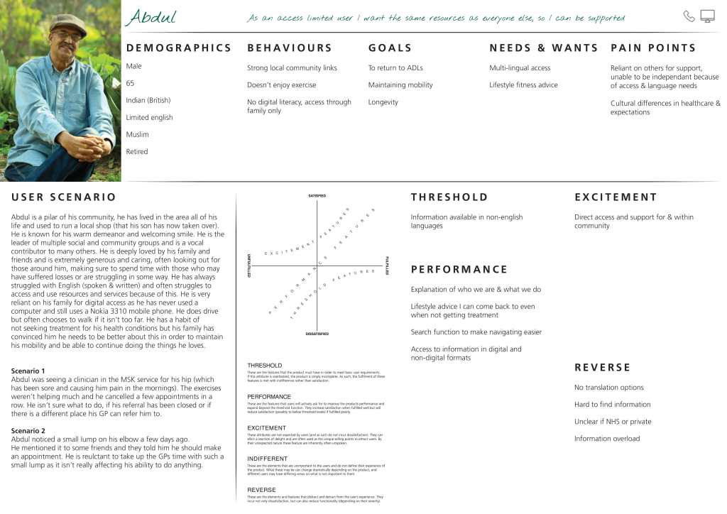
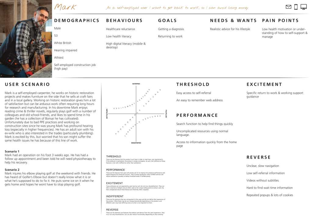
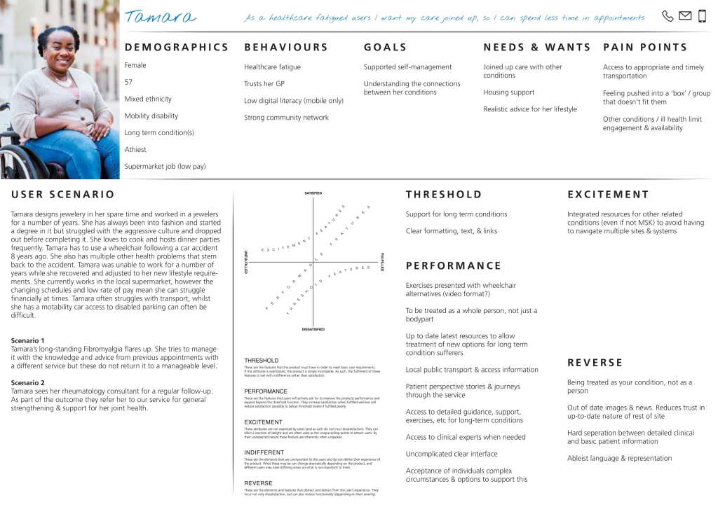
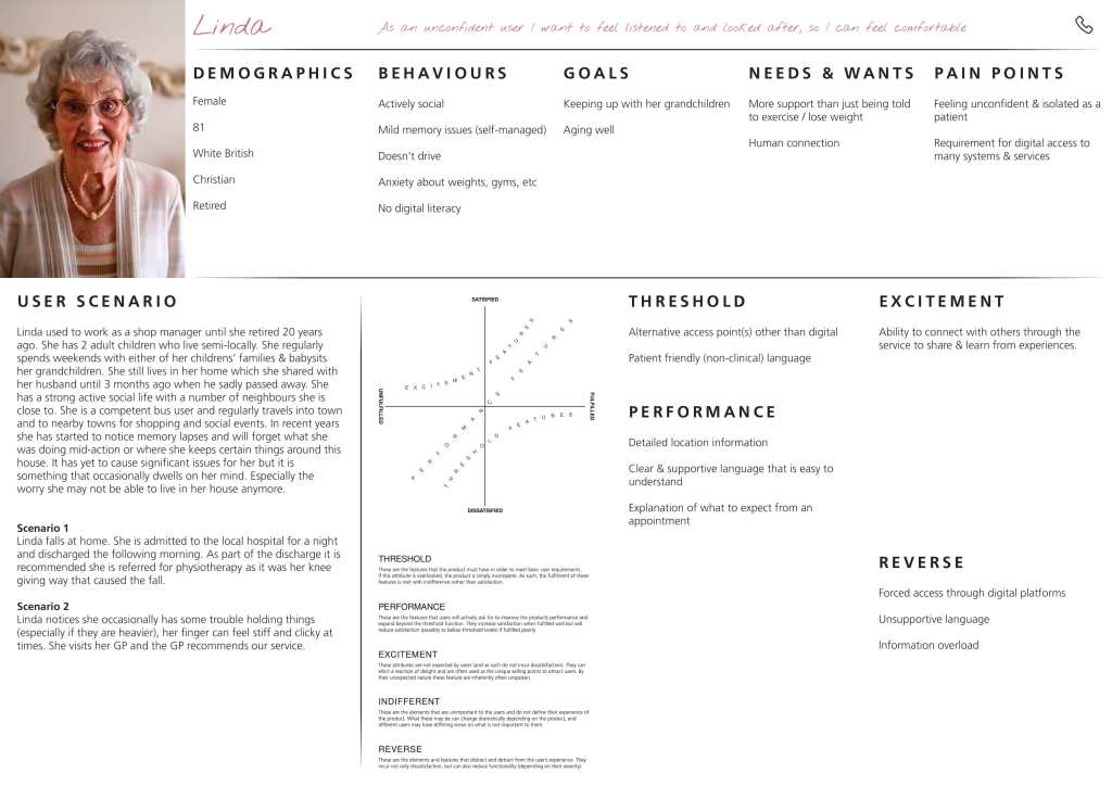
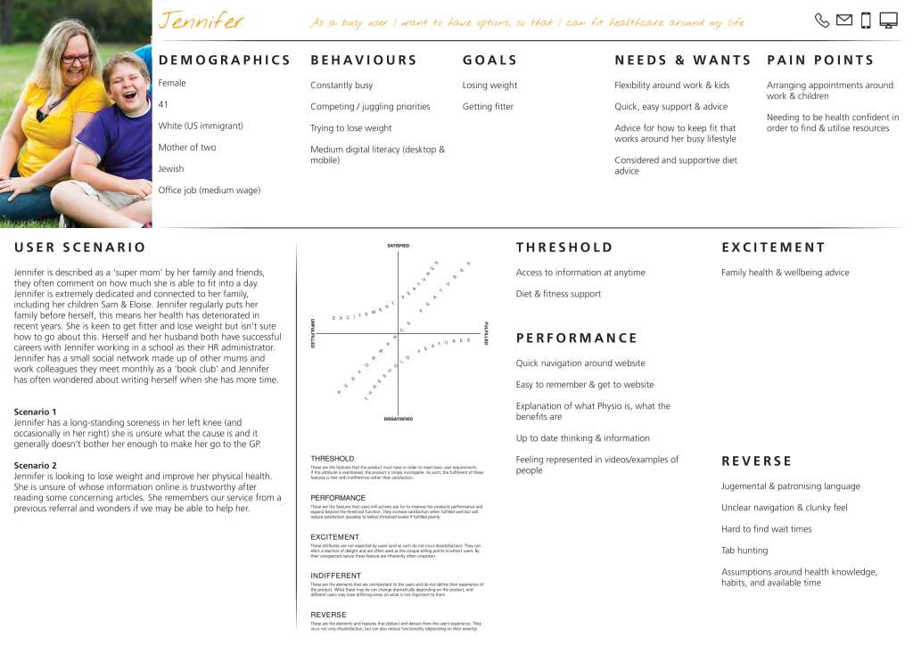
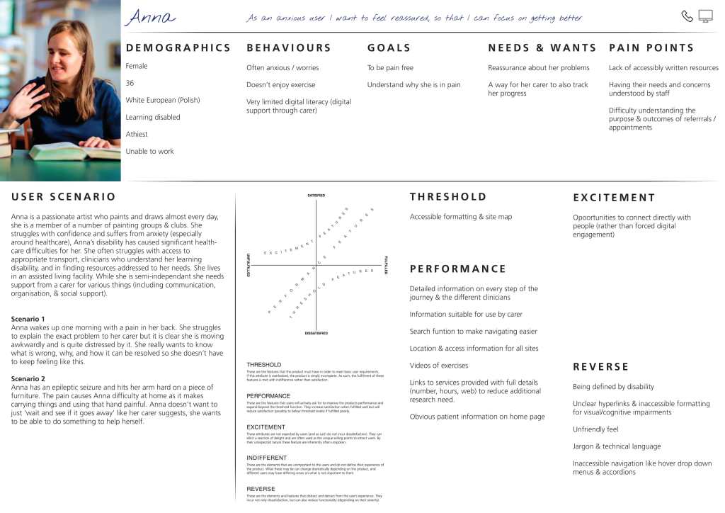
I then developed a series of user personas & scenarios (based on national, regional, & service data) and used the journey map to highlight pain & opportunity points within their respective treatment journeys.


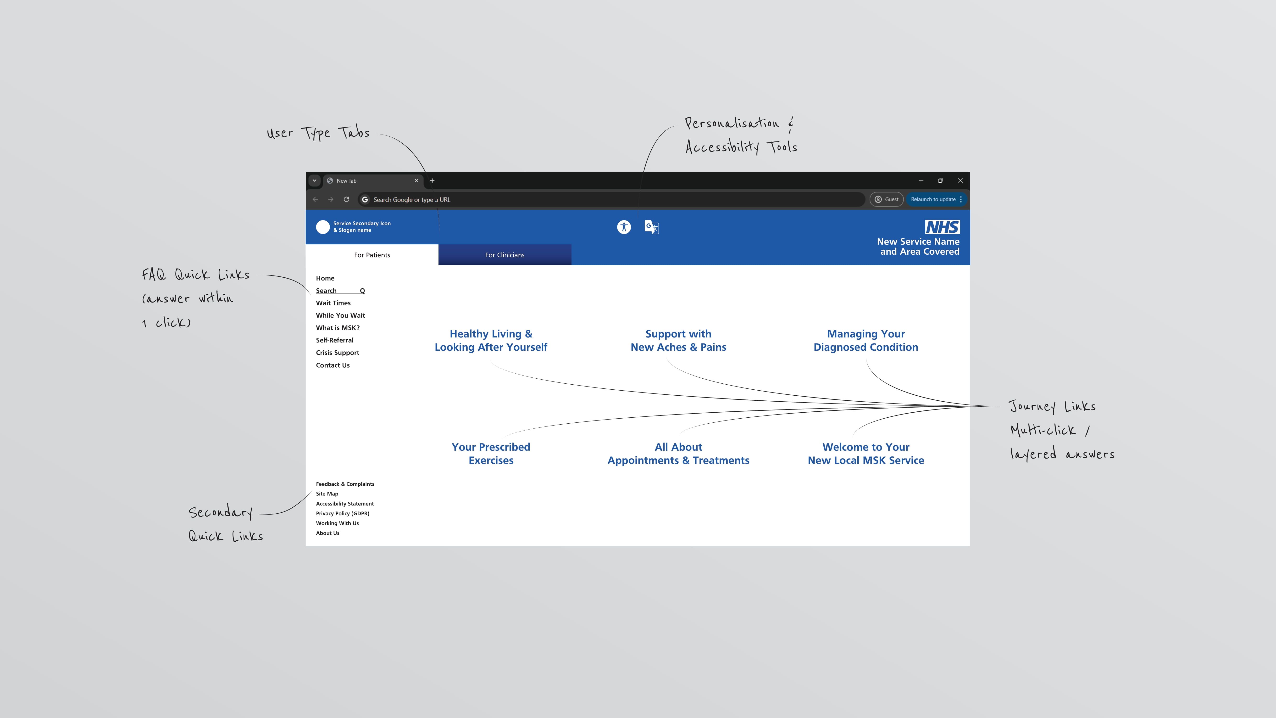
The interviews & observations also established 3 key use cases for the service websites that formed the foundation for the new site’s information architecture:
Quick FAQs – Users across all types seeking an answer to single questions (What are the wait times? How do I self-refer? What’s the telephone number?)
Information Journeys – Primary users (patients) seeking tailored advice, guidance, & resources for appointments & self-management.
Clinical Support – Secondary users (internal & external clinicians) accessing resources to support their own practice & development.
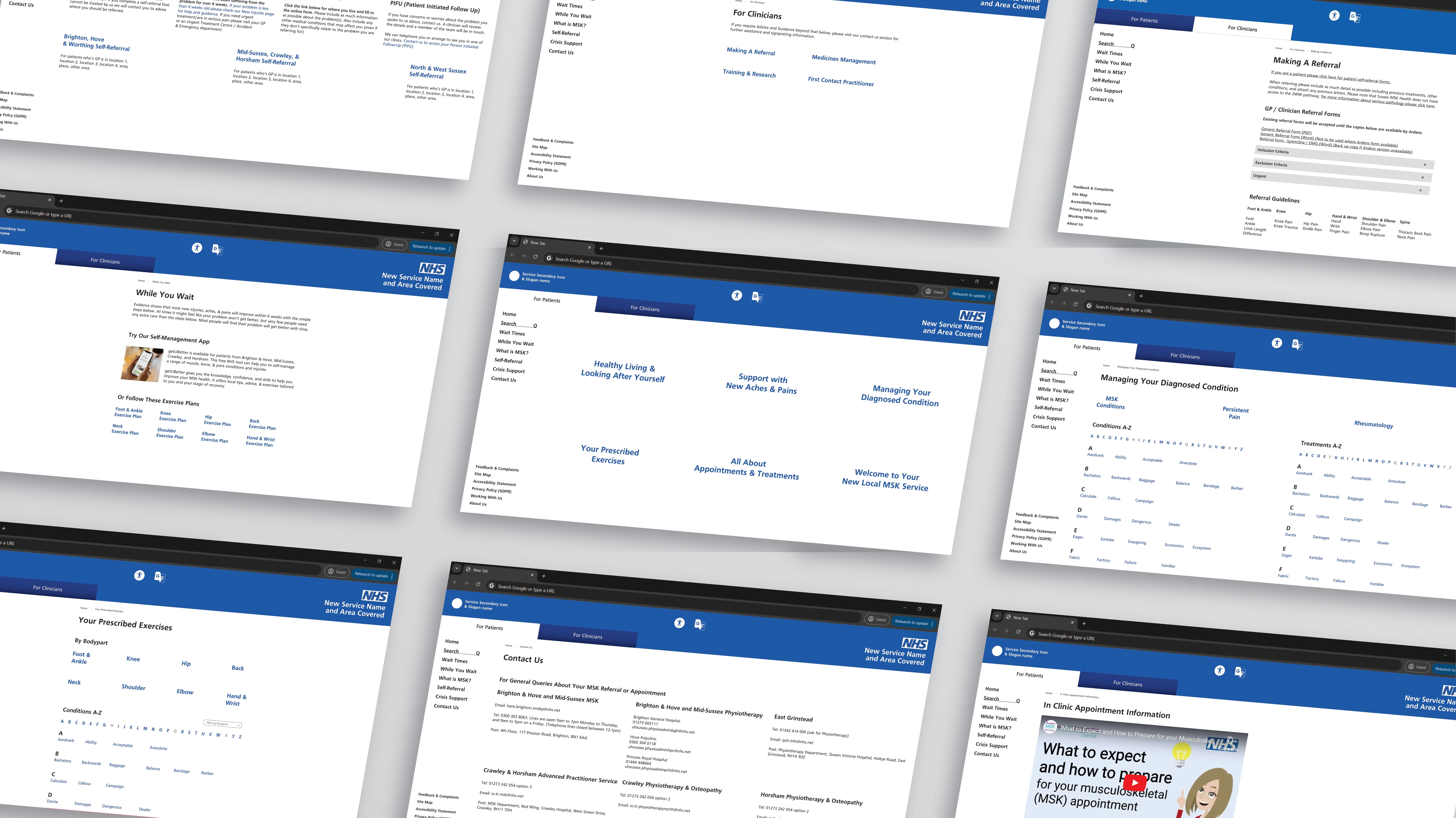
The ‘For Patients’ tab supports patients to access support and resources around their care, appointments, & self-management, written in accessible and approachable language.
The ‘quick links’ & ‘secondary links’ are shared between both tabs as all user types accessed these pages in similar proportions.
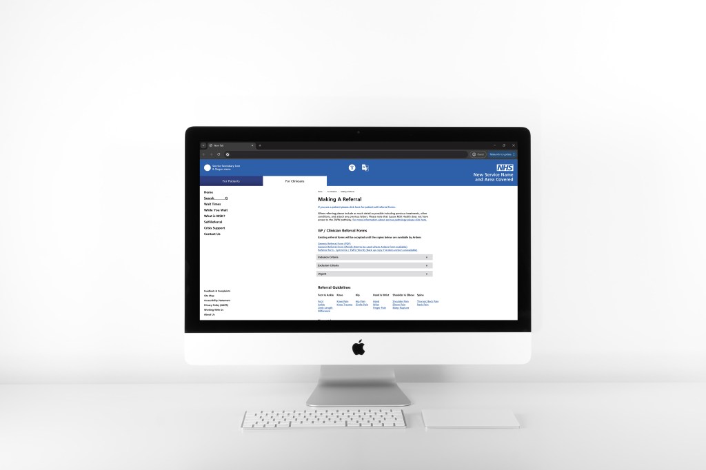
The ‘For Clincians’ tab supports clinical users to access more complex/specialised medical resources, pathway guidelines, and professional development resources.
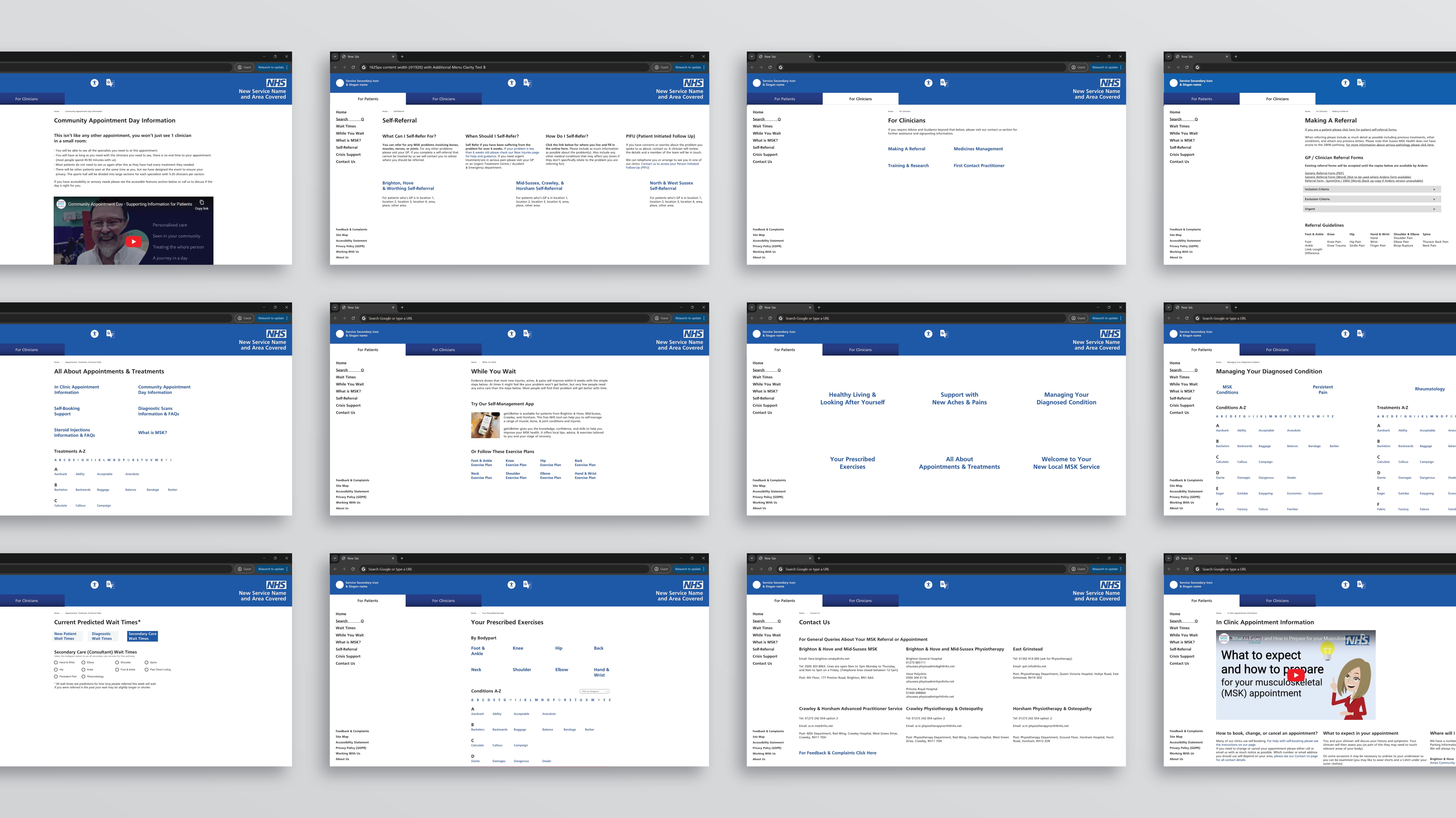
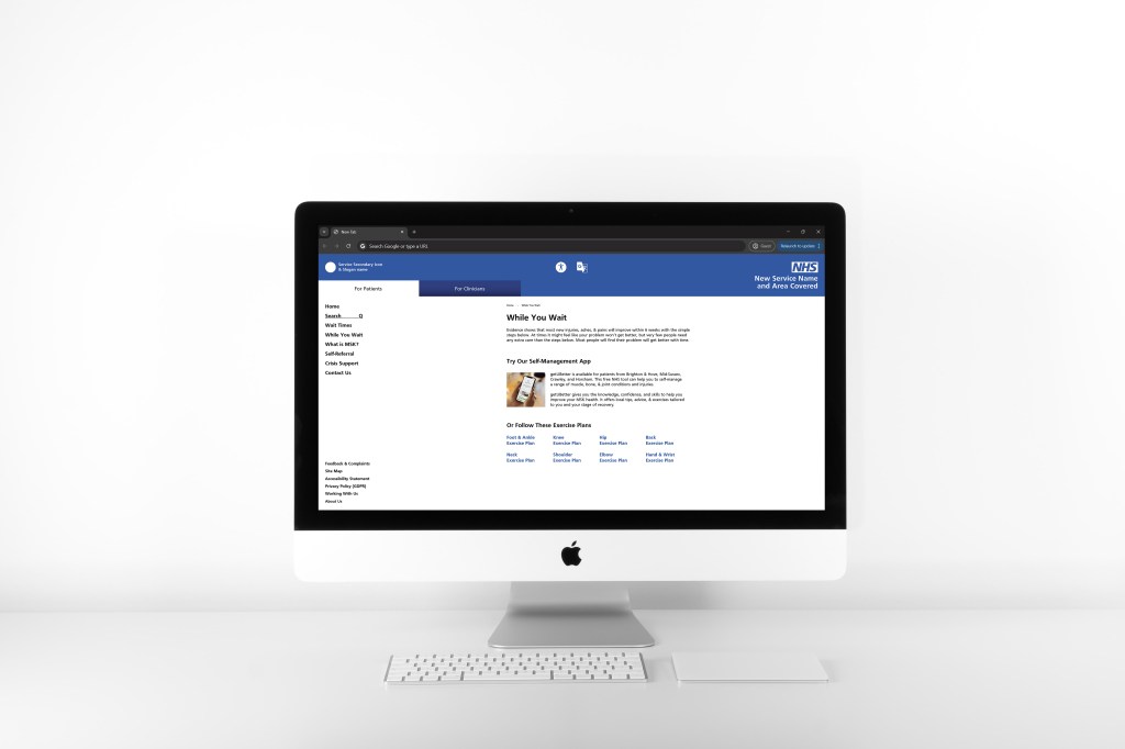
One of the surprising complex challenges was developing the wait times page as there are multiple complicating factors at play:
For internal ‘New Patients’ too many travelling outside their local area makes it impossible for the Operations Team to balance demand & capacity across the service. As such there is a need to avoid presenting wait times in a way that makes the different areas directly comparable.
There is also a confusion risk with different specialists using different titles. When waits are presented openly, patients default to the services that feature simple bodypart names (e.g. ‘Shoulder AP’) instead of the service they have been triaged into (of which they are notified by SMS or letter) which may have a less clear name (e.g. ‘Physiotherapy’ or ‘Rheumatology’).
The solution for this was to isolate each local region behind a drop down selection, under which each specialism has its own accordion where the waits are positioned.
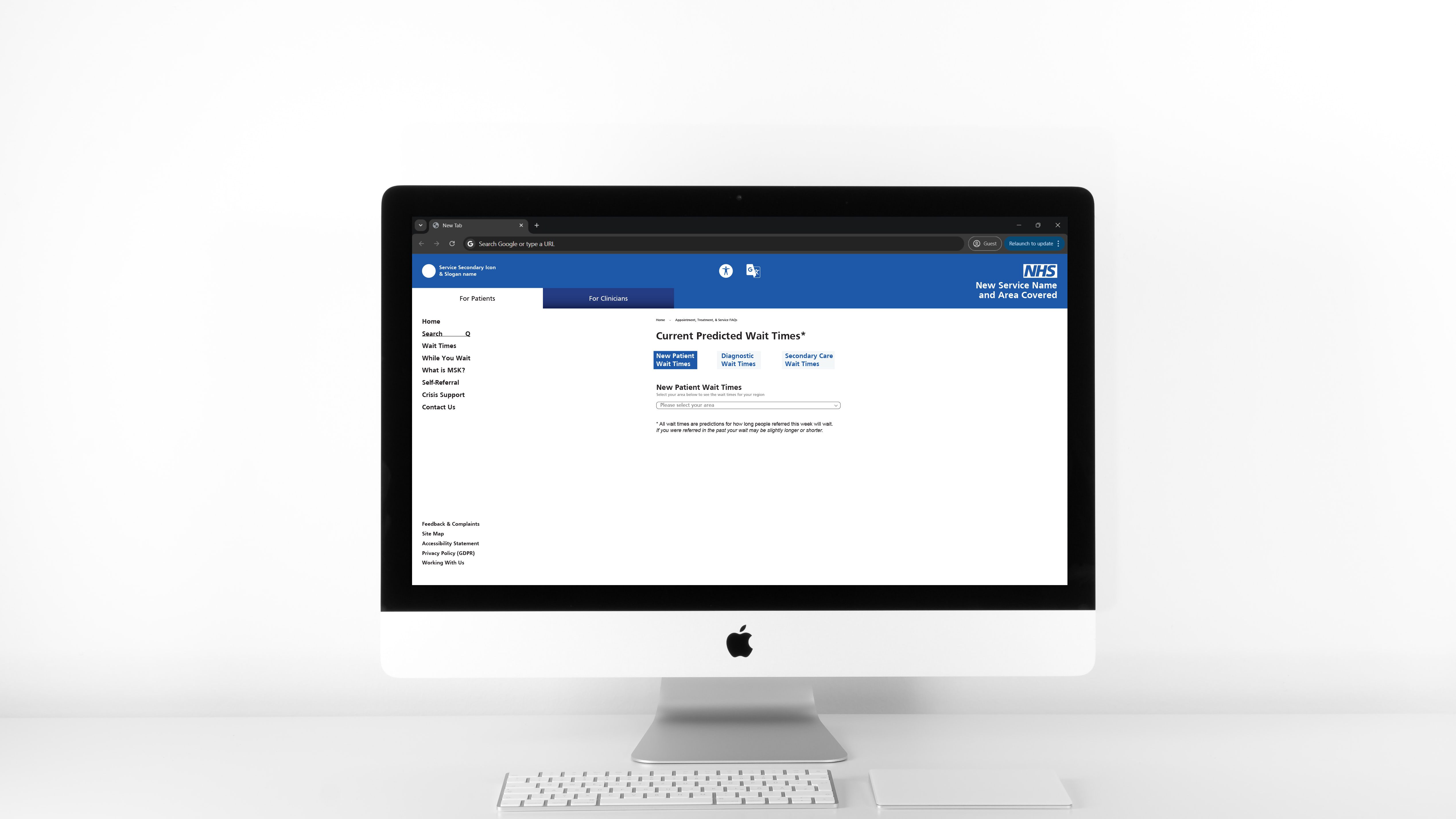


Secondary Care (surgery) services benefit from patients choosing providers with the shortest waits. However, many patients prefer to stay local and/or see a known consultant. With the new service covering approx. 1600 square miles there needed to be an easy way for patients to understand which providers were local to them (whilst also providing clear waits & consultant names for those more willing to travel). The solution for this was clickable map links that not only displayed the requested provider, but also all others that offer treatment for that bodypart, allowing patients to discover other local providers they may not have been aware of and who may have shorter wait times.
