Problem: Making healthcare more approachable, understandable, and accessible in a way that represents & manifest personalised care.
Solution: A bright warm graphic identity, aligned with new tone of voice guidelines, and a website built on user feedback & experience foundations.
The Brief
During the COVID-19 pandemic this NHS physiotherapy service suddenly found they needed to communicate with patients without being able to access them in person. This lead to the need for a new brand identity (to improve the services recognisability and support patients understanding of who the service was) and a new website through which to deliver clinical treatment resources to patients.
The Approach (Brand)
In preliminary discussions with patient groups & staff they consistently raised the need for healthcare to feel friendlier/more approachable, more modern, and less ‘stuffy’. From this it was clear that any new identity needed to lean away from traditional medical imagery, feature a more brightly colourful palette, and integrate softer forms.
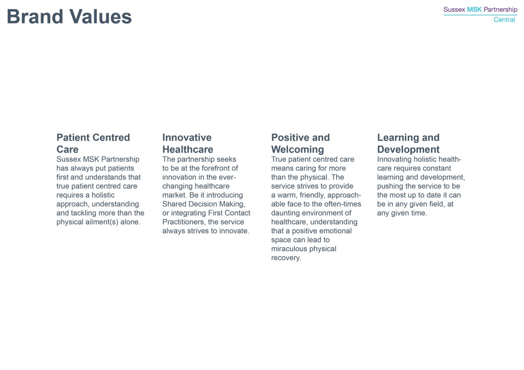
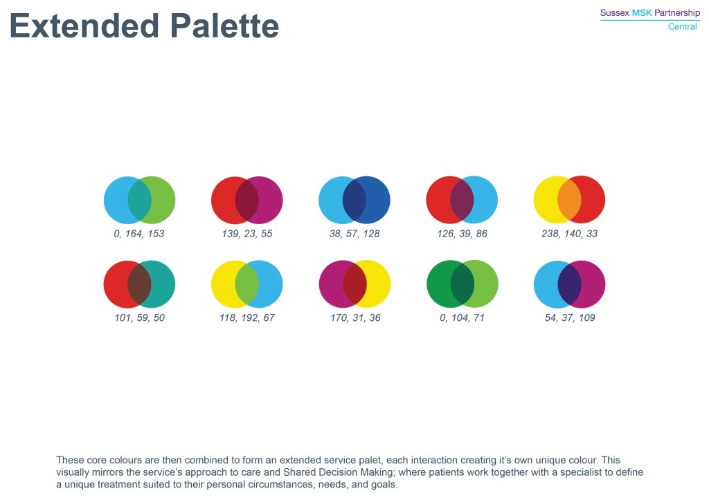
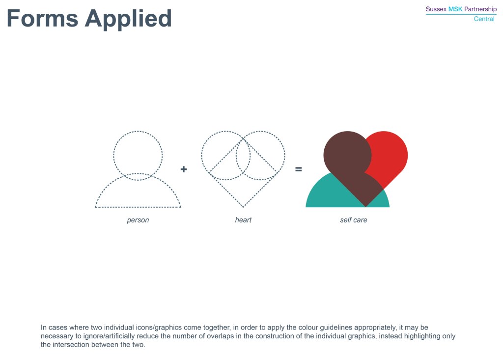
Key to the development of this identity was the services focus on Personalised Care (with this being particularly unique within NHS healthcare). This approach means that clinicians and patients come together to define the best treatment approach/course for that patient’s individual circumstances. Both parties are equal in the discussion and their outcome is based on shared decision making.
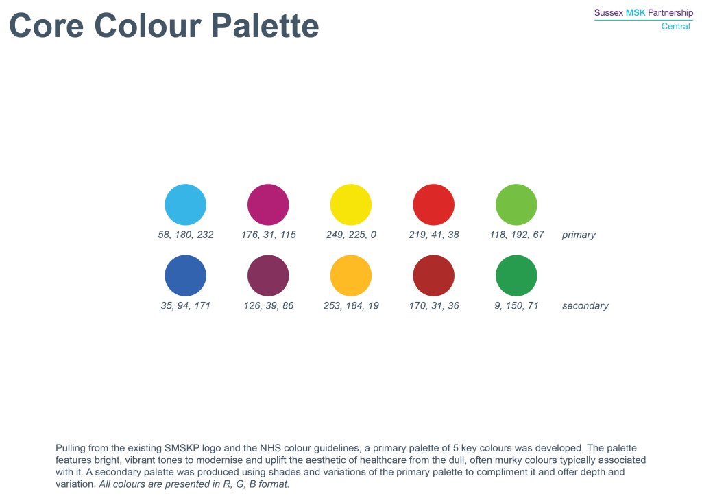
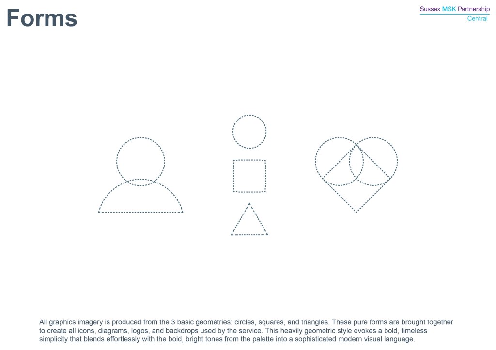
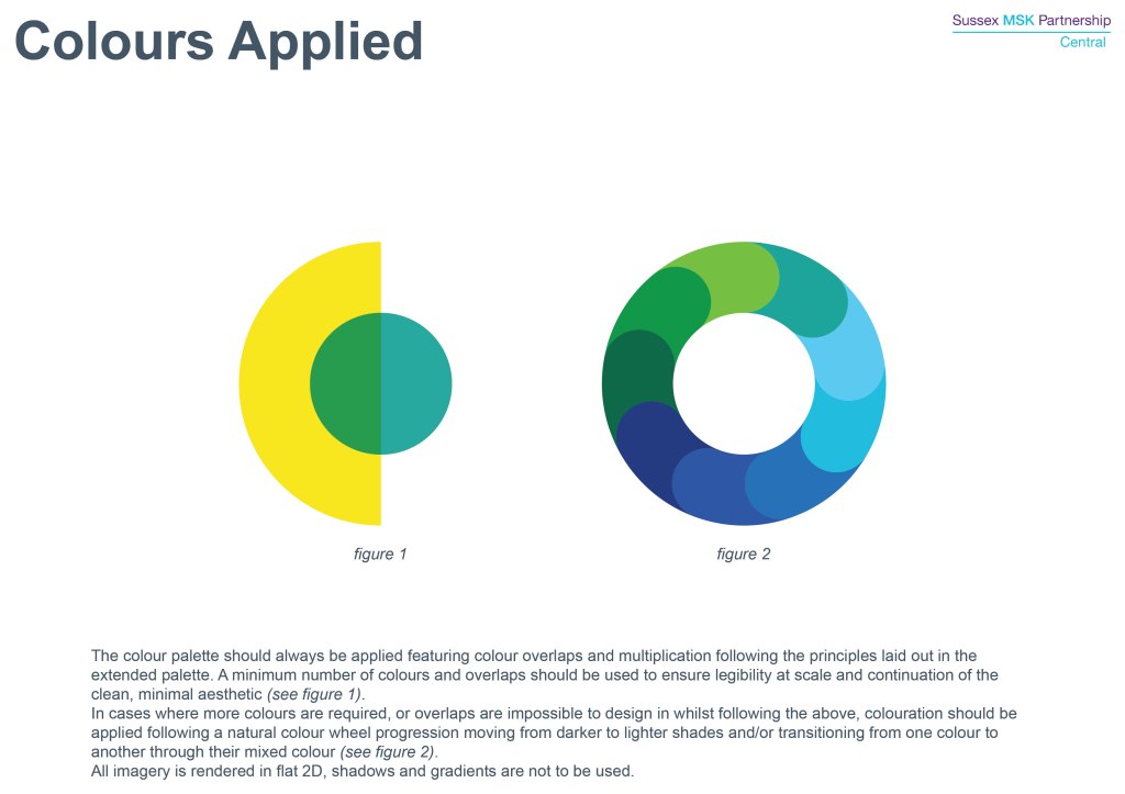
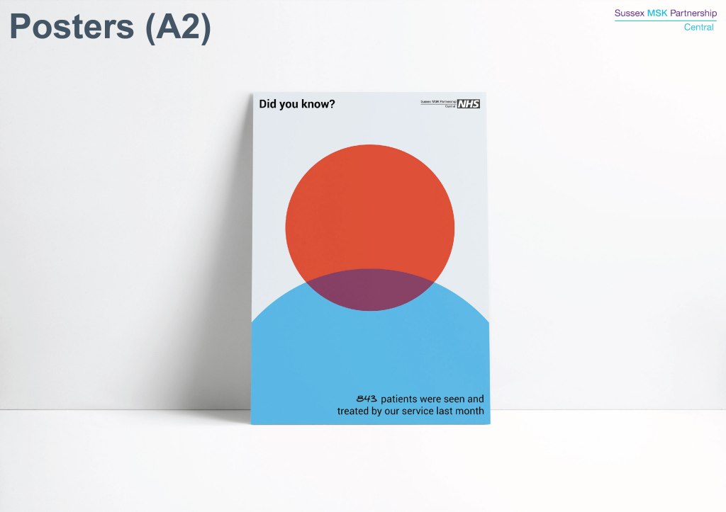
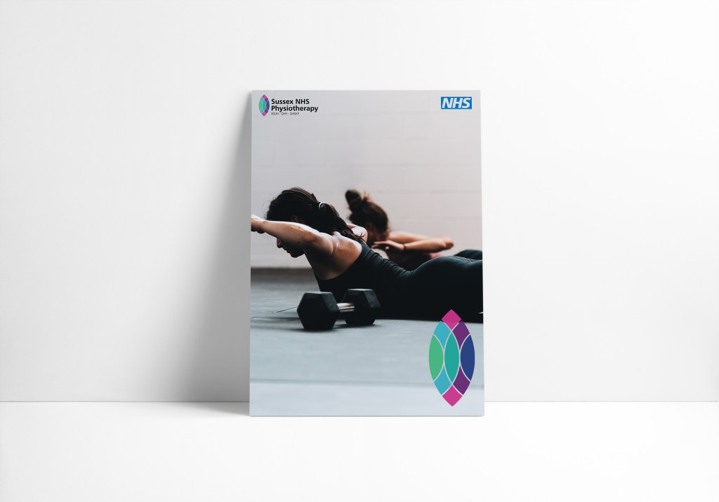
The final identity was inspired by the use of overprinting in screen printing, and translates the personalised care approach into a coming together of colours and simple geometric forms. Forms consistently intersect, and at each intersection a unique interaction/relationship is formed creating a third colour unique to that pairing of colours. For further explanation see the below brand guidelines images.
The Approach (Website)
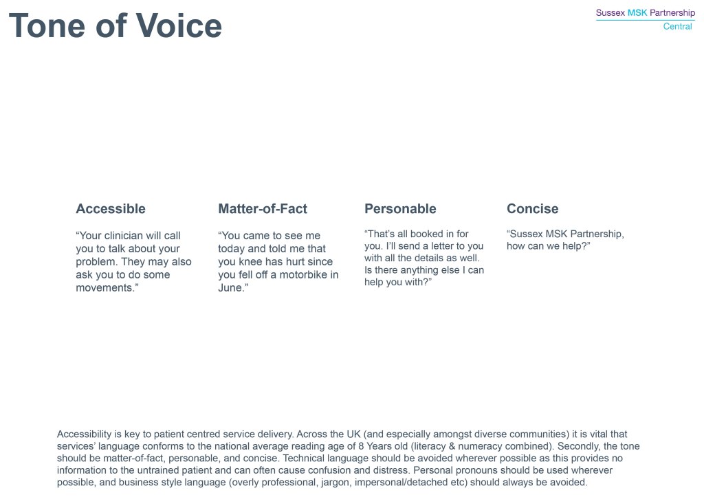
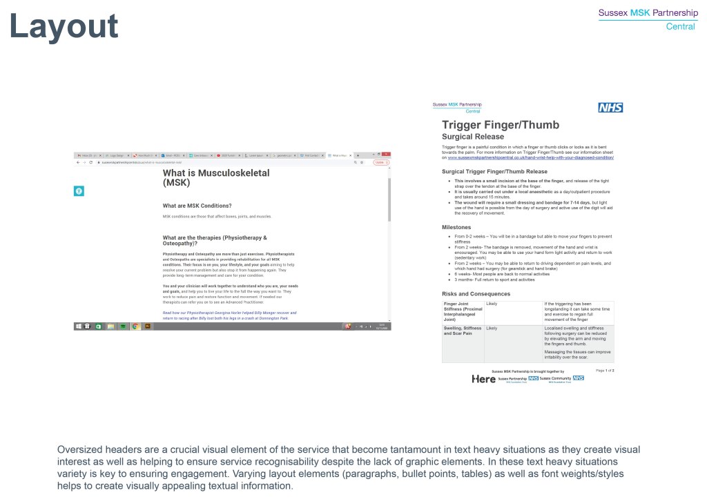
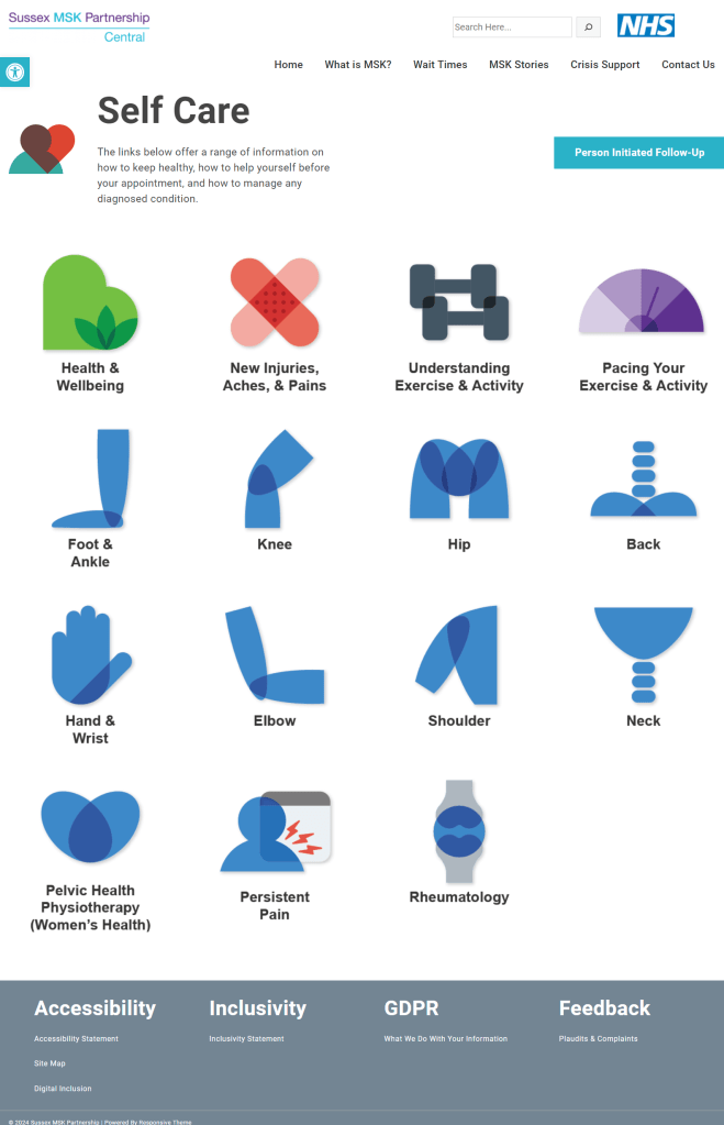
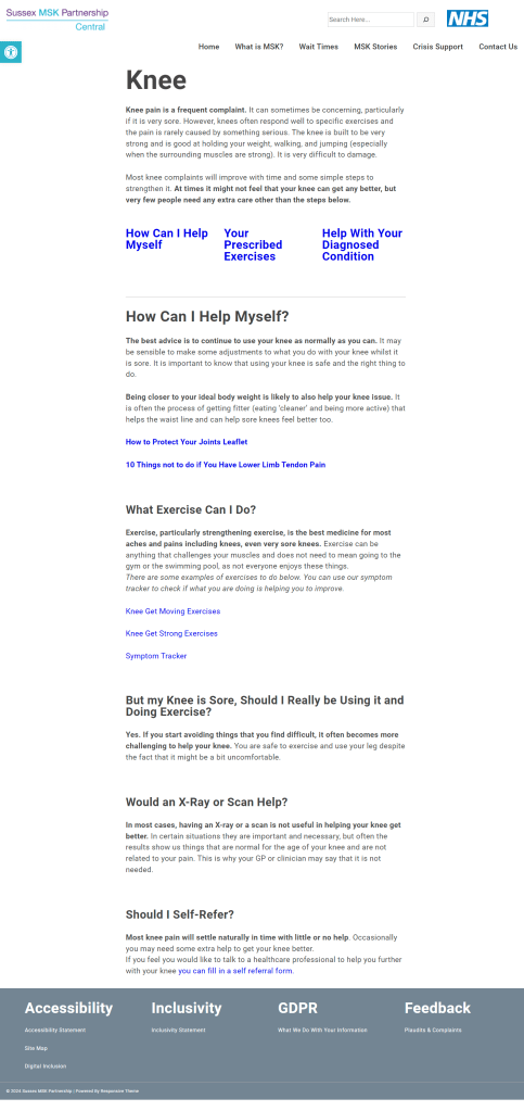
Patients particularly raised the need for clearer, simpler information pathways, less reliance on technical terminology & jargon, and better accessibility.
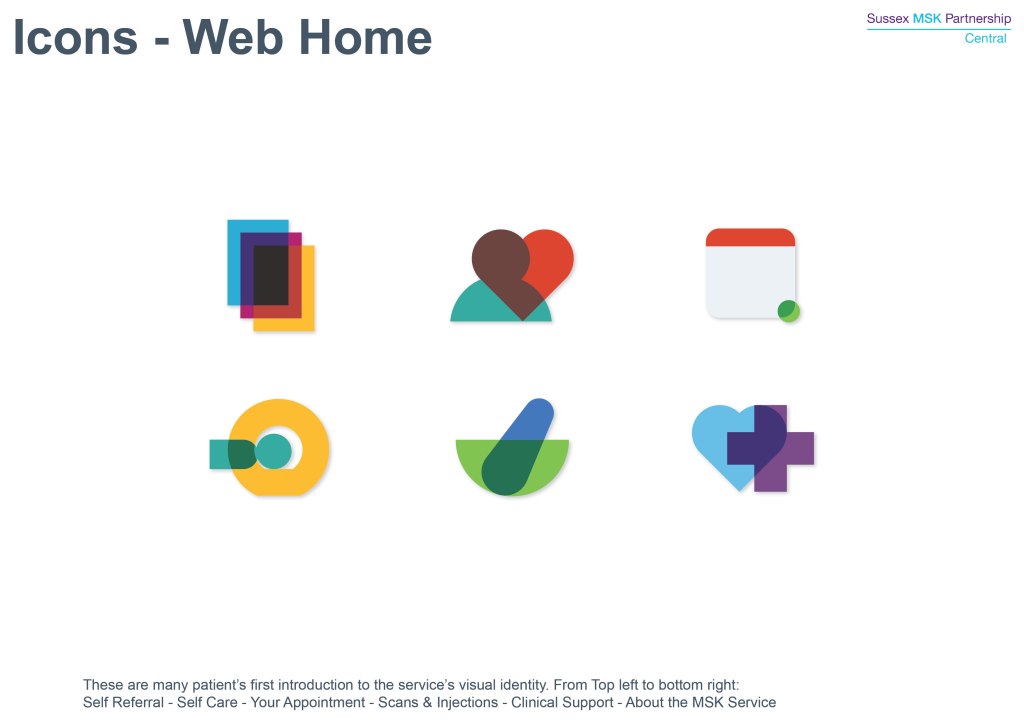
The website’s navigation was developed to create simpler step-by-step journeys, allowing patients to feel a stronger sense of progress towards their goal without relying on technical knowledge or terminology (as was necessary for the previous sites drop down menu system). The home page was developed to seperate the ‘quick questions’ from the more in-depth queries by splitting these across the navigation bar, and home page icons respectively.
Select screenshots below, full site navigable at www.sussexmskpartnershipcentral.co.uk


Service Sub-Brands
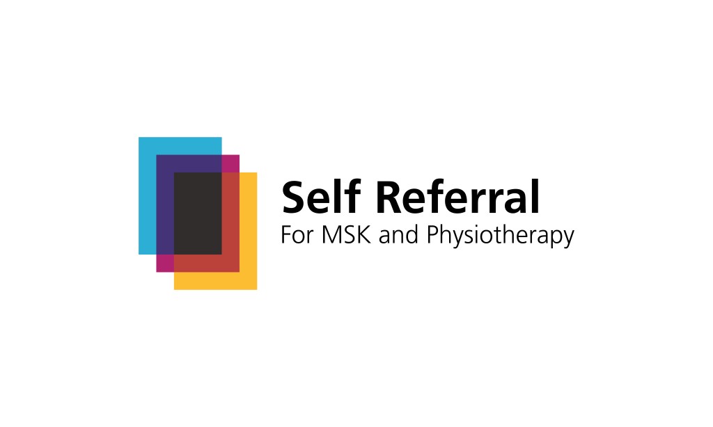
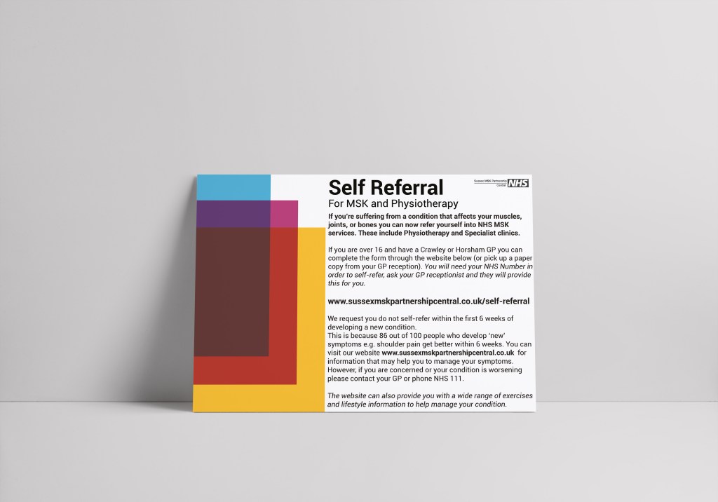
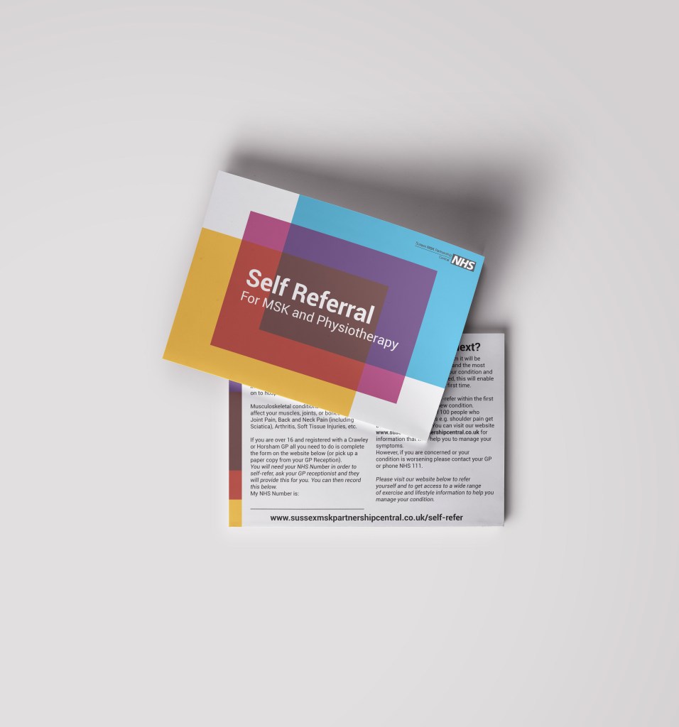
Self-Referral
The Brief
Self Referral was the first major service product presented to the public using the new identity. For the first time patients were able to refer themselves to the service rather than needing to see their GP first.
The Approach
With such a new offering, the identity needed to be bold and clear. Above all it needed to be easy to recognise from the first poster in a waiting room, to the icon on a webpage. The self-referral itself was comprised of 3 A4 sheets, the icon references this literally presenting them in bright colours with rich overlaps betwene them.
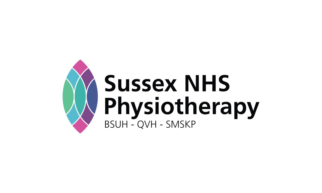
Sussex NHS Physiotherapy
The Brief
In response to the COVID-19 pandemic, the three Sussex physiotherapy trusts (BSUH, QVH, & SMSKP) proposed coming together to create a unified comprehensive collection of patient information. I was asked to produce a single logo for the collective that could be used across all media rather than their 3 individual logos.
The Approach
The logo I developed was focused on integrating all 3 organisations brands under a single unified icon. It takes the form of the Chartered Physiotherapist Crest and reinterprets it to feature the colours of each of the 3 contributing organisations:
BSUH – Dark Blue, & Mid Green
QVH – Dark Blue, Mid Green, Pink, & Light Blue
SMSKP – Light Blue, & Purple

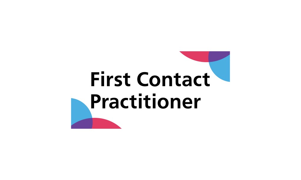
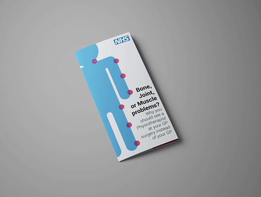
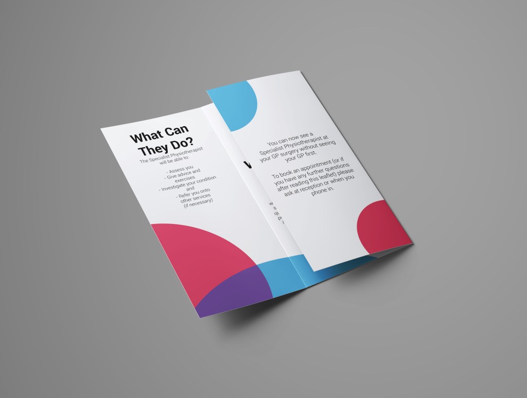
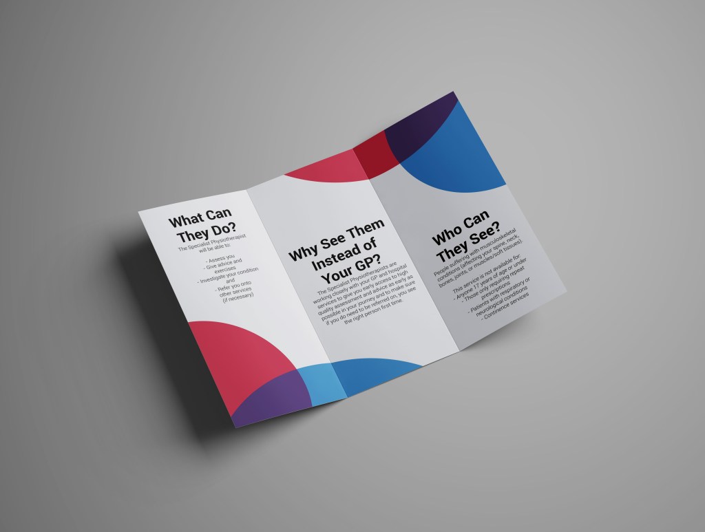
First Contact Practitioner
The Brief
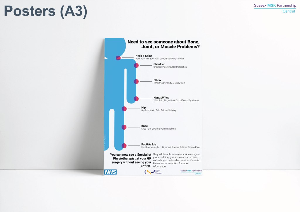
First Contact Practitioners are musculoskeletal specialists working from GP practices. The first challenge was explaining to patients what musculoskeletal means. In the past the service had used anatomical drawings to do this but, with the new identity moving away from clinical imagery, a softer form was needed for this.
The Approach
I initially developed a simplified version of the anatomical model, aligning this under the new brand identity. The ‘pain points’ from this image were then expanded to form a recurring corner icon/motif that could be used to identify the FCP offering whilst also visualising the collaboration between SMSKP and GP services.