Problem: The existing service website was not supporting the needs of patients or staff. This was exacerbated by the COVID-19 pandemic during which all appointments had to be made virtual (something which had never been offered before).
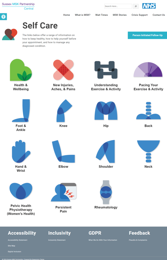
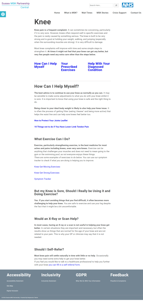
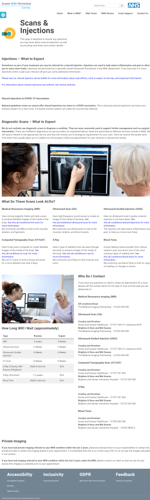
Solution: A website design that presented information in a more accessible, patient friendly, and easy to navigate format.
Outcome: A 294% increase in traffic over the first 2 years, 90%+ reduction in web related complaints, and significant praise across the organisation for it’s functionality and ease of use.
The Brief
It had been recognised for a number of years that the service website was not performing well, but without a design professional they were unsure how to move forwards with understanding the issues and resolving them. When I joined the organisation the project was quickly offered to me as someone with experience in related fields and I gladly took it on.
The Approach
Analysis of the existing site made clear the core issues, inaccessible hover to expand menus, overly-complex medical language, multiple dead-ends and unnecessary redirects, and a UI that did not support the differing requirements of different information (either from a presentation or an access perspective).
In order to establish additional user needs & issues I developed a questionairre for all staff and attended a number of patient focus group sessions to understand their problems, requirements, and desires from the site. Alongside the service brand work this aligned into a simple core requirement – make healthcare more approachable and more accessible.
I designed a site concept, tested this with users and then developed the site using WordPress. Launching the site in the early months of the COVID-19 pandemic, allowing our clinical services to continue despite the lockdowns (something that would not have been possible overwise).