Problem: Designing a brand that provides CMF solutions to allow for seamlessly beautiful bathrooms & interiors.
Solution: A brand identity that takes a back seat to the product, allowing their USP to shine through.
The Brief
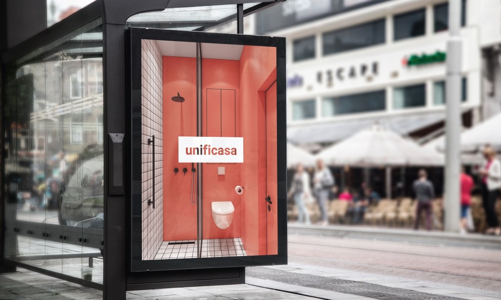
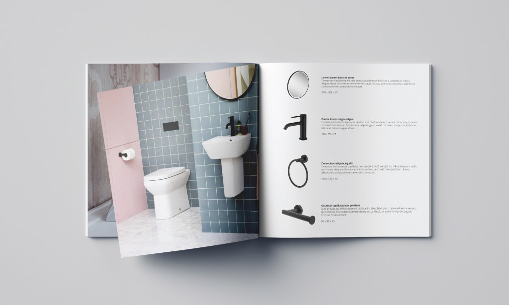
Unificasa was formed through the collaboration of a number of Italian bathroom product and finishing specialists. They sell the opportunity to supply and/or refinish any product in any material/finish, ensuring that everything in your bathroom works seamlessly together.
They needed an entire identity, from the name down. They were keen to make clear their Italian design heritage, whilst also wanting some ways to stand out and surprise their potential clients.
The Approach
As their Italian heritage was most important to them, the name Unificasa was developed as a portmanteau of the Italian ‘unificata’ – unified and ‘casa’ – home.
In discussion with them, the most important thing for their identity was the visibility of their work, the bold, cohesive design environments. As such the brand’s identity is designed to transparently allow this, offering as little as possible in way of it’s own visual identity in order to allow the wider environments to stand out through the company, an anti-identity as it were.
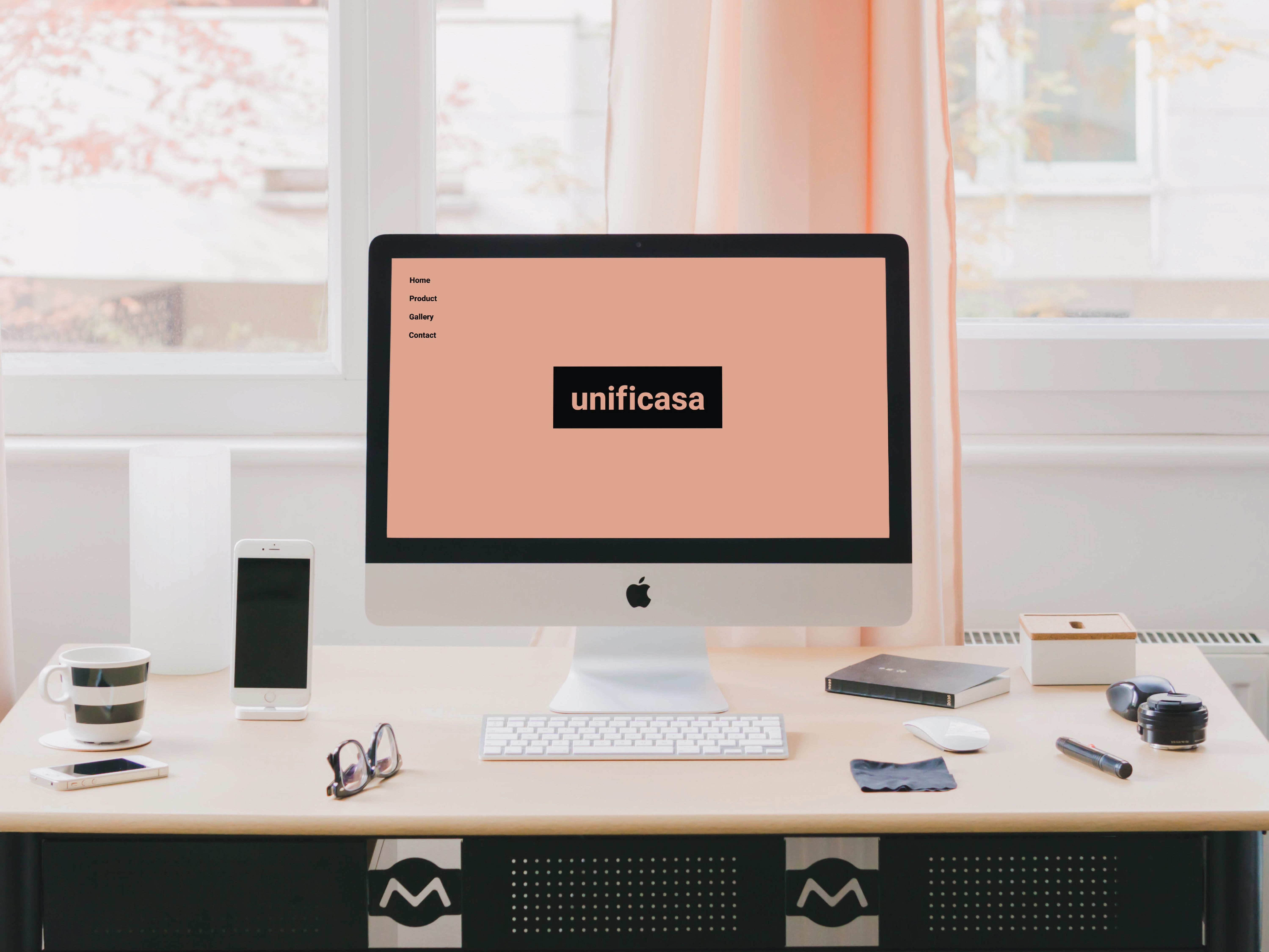
Though Unificasa’s identity is brutally minimalistic (and the design of the website homepage reflects this) an opportunity was realised to provide a wow factor in the brand’s interactions. The camera is used to pull the predominant colour from the user’s location and replicate it as the background for the site, customising the site to each individuals environment as the company customises each product to the clients’ environment designs.