Problem: A lack of clarity on the impact of various service wide initiatives on the patient journey and how they might fit together and into existing patient treatment structures.
Solution: A comprehensive visualisation of all potential treatment pathways including the new initiatives & representations of relative patient volumes.
The Brief
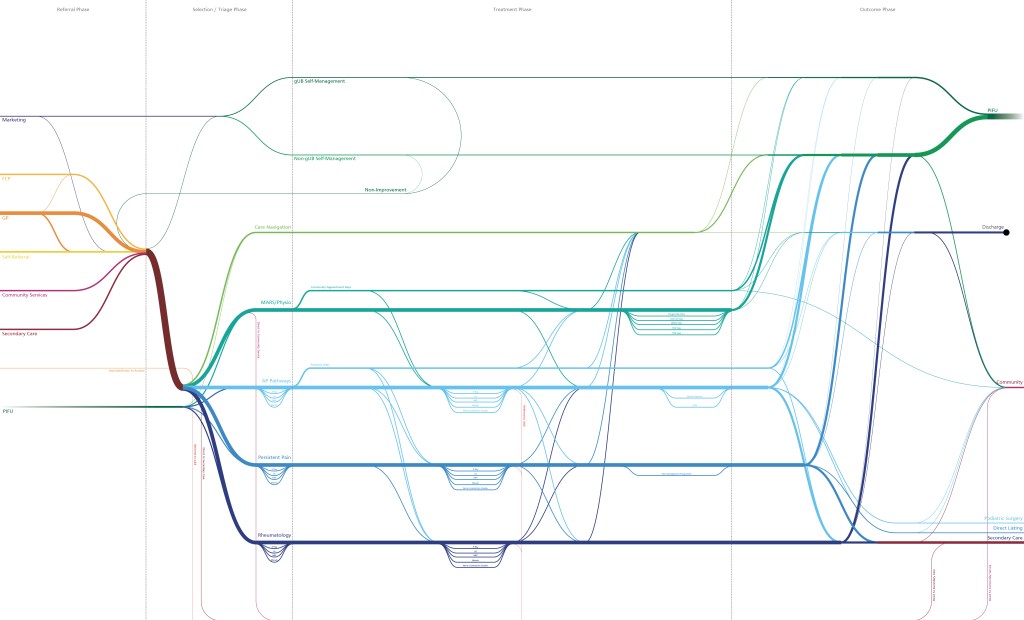
During a time of significant evolution a large number of service initiatives were being piloted and introduced at the same time as a new Target Operating Model and clinical computer system were being developed. The organic growth of many of these projects meant that theit impact on the overall patient journey was unclear. This was leading to confusion, work duplication, and difficulty prioritising amongst the various workstreams.
The Approach
Being a member of a few of these projects I was able to recognise quite quickly the disasterous impact this lack of clarity could cause downstream. Having created a top down journey map for the website project I was able to use this as a starting point onto which to add the deeper, richer data that would allow me to represent all possible patient journeys in one visual.
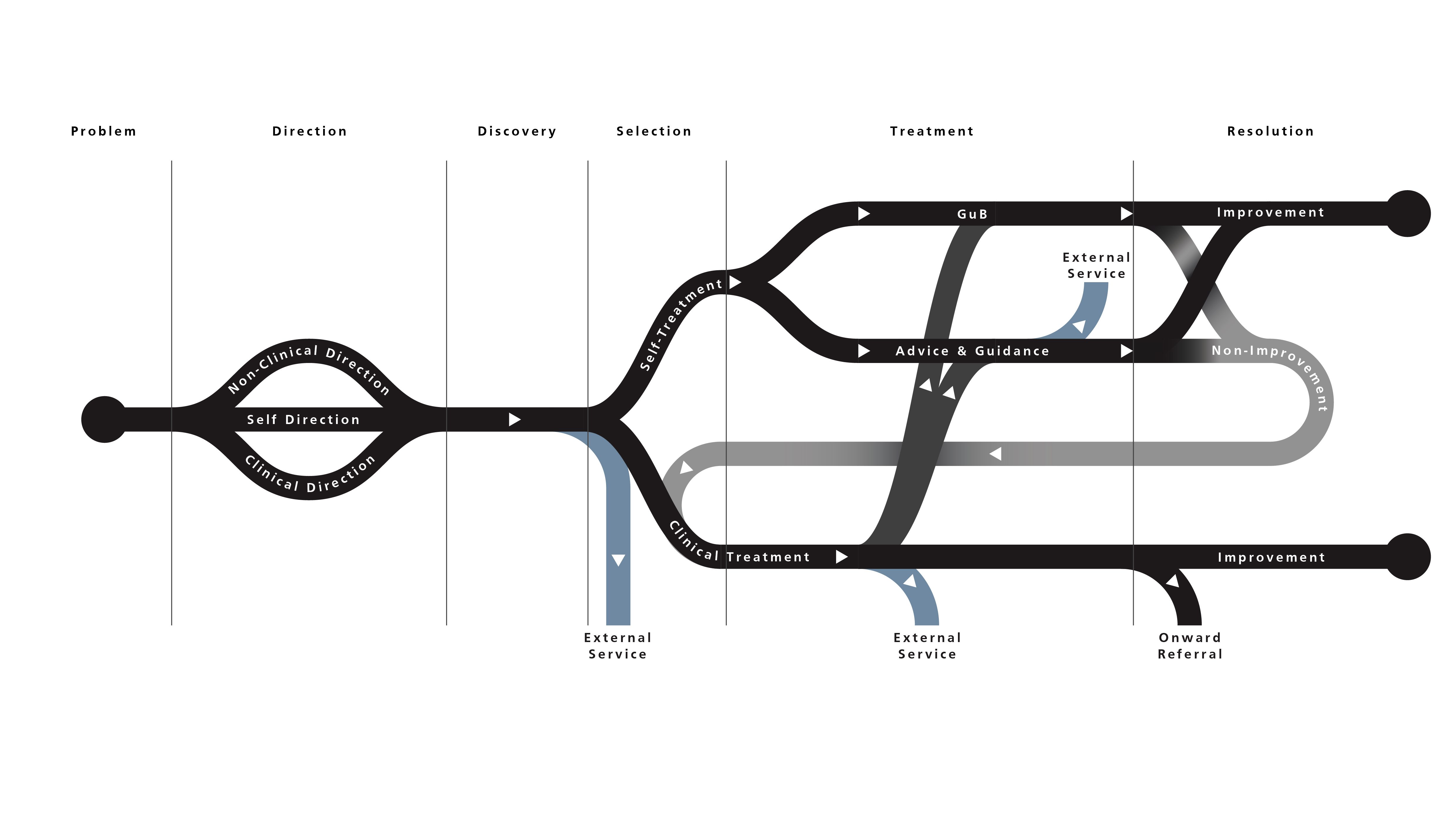
This service wide journey map allowed members & teams regardless of specialism or skillset to quickly understand where their work would impact the patient journey, relative volumes of patients flowing along each ‘path’, and supported prioritisation of the work that would impact the highest volume of patients.
The process also allowed me to develop some critical insights that informed a number of the projects. For example, prior to this exercise PIFU (Patient Initiated Follow Up) was thought of like any other follow up, but this mapping established it behaves much more akin to a transfer of care. This allowed us to change PIFU processes to better align to how it functions within the patient journey.